

You are using an out of date browser. It may not display this or other websites correctly.
You should upgrade or use an alternative browser.
You should upgrade or use an alternative browser.
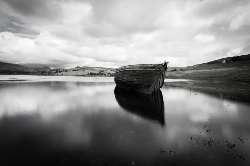
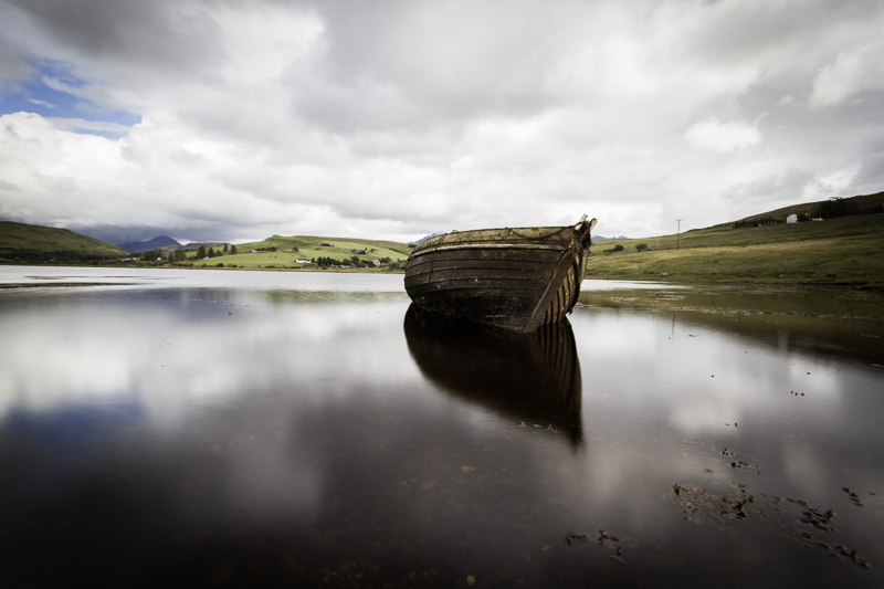
B&W or colour, any comments
- Thread starter mrgubby
- Start date
- Messages
- 20,926
- Name
- Steve
- Edit My Images
- Yes
Colour - it's got more punch
- Messages
- 4,635
- Name
- Pete
- Edit My Images
- Yes
In answer to the question I feel the colour one is best.
I personally would also crop out some (but not all) of the seaweed in the bottom giving it a more letter box aspect ratio.
I personally would also crop out some (but not all) of the seaweed in the bottom giving it a more letter box aspect ratio.
OP
- Messages
- 7,987
- Name
- Brian
- Edit My Images
- Yes
It looks like colour one wins on TPF ") (I prefer it as well) while a group that I post to on Farcebook like the B&W !
(I prefer it as well) while a group that I post to on Farcebook like the B&W !
I'd left the weed in to give it context but I understand where you coming from, especially the framing
(I prefer it as well) while a group that I post to on Farcebook like the B&W !I personally would also crop out some (but not all) of the seaweed in the bottom giving it a more letter box aspect ratio.
I'd left the weed in to give it context but I understand where you coming from, especially the framing
- Messages
- 1,783
- Name
- Jim
- Edit My Images
- Yes
I think you're being unfair to your B&W image which looks as though it's just had a B&W layer added to the colour version- which often leaves images looking flat. I think you need to work a bit on B&W to bring out tones and contrast. Hope you don't mind a I noted you're OK with editing of your images so I ran the colour version through Nik Silver Efex Pro and got a B&W in a few minutes as below- not great but could do more with the RAW file and a bit more time. Don't know if you like it but it shows what's to be gained from mono conversions with a little work.
View attachment 19559
View attachment 19559
- Messages
- 4,516
- Name
- droj
- Edit My Images
- No
Note how in the first pair the removal of colour alters the effect of the composition. The removal of the blue in the sky in particular changes the way the eye wanders about the image. The light or your rendition of it is rather lugubrious though across both versions, but is lessened in the mono.
Apart from that, I feel that the underside of the boat and its reflection is probably just too dark. But Jim's mechanical conversion smacks of too much, too easily, and has a metallic flavour unsympathetic to a sense of the scene.
Apart from that, I feel that the underside of the boat and its reflection is probably just too dark. But Jim's mechanical conversion smacks of too much, too easily, and has a metallic flavour unsympathetic to a sense of the scene.
Last edited: