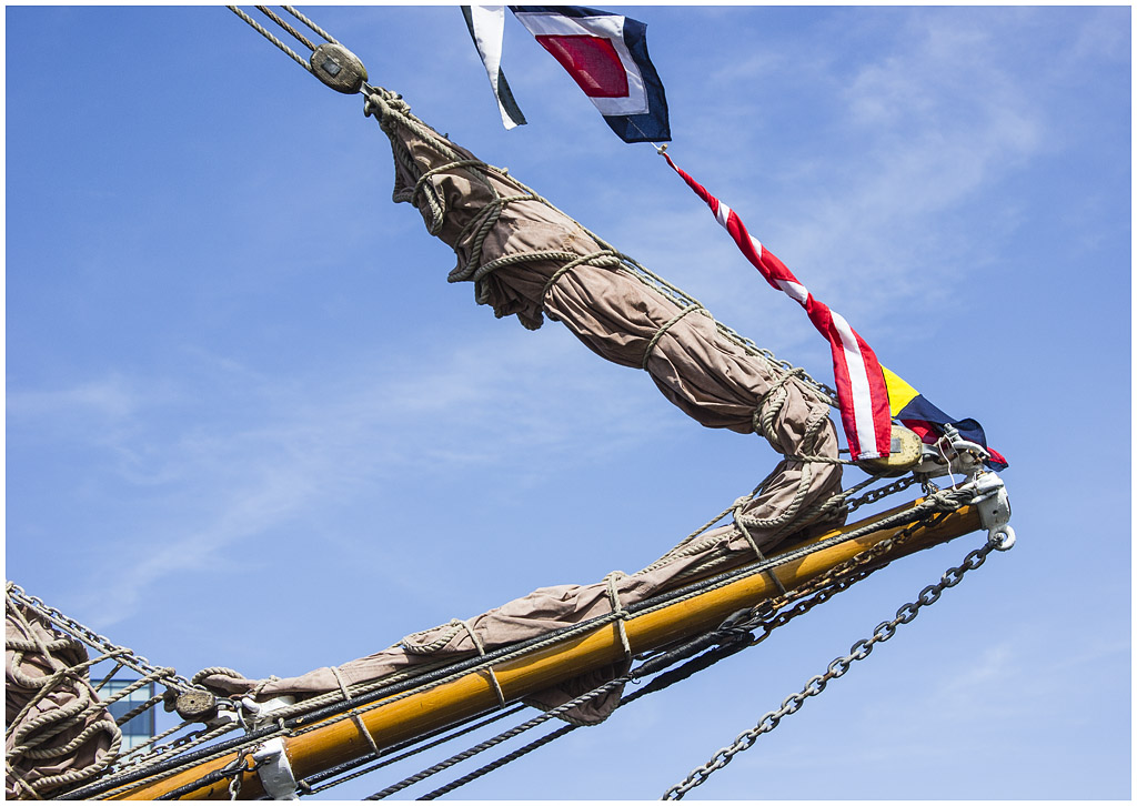
Critique B&W or colour - pointy end of sailing ship

Messages
1,156
Name
Chris
Edit My Images
No
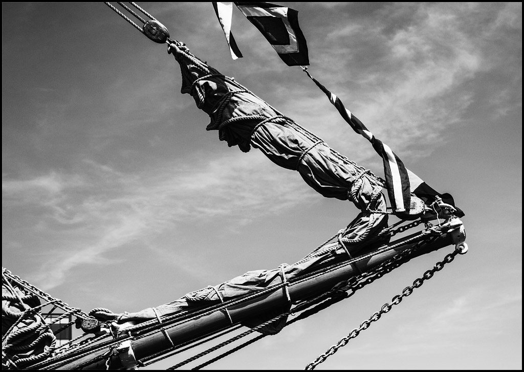
I is mainly doing B&W at the moment (?remember that comedy character??) and when I came to process this image my immediate thought that it was best suited to colour, but I then also processed it in B&W too.

I think I actually prefer the B&W but Higher Management prefers the colour version

By the way - this is another one from our Liverpool trip - it was outside the Tate.

?views
6146-1406384812-72cc2c4b4157a0d33b9386e1bc2de326.jpg


6147-1406384908-3faed00ca8a80aa86bf44bcb1b938b25.jpg
 
I hate to disagree with the higher management but I too think the B&W image is better.

I like the way the clouds stand out and the shadows of the ropes and canvas textures appear better to me.
 
I agree with huffy. The B&W is much better. I find the colour elements a little distracting.
 
Good oh (so far anyway:))

I think that most people who don't look at a lot of images would automatically go for the colour version (after all we don't watch B&W tele do we?) but B&W has a timeless quality if it is done correctly (which I don't always manage:))
 
Thanks Carl - thinking about it when I was in Liverpool I was specifically trying to take images for B&W so I am particularly pleased (now that I have remembered:)) that it was supposed to be in B&W in the first place:)
 
B&W for be too! Although I think the shadows under and up the main sale look a bit dark although im only looking on my phone?
 
Thanks Rob - I will check out the shadows:)
 
B&w for me. Agree with Rob re the shadows on the b&w image. Shadow detail on the colour image is lost on the b&w
 
Thanks Robert - I had been producing B&W that was too light and so have gone to far the other way (probably:))
 
Back
Top