

You are using an out of date browser. It may not display this or other websites correctly.
You should upgrade or use an alternative browser.
You should upgrade or use an alternative browser.
weekly Bilko's 52 for 2012 - Week 48 Shadow Added
- Thread starter Bilko
- Start date
- Messages
- 13,760
- Edit My Images
- Yes
Yep liking that one too... real nice roots ")
- Messages
- 999
- Name
- Roly
- Edit My Images
- Yes
Yep me too, nice take on difficult theme. Like the POV and the colours
Hi Robert,
Just catching up on your thread,
Sweet:- Nice one, I like it.
Secure:- Simple but oh so effective.
Industry:- Nice colours, like the way you've shot this one through railings.
Root:- those are some roots, like the perspective.
Carol
Just catching up on your thread,
Sweet:- Nice one, I like it.
Secure:- Simple but oh so effective.
Industry:- Nice colours, like the way you've shot this one through railings.
Root:- those are some roots, like the perspective.
Carol
- Messages
- 6,408
- Edit My Images
- No
Hi Robert, I really like those Harland and Wolf cranes, when you think what was achieved there it was amazing. Have you tried a mono conversion. May work well?
'Root' is very nice I like the soft tones. it's a very nice image.
'Root' is very nice I like the soft tones. it's a very nice image.
OP
- Messages
- 989
- Name
- Robert
- Edit My Images
- Yes
Thank you for the comments one and all. It's what keeps me going.
Just trying to catch up on things after a really busy week, with hardly any time to take any photo's, but I got one for handmade...
I don't smoke, but I used to and I used to roll my own handmade cigs. For this I popped down the shop for rollling papers and opned up a teabag. I used a single flash on a stand, direct at my hands with my assistant using the remote. I didn't spend anywhere near as much time doing this as I would have liked to.

week 8 handmade by robertalexandershaw, on Flickr
Just trying to catch up on things after a really busy week, with hardly any time to take any photo's, but I got one for handmade...
I don't smoke, but I used to and I used to roll my own handmade cigs. For this I popped down the shop for rollling papers and opned up a teabag. I used a single flash on a stand, direct at my hands with my assistant using the remote.
I didn't spend anywhere near as much time doing this as I would have liked to.week 8 handmade by robertalexandershaw, on Flickr
blakester
Shine On Harvest Moon
- Messages
- 6,679
- Name
- Iain
- Edit My Images
- No
Good work on handmade Robert. Quite a simple but effective take on the theme, the lighting works well, lots of detail in the hands and great composition. You've nailed this for one you would've liked to have spent more time on. Iain

- Messages
- 13,760
- Edit My Images
- Yes
Handmade - Nice thought and shot Robert, like the processing, Sharp where it needs to be and some nice detail... spot on
- Messages
- 478
- Name
- Phil
- Edit My Images
- Yes
That's a good shot for handmade. Great DOF and I like the colour tones.
- Messages
- 329
- Name
- Sam
- Edit My Images
- Yes
direction - great shot, love the shapes in the wheels
Fear - simply Great. B&W and grain for me pls.
sigh - another great shot, very abstract.
sweet - really good idea for a picture.
industry - love this shot, great colours and contrast. the person adds a human element. Great shot.
handmade - works very well. I like that you use yourself as the model too. Nicely lit.
- Messages
- 2,820
- Name
- Mark
- Edit My Images
- Yes
Handmade is perfect; wouldn't change a thing!
- Messages
- 8,398
- Name
- Lynne
- Edit My Images
- Yes
Hi Robert
love your image for handmade.....good lighting , nice detail in the fingers , simple but very effective & right on theme ....good one mister
love your image for handmade.....good lighting , nice detail in the fingers , simple but very effective & right on theme ....good one mister
- Messages
- 234
- Name
- Chris
- Edit My Images
- No
Well I think that the others have said it all so all you get is great pic I really like it. Well done
OP
- Messages
- 989
- Name
- Robert
- Edit My Images
- Yes
Thanks very much for the replies. I know how time consuming it is trying to reply to posts.
Week 9 Money.
I wasn't too happy with this shot, but my planned idea didn't work, so this was my plan B.
I got some pennies and cleaned them in lime juice. Placed them on paper and two off camera flashes with a bit of bounce.
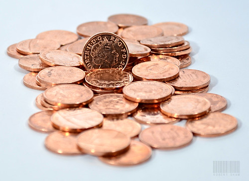
Week 9 Money by robertalexandershaw, on Flickr
Week 9 Money.
I wasn't too happy with this shot, but my planned idea didn't work, so this was my plan B.
I got some pennies and cleaned them in lime juice. Placed them on paper and two off camera flashes with a bit of bounce.
Week 9 Money by robertalexandershaw, on Flickr
- Messages
- 1,513
- Name
- Alex
- Edit My Images
- Yes
Handmade - nice and simple, very well lit and I like it alot.
Money - love the shine on the coins. Really nice composition and good result!
Money - love the shine on the coins. Really nice composition and good result!
- Messages
- 234
- Name
- Chris
- Edit My Images
- No
Fantastic money pic love the colours
- Messages
- 253
- Name
- Ben
- Edit My Images
- No
Great colours. Nice DoF and composition.
OP
- Messages
- 989
- Name
- Robert
- Edit My Images
- Yes
Thanks for the replies.
Win:
I'll let the picture do the talking on this weeks rather boring picture ...

Week 11 Win by robertalexandershaw, on Flickr
Win:
I'll let the picture do the talking on this weeks rather boring picture
...Week 11 Win by robertalexandershaw, on Flickr
Last edited:
- Messages
- 6,502
- Name
- Peter
- Edit My Images
- Yes
I’m a bit behind on this one
Industry – I like the composition of the new cranes (maybe too yellow for me) and the old gate
Root – Roots of a tree is a difficult choice as they don’t always make a good picture but in this case I think you’ve pulled it off
Handmade – I like this one. The tone you’ve given it compliments the subject well
Money – Well lit and nice use of DoF
Win – Just spotted that the numbers match. I hope you’ll remember us as you order lots of shiny new camera gear LOL
- Messages
- 4,827
- Name
- Alan
- Edit My Images
- Yes
Hi Robert
seem to have missed your thread - sorry
Handmade - simple and effective, I like the light
Money - not sure about the background/base - looks blue on the right and white on the left. sharp focus on the centre
Win - how did you do that with the winning numbers? Right hand edge looks a bit dirty - if it is the edge of the paper then maybe show a bit more or remove altogether
seem to have missed your thread - sorry
Handmade - simple and effective, I like the light
Money - not sure about the background/base - looks blue on the right and white on the left. sharp focus on the centre
Win - how did you do that with the winning numbers?
Right hand edge looks a bit dirty - if it is the edge of the paper then maybe show a bit more or remove altogether- Messages
- 13,760
- Edit My Images
- Yes
Money - Very shiny coins them... nicely taken, nice dof
Win - Nicely staged shot that Robert, I really like that
Win - Nicely staged shot that Robert, I really like that