weekly blakesters 52 for 2013 Finally Complete! Last 3 weeks added

Hi Iain - love your sin shot - I think I prefer the original colour balance as opposed to the black - it just wants a little cloning of the spots! Really good idea though - makes a strong tryptych - interesting to see it as a horizontal tryptych as well.

Phil
 
Hi Iain - love your sin shot - I think I prefer the original colour balance as opposed to the black - it just wants a little cloning of the spots! Really good idea though - makes a strong tryptych - interesting to see it as a horizontal tryptych as well.

Phil

Thanks Phil, I am a little undecided on which one I prefer.
I haven't quite mastered cloning in pp yet, I always seem to leave traces when I do.
I never tried a horizontal triptych as I thought it would be too wide. I had intended to shoot the mannequin in portrait orientation but the "hear no evil" frame was too wide :LOL:
Nice to see you again, I remember you from the 52 in 2010 we did ;)
 
Hi Iain, a great start to the year, the 2nd version with the black bg is better. Nice lighting and composition through out.

Thanks Michael, I think the black bg is edging the vote;)
 
Hi Iain

Good start to the new year.

I thought that #1 set is fine with the light b/g but it looks a bit marked in places. #2 is very good and the b/g is clean and saturated. My only very minor crit is that the head on the top one is slightly larger than the other 2 and the exposure on top of the head and the hands looks very sligthly different to the other 2.

Excellent idea and well executed.
 
I like how you've done this well thought out in my opinion great start!

Thanks Lee (y), I am pleased with it, mainly because it turned out as I envisaged. So often I get an idea for the 52and for varying reasons itdoesntwork out.

Hi Iain

Good start to the new year.

I thought that #1 set is fine with the light b/g but it looks a bit marked in places. #2 is very good and the b/g is clean and saturated. My only very minor crit is that the head on the top one is slightly larger than the other 2 and the exposure on top of the head and the hands looks very sligthly different to the other 2.

Excellent idea and well executed.

Thanks Alan (y) I was happy with #1 but could see what others had said about the background.
Not sure why there is a size difference :thinking: the head was placed in the same place for all three and taken with my 105mm lens so its not even a zoom issue.

I like the first one, I think. I find the slightly grimy background contrasts well with the clean white of the face which in turn highlights the rich warmth of the wood. The black background, on the other hand, although neater seems somewhat more clinical.

Either way, I'd be happy with either.

Cheers Tony (y)
I can see what you mean about both backgrounds.
Glad you like them, much appreciated.
 
torn on which I prefer.. leaning slightly towards the back background but either way a clever take on the theme and very nicely done!
 
Excellent Iain, nothing much I can add to the existing comments. A really good take on the subject.
 
torn on which I prefer.. leaning slightly towards the back background but either way a clever take on the theme and very nicely done!

Thanks Michelle, (y)
The black background seems to be the one that people prefer between the two. I myself am still undecided :LOL:

Excellent Iain, nothing much I can add to the existing comments. A really good take on the subject.

Thanks Dave, (y)
Much appreciated. I will get round to comment on others threads when time is not at such a premium.
 
Look what's finally found it's way onto the wall:

3DB18284-D508-4D5E-A0EE-13D29158C69A-8870-0000062DF8BD38F9.jpg


Excuse the poor phone shot!
 
Look what's finally found it's way onto the wall:

3DB18284-D508-4D5E-A0EE-13D29158C69A-8870-0000062DF8BD38F9.jpg


Excuse the poor phone shot!


:clap:
Fame at last, well in the Goblin household at least ;)

Thanks again Marsha for your kind words on the subject of the pebble feet series I am glad you like them enough to hang them on your wall.
 
Week 2 - Season
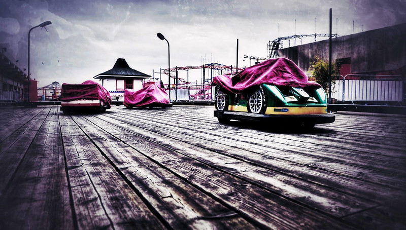
My thinking behind the image below is closed season at the seaside. This was captured on a visit to Clacton Pier today. Submitted quite early as I will have no other opportunities for photography for the rest of the week.

C&C welcome as always.


2 - Season by iain blake, on Flickr
 
Great idea, and a lovely shot. The processing really works for me.
 
Great idea, and a lovely shot. The processing really works for me.

Thanks Nick, I was going for a kind of grungy look, evrything looking a bit dark out of season.
 
Fine use of colours against the wooden floor and certainly in theme. Good example.
 
For me you nailed the grungy look you were going for really live the way you processed it
 
I really like this picture Iain - you've captured the desolation of the closed season and I like the processing of the colours.

Phil
 
On, yeah. Cracker. As soon as I saw it I liked it.

So usual crit could be too much empty FG, but the leading lines really draw my eye into the photograph...but more, for me, is the cracking detail and the weathered colour on the wood. Then I thought more detail in the sky....then I thought, no...that would have detracted from the wood and cars.

Great colour in the cars and the whole image really speaks 'off season'.

Crit. I really like not being able to offer any crit....but I can't offer any.

Good show.

Cheers.
 
For me you nailed the grungy look you were going for really live the way you processed it

Thanks Jon, glad you like it (y)

I really like this picture Iain - you've captured the desolation of the closed season and I like the processing of the colours.

Phil

Cheers Phil, I wanted to maintain the bright colours of the cars and not desaturate them too much whilst still having a dark desolate feel to the place.

On, yeah. Cracker. As soon as I saw it I liked it.

So usual crit could be too much empty FG, but the leading lines really draw my eye into the photograph...but more, for me, is the cracking detail and the weathered colour on the wood. Then I thought more detail in the sky....then I thought, no...that would have detracted from the wood and cars.

Great colour in the cars and the whole image really speaks 'off season'.

Crit. I really like not being able to offer any crit....but I can't offer any.

Good show.

Cheers.

Cheers Andy, there wasn't a lot of detail in the sky so made a conscious decision to have more foreground, which had loads of detail in the boards.
As mentioned to Phil above, the colour in the cars was something that had to stay, because of their vivid colours as contrast against the darker feel to the surroundings.

Quick entry this week Iain and a superb effort too. The detail in the flooring is amazing and really draws the eye towards the cars :clap:

Thanks Marsha, a quick submission was a must this week as I am away from tomorrow afternoon on a week long residential course for work.
 
Great 2nd shot Iain and interpretation of the theme..very desolate and lonely.. loving the lines and texture in the floor with vibrant car colours...(y)
 
Great 2nd shot Iain and interpretation of the theme..very desolate and lonely.. loving the lines and texture in the floor with vibrant car colours...(y)

Thanks Trace, I had a moment of inspiration this morning when the theme was announced and got myself down to sunny :cautious: Clacton-on-Sea. Clacton Pier did the rest :LOL:

Love the texture to this image, is it how you processed it or HDR?

Thanks Mark, the texture comes from HDR. The HDR was at 50% strength, then processed it in photoshop.
 
Hi, Iain, I had another look and wondered what your Season would look like with a bit of a grungy/textured feel so I ran it through Snapseed on my iPad.

It gave it a real Silent Hill feel. I won't post any here unless you want, but will email you one for perusal, if you want.

Cheers.
 
Hi, Iain, I had another look and wondered what your Season would look like with a bit of a grungy/textured feel so I ran it through Snapseed on my iPad.

It gave it a real Silent Hill feel. I won't post any here unless you want, but will email you one for perusal, if you want.

Cheers.

Andy,
I don't mind at all if you post it in here, I'd be interested to see what you've come up with (y)
 
Hi Iain

All has been said. Very quick off the mark and an excellent idea, well executed.
A real sense of out -of-season to the shot so spot on theme.

Have a good week away.

Thanks Alan,
I had to be quick off the mark otherwise I would be playing catch up so early in the year :LOL:
Cheers (y)

Here you go. My edit may have removed some of the Seasonal feeling, but I really wanted to see what it looked like with a Silent Hill feel.

Cheers.


Not mine...Iains photograph by andysheader (Posiview), on Flickr

I like that Andy, cheers (y)
Is that a texture overlay thats been applied?
It certainly has the silent hill feel to it.
 
Yeah, used Snapseed, cheap and cheerful :D

Cheers.

I will need to look into that Andy. I have just acquired an ipad from my daughter who is off to Australia for a year or two and didnt want to take her ipad. :LOL:
 
I like the processing, it definitely livens up the picture. Good use of lead in lines too.
 
Yet again an excellent submission the floor is excellent and it does have that out of season feeling only a funfair can have :clap:
 
Like the way the colours, lines, background draw you into picture.
 
like your POV, great processing.. really brings out the textures and the colours pop..
 
Back
Top