Chloe

Messages
6,502
Name
Peter
Edit My Images
Yes
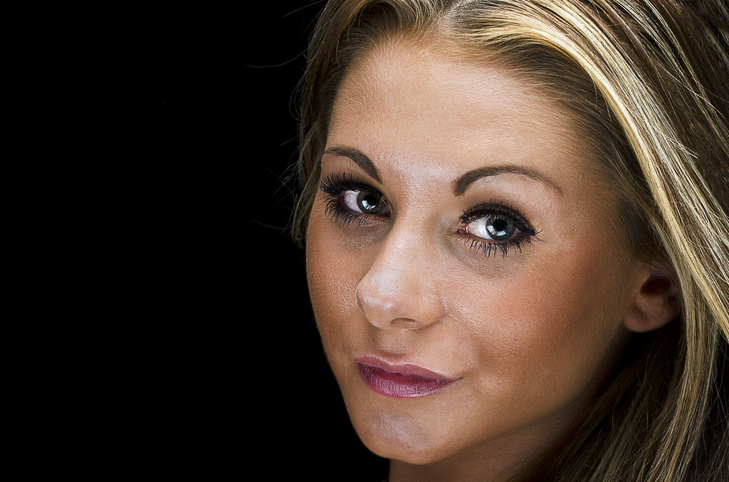
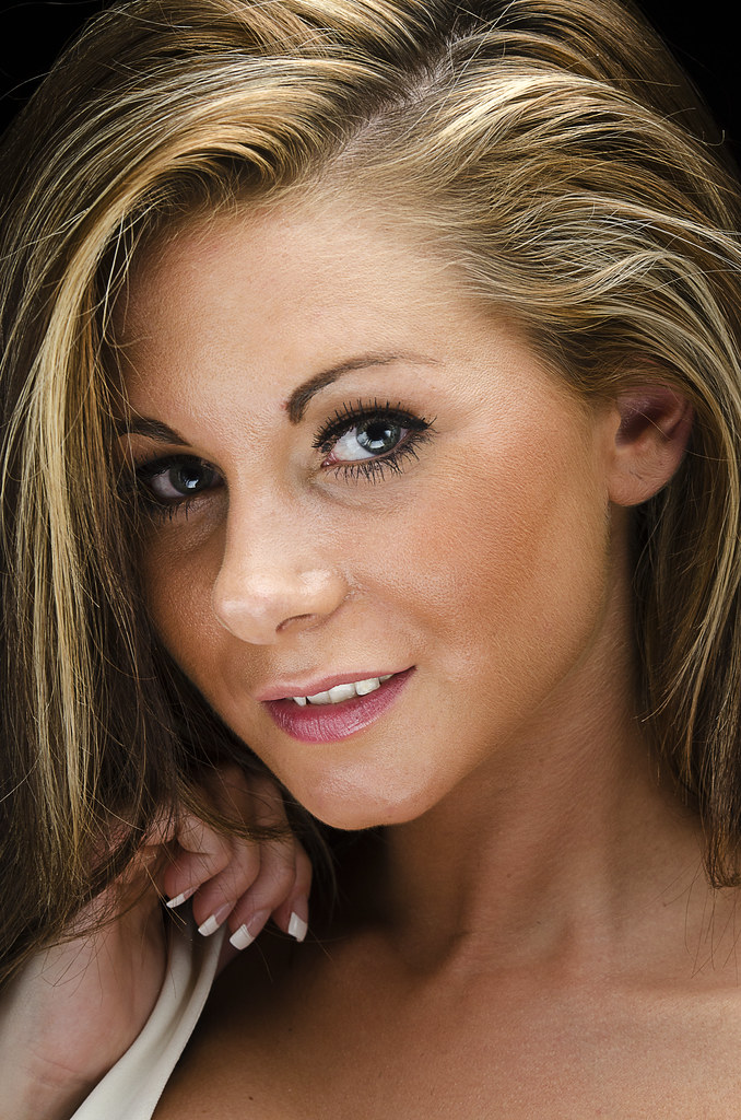
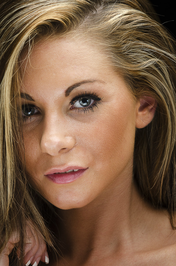
These were taken on a lights night at the local camera club. The model, Chloe, was brought down by the resident professional as were the lights. As I've said on previous threads I'm still learning the art of model/studio shots. I've kept away from the rather dodgy skin softening editing in my last thread but any C&C would be welcomed. Apologies for putting eight shots up but views on what works better and why would also be appreciated.

#1
Chloe-1 by Delta Skies, on Flickr
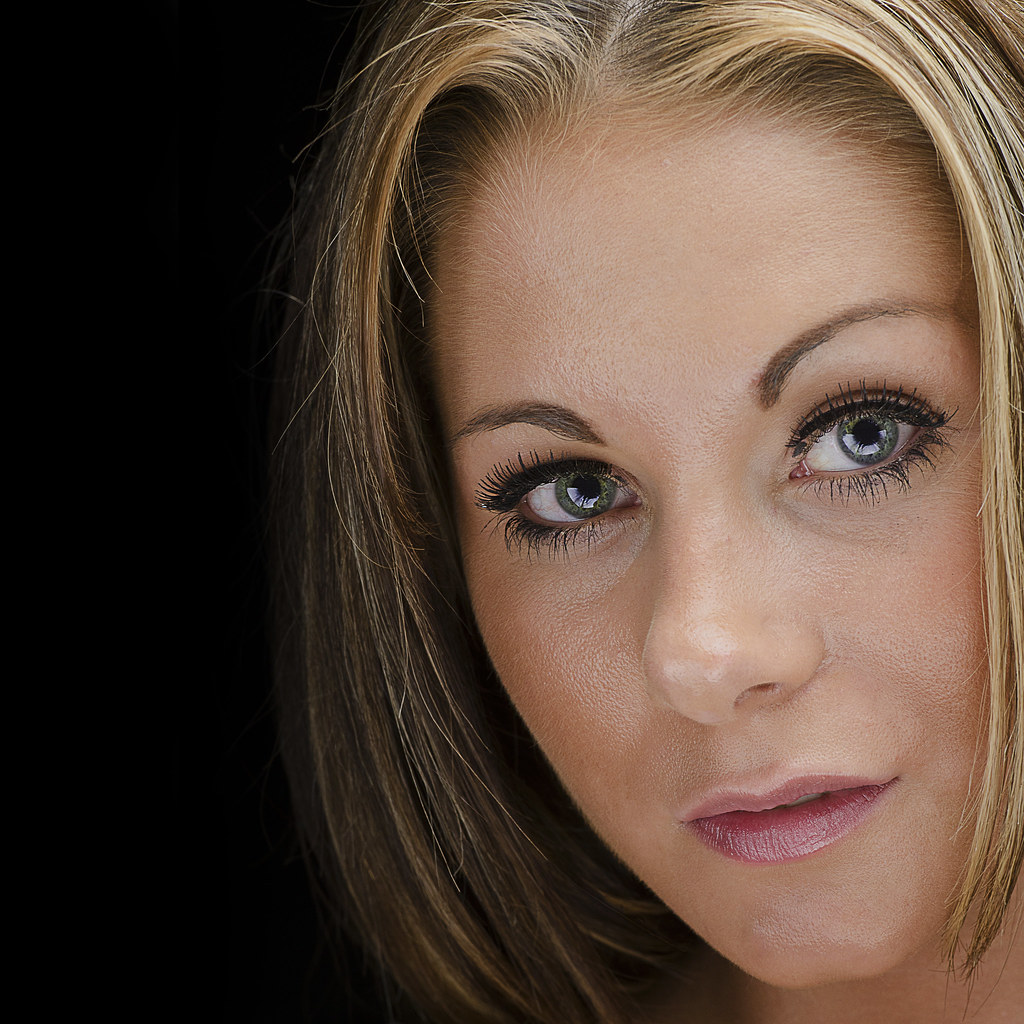
#2
Chloe-2 by Delta Skies, on Flickr
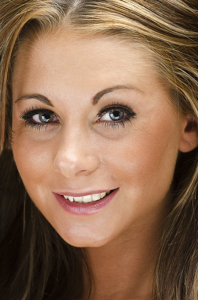
#3
Chloe-3 by Delta Skies, on Flickr
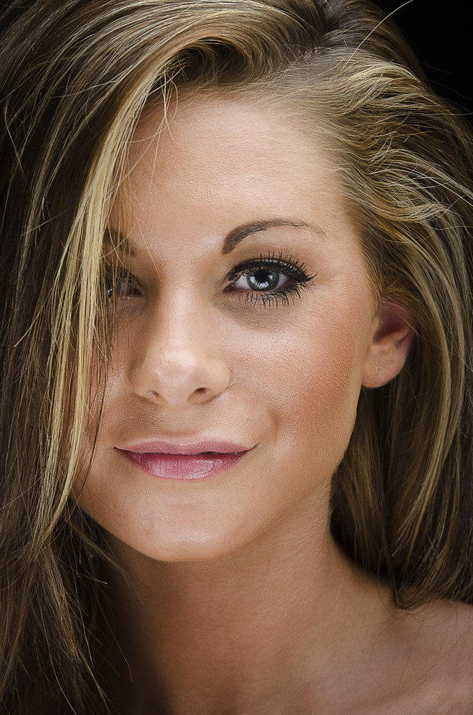
#4
Chloe-4 by Delta Skies, on Flickr

#5
Chloe-5 by Delta Skies, on Flickr

#6
Chloe-6 by Delta Skies, on Flickr

#7
Chloe-7 by Delta Skies, on Flickr

#8
Chloe-8 by Delta Skies, on Flickr
 
Last edited:
In terms of poses, I like them all. But...

..a number of them show reflections/hot spots off the lights, in particular 1-4, but they all seem to have it. This could have been a function of the make-up used by the model, though. I think something more matt would have helped.

Can't comment on the technical aspects of the actual lighting set-up as you haven't said what you used and how the model was lit. I seem to remember there's an on-line resource that allows you to create a plan of lighting arrangements that might be useful, but I can't remember the web-site link.
 
Last edited:
I'm not expert at all in portrait but these are my feeling about the picture. It look to me that her hair looks really good but her skin looks really too post-processed and it look like an orange peel.
 
Nice set #3 is the pick of the bunch for me :)
Thanks Steve. I concur about #3.

In terms of poses, I like them all. But...

..a number of them show reflections/hot spots off the lights, in particular 1-4, but they all seem to have it. This could have been a function of the make-up used by the model, though. I think something more matt would have helped.

Can't comment on the technical aspects of the actual lighting set-up as you haven't said what you used and how the model was lit. I seem to remember there's an on-line resource that allows you to create a plan of lighting arrangements that might be useful, but I can't remember the web-site link.
Thanks John. These lights nights don't have a MUA come along so the model usually will have done the make up herself. In terms of the light setup I have to say I can't remember. I'm guily of only just having got around to editing these after taking them back in September last year :whistle: I'll do a google for the site you mention.

I'm not expert at all in portrait but these are my feeling about the picture. It look to me that her hair looks really good but her skin looks really too post-processed and it look like an orange peel.
Thanks Thomas. I've not changed the WB in PP and to be fair (after my last thread) kept away from playing with the skin other than spot healing/cloning out some blemishes. #1 definitely does look like I have though :thinking:
 
couldnt pick one from the panel...
but i see on them all...shiny ness on the facial preparation...
how do you feel about that
oh go one then i did like best no 1 for the intensity of approach and the pleasant and non coy
best of luck
cheers
geof
 
Hi

the one unsettling thing for me is the almost smirk she has with her slightly wonky top lip, it should be easy to fix in PS though.

Also biting sharp images flatter no one these need some soft of more gentle approach both in lighting and make-up, again all fixable.

Paul
 
Why is she lit from below? There are shadows above her mouth, and above her cheeks, making the area around her eyes darker. You can see this on shot 1,shot 5, and shot 8 most, but they all suffer from it. It's not really flattering her at all. The huge catch light at the bottom of the eye makes me think this is a reflector used a little over zealously.
 
Last edited:
I agree with all the comments above Peter, but you had to work with the model and how she turned up. Yes, the make up is shiny but you could hardly do anything about that at the time.

Looks to me like a silver reflector was used from below? Does look a bit Adams Family. Was it lit with a flash too?

#3 is my pick from the bunch. :)
 
couldnt pick one from the panel...
but i see on them all...shiny ness on the facial preparation...
how do you feel about that
oh go one then i did like best no 1 for the intensity of approach and the pleasant and non coy
best of luck
cheers
geof
Thanks for the comments Geof.

Hi

the one unsettling thing for me is the almost smirk she has with her slightly wonky top lip, it should be easy to fix in PS though.

Also biting sharp images flatter no one these need some soft of more gentle approach both in lighting and make-up, again all fixable.

Paul
Thanks Paul. Not sure I want to change the "smirk". That's how she was. If a commercial shoot for a paying client then maybe. I stayed away from softening these on purpose but I know what you are saying about this.

Why is she lit from below? There are shadows above her mouth, and above her cheeks, making the area around her eyes darker. You can see this on shot 1,shot 5, and shot 8 most, but they all suffer from it. It's not really flattering her at all. The huge catch light at the bottom of the eye makes me think this is a reflector used a little over zealously.
Thanks for the feedback David. You've now reminded me that this was lit with a main light above/side and a Lastolite Triflector underneath that the club pro brought with him. Maybe it should have been a little further away to lower the power of the reflection?

I agree with all the comments above Peter, but you had to work with the model and how she turned up. Yes, the make up is shiny but you could hardly do anything about that at the time.

Looks to me like a silver reflector was used from below? Does look a bit Adams Family. Was it lit with a flash too?

#3 is my pick from the bunch. :)
Thanks David. Another vote for #3(y). See response above re: triflector.
 
Firstly what a stunning girl? - assuming I'm allowed to say that.
In general the shots make her skin look greasy/shiny. I'm no expert but knocking back the highlights in post processing might help that out?
In #1 I think the teeth just peaking through don't do her any favours.
#'s 3 & 7 are my picks though.
 
Hiya Peter... as you know, I don't really know what I'm talking about but I'll offer you my thoughts anyway :)

#1 lighting looks really odd. At least there's some lighting from higher above which helps fill in her eye sockets... maybe that the main lighting is from below (as @Pookeyhead said) and fill from above, which seems a bit weird to me? In some ways it almost looks like direct on camera flash but the catchlights show it's not...
#2 looks quite a bit underexposed and too contrasty to me. Has it been HDR'd as it has a quasi "medium-format" look about it for want of a better description? Apart from exposure/constrast, the direction of lighting seems to work a bit better here but the lighting of the skin texture is really not flattering
#3 best so far by a mile and I do like the framing
#4 cropped too tight at the left for me (IMO) and lighting has gone a bit funny again... more shadows in the eye sockets and not a fan of the reflections off the chin and nose
#5 the lighting doesn't flatter at all IMO and the right side of her face (left as we look at it) needs more - or far far less if you want that look
#6 I love the pose - she looks lovely and natural in this one but again the lighting still isn't quite working for me!
#7 & #8 seem to suffer a bit from lighting problems of #5 for me?

In all, I'd be tempted to knock down the clarity/contrast a chunk in these which might help with tempering the skin definition. You could always go to town with more comprehensive skin smoothing but as a quick edit it might help?

As you know, I really struggle with portrait lighting so I'm really not best placed to leave comment on your shots, but to my eyes these are what I'm seeing and liking/not liking. Hope you don't mind!
 
Firstly what a stunning girl? - assuming I'm allowed to say that.
In general the shots make her skin look greasy/shiny. I'm no expert but knocking back the highlights in post processing might help that out?
In #1 I think the teeth just peaking through don't do her any favours.
#'s 3 & 7 are my picks though.
Thanks for the comments Richard.

Hiya Peter... as you know, I don't really know what I'm talking about but I'll offer you my thoughts anyway :)

#1 lighting looks really odd. At least there's some lighting from higher above which helps fill in her eye sockets... maybe that the main lighting is from below (as @Pookeyhead said) and fill from above, which seems a bit weird to me? In some ways it almost looks like direct on camera flash but the catchlights show it's not...
#2 looks quite a bit underexposed and too contrasty to me. Has it been HDR'd as it has a quasi "medium-format" look about it for want of a better description? Apart from exposure/constrast, the direction of lighting seems to work a bit better here but the lighting of the skin texture is really not flattering
#3 best so far by a mile and I do like the framing
#4 cropped too tight at the left for me (IMO) and lighting has gone a bit funny again... more shadows in the eye sockets and not a fan of the reflections off the chin and nose
#5 the lighting doesn't flatter at all IMO and the right side of her face (left as we look at it) needs more - or far far less if you want that look
#6 I love the pose - she looks lovely and natural in this one but again the lighting still isn't quite working for me!
#7 & #8 seem to suffer a bit from lighting problems of #5 for me?

In all, I'd be tempted to knock down the clarity/contrast a chunk in these which might help with tempering the skin definition. You could always go to town with more comprehensive skin smoothing but as a quick edit it might help?

As you know, I really struggle with portrait lighting so I'm really not best placed to leave comment on your shots, but to my eyes these are what I'm seeing and liking/not liking. Hope you don't mind!
Wow. many thanks Paul for the extensive feedback. It's certainly appreciated.

I'm going to take the comments from everyone on board. Some fixes to do in PP but quite a few to address at the time of clicking the shutter. We're normally at the mercy of the pro who brings the lights and models as well as time - we usually only get a few minutes each. The last lights night ended up being a NEC photo show style free for all rather than us each going one by one. Not for me that one but maybe next time.
 
Back
Top