Critique Clevedon Pier - Long exposure (B&W)

Messages
147
Name
Nick
Edit My Images
Yes
It's been a while since I've posted on here; with a new baby arriving 4 months ago, and a house move, opportunities to get out with the camera have been limited of late.

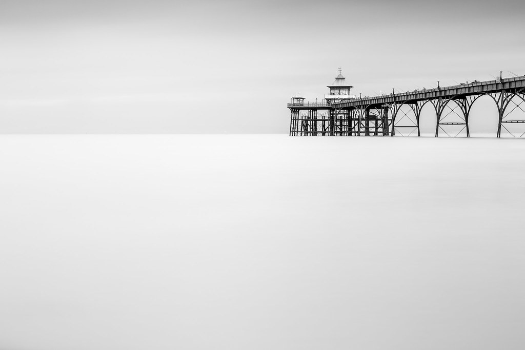
Clevedon Pier is a regular location for me; it is only 5 minutes from my house and tends to be my location of choice when I only have a small amount of time to pop out with the camera. This is something I've wanted to try for a while, but the conditions have never been quite right.

For anyone thinking of visiting Clevedon Pier in the near future, there is currently a large amount of scaffolding on part of the pier, where some building work is ongoing, so you can't include much more of the pier than I have in the image below.

Any comments or critique would be much appreciated.

Clevedon Pier 15.11.14-4-3.jpg by Nick Clarke Photography, on Flickr
 
Last edited:
Love this, really captured the beauty of the Victorian iron work. I visited clevedon many times as I had friends there. Many beers drunk in the Harp and the Salthouse and somewhere I have some shots of the pier and the salt pool.
 
Last edited:
I'm a sucker for these minimalist long exposure seascapes and this one is no exception. I do feel, however, that perhaps the pier is a little too high up in the frame here. I think it would improve the composition if the superstructure came into shot about half way up so there were roughly equal halves of sea and sky.
 
I'm a sucker for these minimalist long exposure seascapes and this one is no exception. I do feel, however, that perhaps the pier is a little too high up in the frame here. I think it would improve the composition if the superstructure came into shot about half way up so there were roughly equal halves of sea and sky.

Many thanks for taking the time to comment. I'm inclined to agree with your comments; I'm also not 100% happy with the composition. Composition was compromised due to the scaffolding on a large part of the pier and the fact that I wanted to include a large amount of milky water. In hindsight, whilst I think I've got the feel I was after, the pier is too high and right in the frame.
 
Too much dead space down below I am afraid. I'd have gone in a light tighter, personally. Other than that, its a fine image

Have to disagree with Stephen with regards to the "dead space", negative space as it's often referred, comment. I think that this is an excellent fine art image. The distribution of negative space and positive space, the pier, is excellent.

My only negative comment would be the watermark which detracts from the photograph. Personally I would leave the watermarks off photographs but that's only personal preference.

Very kind of you to comment so possitively, Michael. A 'fine art' style image, with 'dead space' was what I was after, but I do tend to feel, the more I look at the image, the composition isn't 100% right. You're certainly right about watermarks; I should probably just change my settings and get rid of them!

It is great to have such a mix of comments on this image!
 
Perhaps if you brought the composition in from the bottom left corner on the diagonal about two inches that might work better?
 
Have to disagree with Stephen with regards to the "dead space", negative space as it's often referred, comment. I think that this is an excellent fine art image. The distribution of negative space and positive space, the pier, is excellent.

My only negative comment would be the watermark which detracts from the photograph. Personally I would leave the watermarks off photographs but that's only personal preference.
agreed
 
Perhaps if you brought the composition in from the bottom left corner on the diagonal about two inches that might work better?

That is probably what the composition needs. The more I look at it, the more I feel the pier is a little too high and right in the frame. I'll have a play tonight and will post a different crop (or two!). Cheers
 
Actually a letter box is a fine suggestion for this. Whilst room to breathe is good in any composition, too much of it and you can lose the subject matter. Had there been some rock and flowing water over this in the front I'd be happy with the composition but a 16:9 or 2:1 could really work here.
 
Actually a letter box is a fine suggestion for this. Whilst room to breathe is good in any composition, too much of it and you can lose the subject matter. Had there been some rock and flowing water over this in the front I'd be happy with the composition but a 16:9 or 2:1 could really work here.

Thanks Steve.

Some great feedback from the forum on this images. Just what I was after.
 
  • Like
Reactions: ST4
Last edited:
  • Like
Reactions: ST4
I do like photographers who really go for it, --What do I think of it? what the hell dose that matter, I'll happy take what you have offered and roll with it, very creative work Nick,

Geoff
 
Those crops are excellent, wonderful work.
 
Much improved in my humble opinion. Prefer #2 crop - space without overkill and I do seem to have a 'thing' about the 16:9 configuration.
 
Prefer the pano definitely. I have a wall in my new office that needs filling and this is exactly what I have planned. Hoping the weather is ok over the festive period to get over and have a go.
 
In order Crop #2, original, Crop #1.

Either way I love all three of them. I like the simplistic approach with the smoothed out water and sky. The mono conversion has also suited the subject well.
 
I like them all but the pano crop looks best to me. With the original shot I feel there is nothing to hold or direct my eye in the water area. You might try an exposure gradient that darkens the water at the bottom of the frame and very gently transitions to no effect about half way to the horizon. This might help direct the eye back to the horizon & pier.
 
Back
Top