Critique Could I please have some feedback on these?

Messages
3,307
Name
Nick
Edit My Images
Yes
I covered an evening reception for some friends of ours at the weekend, they got married in barbados but wanted some photos from near home as well.
I'd be interested to know what you think of them, I noticed afterwards that i'd let the horizon go straight through their heads on a couple of them.


Thanks very much

Nick
 
I'm not a professional photographer and I'm a newb to posing - so take with a pinch of salt :)

In general I quite like them, but if I were to pick some things that could be used as constructive criticism - then maybe these things..

1 - The background seems a bit expansive and lacks interest for me. The more I look at the hands, the more awkward it seems and might have been better if they were lightly touching fingers or something. I like their smiles.
2 - Not so sure about the groom's expression, otherwise I think I might prefer this one out of the set.
3 - Not a fan of the location, comes across as a carpark
4 - The background is distracting, particularly on the right "club champion"

I almost deleted my post :D I hope it can be useful.
 
Well I'm no expert on posed wedding work either, but very much FWIW ...

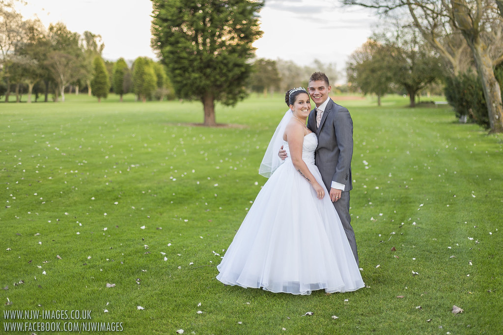
#1 Not a lot wrong with it as it stands, IMO, but I always think that when the couple are posed facing like this, they really need to be central in the frame (or as near as). Maybe crop it in from the LHS until it's square and see what you think?

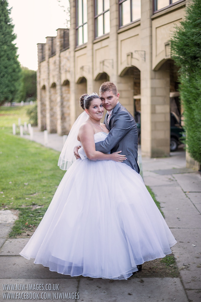
#2 I'm not struck with the setting, particularly with that car being visible, but I reckon the biggest improvement would have come from getting him to rotate to his left somewhat until his shoulderline was at the same sort of angle to you as hers is. In other words, so that if you looked down on them, their shoulders would form an arrowhead pointing away from you. He wouldn't then look so awkward.

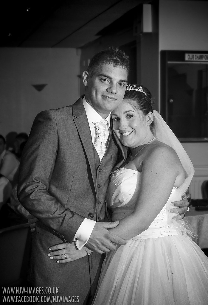
#3 Expressions are great but it looks a bit carpark to me too. What bugs me about this shot though is actually his shirt sleeve. Theoretically you want about 2cm of cuff showing at the most, but none is better than too much AFAIC. Well done you though for avoiding the other pitfall with the "round her waist" shot i.e. only part of the groom's hand showing so it looks like a claw. This is just right.

#4 What Dan. Spend a bit of time cloning out some of that crap behind them and it'll be a different picture ;)

And yes I am being picky, but I hope that helps a bit for the next time!
 
The first one is the best IMHO, the only thing is they don't seem to know what to do with their hands.

In the others he looks a little awkward, this is more evident in the second photo, probably due to the height difference (he appears to be leaning over her), although in the first one they are spot on.
 
Back
Top