

- Messages
- 1,156
- Name
- Chris
- Edit My Images
- No
On a recent holiday to see the Gormley statues we included a short walk along the beach path adjacent to the beach with the statues. I took this picture with the intention of it being B&W but decided to try it in colour too - not something I have been doing so I want to keep/get my hand in.
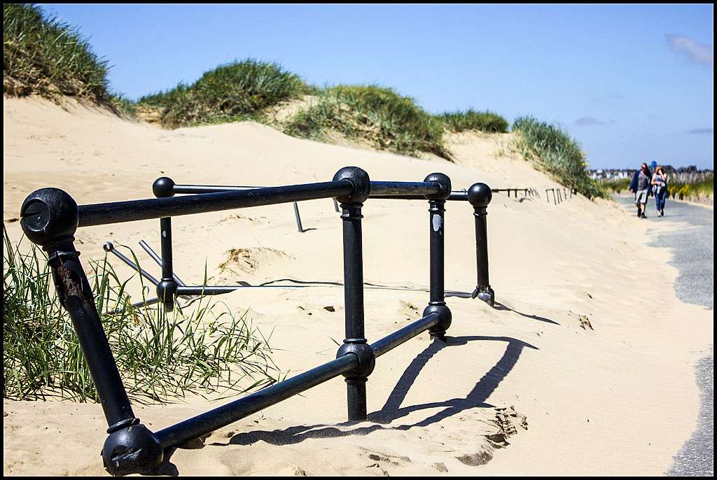
We didn't actually get very far because there was a lot of sand blowing about - just about reflected in the sand over the path and the woman having here hand to her face.
One request for help please ..... I haven't done much colour work recently and I couldn't work out (in PSE 11) how to enhance the marks in the sand in line with the couple - ?any ideas? (+any constructive C&C welcomed as always)