

- Messages
- 2,619
- Name
- Craig
- Edit My Images
- No
Always messing with ideas, and different processing and editing ideas. So, simple question, does this work, or not?
"Straight" edit:
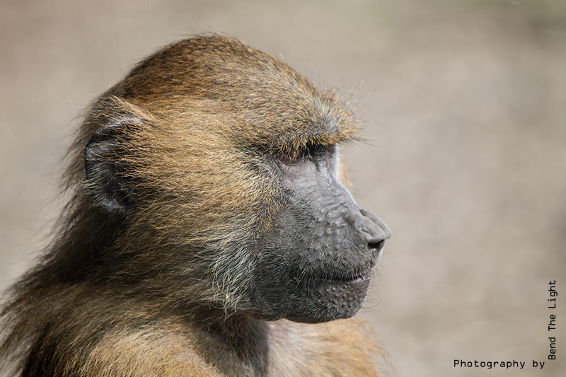 23Apr2014 Baboon by Bend The Light, on Flickr
"Definition" edit:
 23Apr2014 Baboon and definition by Bend The Light, on Flickr
Thanks.
"Straight" edit:
23Apr2014 Baboon by Bend The Light, on Flickr"Definition" edit:
23Apr2014 Baboon and definition by Bend The Light, on FlickrThanks.
") I think this does work and both look good! But I think the original looks better. I think the second looks more like a desktop wallpaper or something. Hope this helps
I think this does work and both look good! But I think the original looks better. I think the second looks more like a desktop wallpaper or something. Hope this helps 