Denver Street Photography

Messages
135
Name
Scott
Edit My Images
No
Got these on Sunday at the the annual 420 meet in Denver (how can I say....it was a sweet atmosphere). I met up with a buddy to shoot for the first time together, and didn't think I got a single shot at the time). Will post some more as and when they are processed. All comments appreciated.

13997882953_04df811e38.jpg


13954787586_e0760af09b.jpg


13978317434_7850b34d55.jpg


13974701891_cfdc09aa87.jpg


13974691192_c454b96c4f.jpg


13974691382_e91ff47a8a.jpg


13974691442_b26648bc9a.jpg


13977889255_83068c5b86.jpg
 
I'd have liked several of these but for a distraction in each.

#1 Pity about the striped sign across the subject
#3 Pity about the other people in the shot as I like the idea of the reflection
#4 Pity about the OOF blob centre left as I like the guy in the mirror watching you
#7 Pity about the lass and the hoop thing coming across the dude
 
O.K, thanks for you reply. I strongly disagree with all you have said, however I greatly respect others opinions, and I appreciate you taking the time to reply.

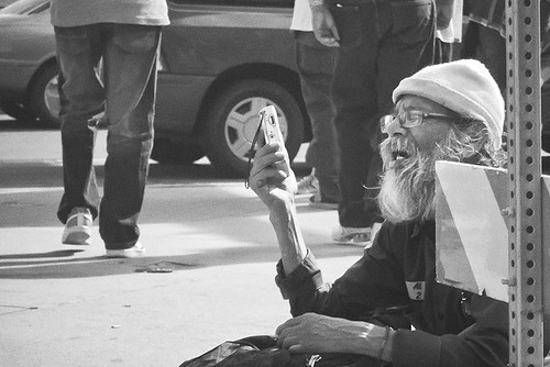
1. In this case its locks attention onto the subject. It has a nice continuing line drawing up to the other guys hand, so a comparison can be considered.
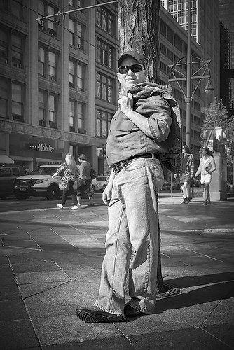
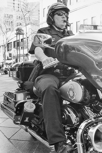
3. Having a guy there fills a void nicely, and also complements the idea, which is dot dot dot, the copper is thinking like a copper, i.e about the city and it's inhabitants.
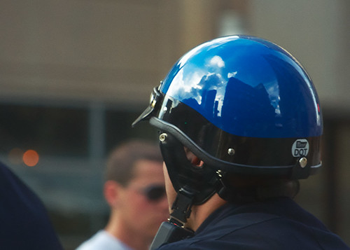
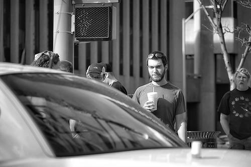
4. Ideally, you are correct, but that was a light attachment to the police car. I tried to incorporate it into a rule of thirds for composition. It also favours a direction of travel.
7. Maybe, but again, falls into the rule of thirds, so just a natural line leading to subject.

Thanks for challenging my ideas-that will always be a healthy thing. :)
 
Last edited:
For me #2 is the only one that has a strong subject.

The rest don't say anything to me. They just come across as snapshots. I have to agree with the above comment about there being too much clutter in a lot of them.

I see what you've said about leading lines and rule of thirds and whatnot but, take 1, for example...the sign takes away more compositionally than it adds in my opinion. Yeah, I kind of see how it's working as a "line" but it also obscures a large part of the obvious focus of attention, which is the subject's face. The theme of "contrasting hands" isn't strong enough to overcome this (there's no clear contrast for a start) and it just comes across (to me) as a mistake in composition.
 
Last edited:
O.K, fair do's. I'll take these ideas on-board for my next attempt. It is always fun to push oneself forward, trying to improve. Thanks both for your thoughtful comments. Street photography is very fun when you start to feel comfortable, but man, it is definitely challenging.

Here is the last of the set that I thought worth editing (apart from a couple of city building scenes http://www.talkphotography.co.uk/threads/denver-skyline.539576/ ).

13985250616_228e8d79fa.jpg
 
I like that last one.
Could do with maybe a little more contrast, but that's a minor point.
 
Back
Top