Critique Feedback on B&W images

Messages
1,370
Edit My Images
Yes
Hi,

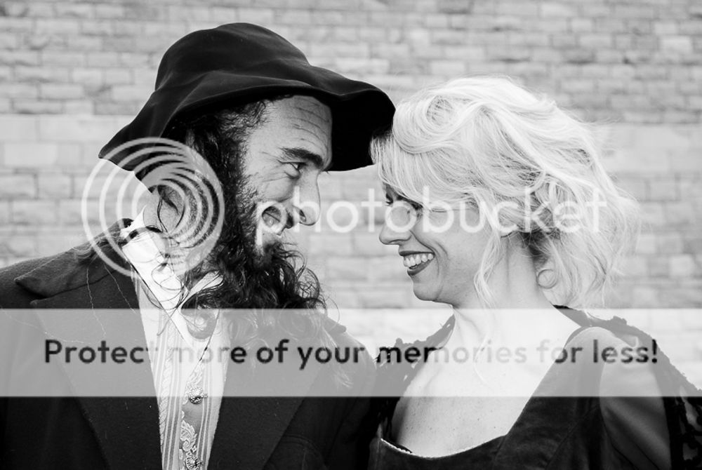
I did a small shoot y/day for an amdram society who've asked for the images to be B&W. It's not an area i have much experience in (B&W conversion) so i was after some feedback please. These were shot in raw and converted in lightroom, I'm always unsure how dark to take B&W images for maximum effect.


I have'nt posted images on herefor a while - what size is the max these days ?

Thanks in advance,
Mike.
 
Thanks for the feedback Rob and agree that Sepia is well worth a try, i'll run that idea past the client.

Many thanks
Mike.
 
Yes - look fit for purpose to me.

Depending on the software you have - and in addition to sepia - you could try vignetting the corners and adding border that look a bit frayed - eg I think the silver fx part of the Nik collection has something like that.

BY THE WAY.... you have managed to duplicate you post so you might want to delete the other one before somebody comments in it
 
Last edited:
They are good "Press" type of pictures and do what they need to do but I would have liked to see the kids play acting a bit a, also maybe up the contrast a tad?

Geoff
 
Yep more contrast! A bit too much midtone for my tastes.
 
Last edited:
Yep more contrast! A bit to much midtone for my tastes.
I can't agree with that, there are plenty of deep blacks, any deeper and they will be blocked, there is detail in the whites, good on the white shirts, push the whites any further and they will start to blow out. Mid-tones are essential for skin, the clothing, the backdrops, and certainly for this kind of subject. These are well exposed shots and good conversions. The overall lighting perhaps lacks drama, probably by necessity, but ramping up the contrast isn't going to create it.
 
  • Like
Reactions: ST4
I can't agree with that, there are plenty of deep blacks, any deeper and they will be blocked, there is detail in the whites, good on the white shirts, push the whites any further and they will start to blow out. Mid-tones are essential for skin, the clothing, the backdrops, and certainly for this kind of subject. These are well exposed shots and good conversions. The overall lighting perhaps lacks drama, probably by necessity, but ramping up the contrast isn't going to create it.
A simple curves adjustment would do it. No need to clip the whites or blacks any further, although I personally tend to clip the blacks a little. Here's a couple of quick edits to show what I mean:

image1_zps51468d6b.jpg


One thing I did notice whilst editing is the background seems to have very similar light and tone to the faces (particularly in the first shot), so if I were to take this further I would probably try masking it and dropping the exposure a bit. I guess it is red brick work in the first one, so I doubt you will be able to separate them by adjusting the red filter during the conversion process (although it would be worth a try).

I agree the lighting could have a little more oomph. Some careful dodging and burning might help here, but obviously better to have been addressed during the shoot.
 
Last edited:
@horrocks yeah you are right. Flicking between them I prefer the originals too now. I just think they need something to lift them a bit if that makes sense.
 
I think the originals are good. Though if I was to say any needed a bit of contrast it would be the 2nd image. But then maybe not. Possibly a touch off the highlights. ?
 
Back
Top