First Dabble at Selective Colouring

Sorry but it does nothing for me I'm afraid. The image looks flat and lifeless. The only reason an image like this generally looks good, is the abundance of colour. In this case, all that life is now just shades of grey.
Selective colouring can work in some instances, but generally where you have a particular focal point to emphasize. I personally am not a fan but some people love it.
 
I sort of feel the opposite way to Wippers and I actually quite like this.

I'd have preferred you to have used a black surface underneath because the bits of white showing through on the RHS are a bit irritating and I think that it could do with a bit more contrast to bring the B&W to life . . . but maybe because my eyes are expecting to see an abundance of colour that isn't there, I'm somehow drawn to this. I certainly think that there are enough different grey tones there to add interest.
Not keen on the orange though TBH - Do M&Ms actually come in that colour or is it a by-product of your processing? I think I'd prefer it if they were made a nice vibrant red.
 
I like it.

Sinister undertones.

I could easily see this in a pharmacy warning about the dangers of unsecured medicines.
 
I struggled not to eat these........ not until after I'd had a little play with them first.

Please let me know what you think

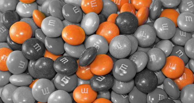
M&M by pthornley1981, on Flickr

I like the idea Paul - and had a little play on CS5, hope you dont mind

added a layer - slight touch of hdr- upped the contrast - adjusted the saturation to get the reds and finally a small black border

7393970424_6bd458445f_z.jpg


Les (y)
 
I find selective colour to be tacky as hell I'm afraid and it impresses lay people less and less. Technically you did a fine job though:)
 
added a layer - slight touch of hdr-

A slight touch of what, Les?

.. maybe you mean you ran it through a tonemapping process?
 
Back
Top