Fragrant tea...

Messages
700
Name
Darren
Edit My Images
No
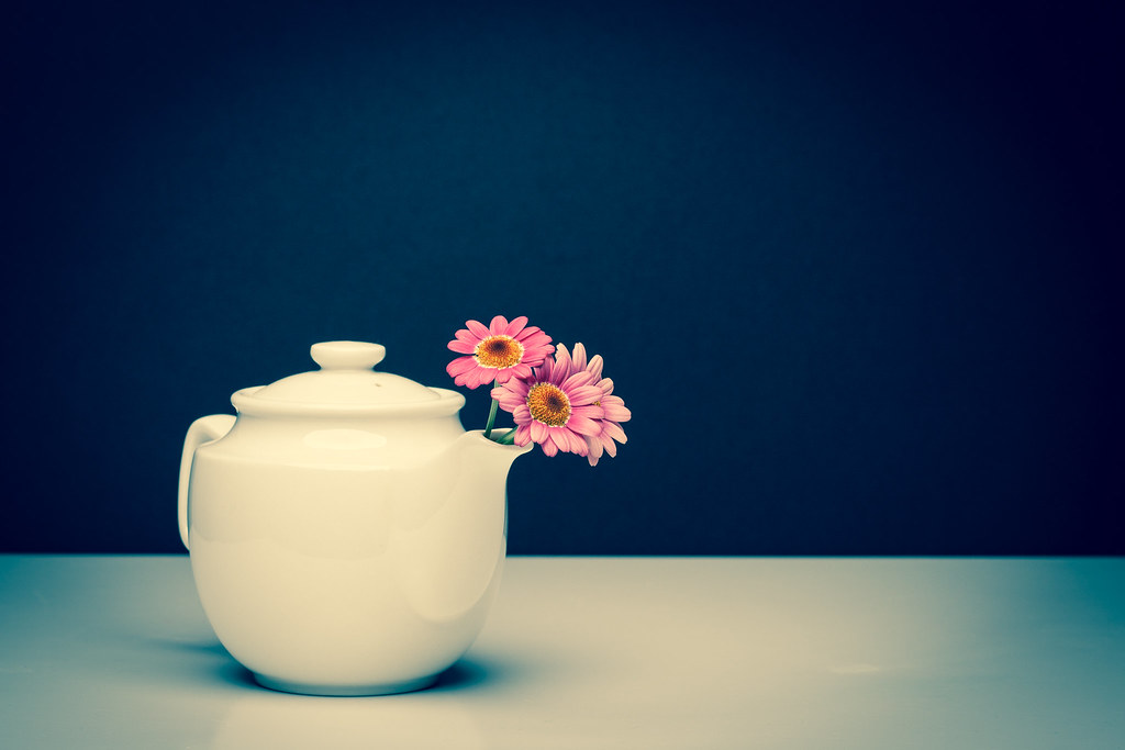
Just processed this one, probably a bit of a marmite shot, but all c&c welcome as usual ;)


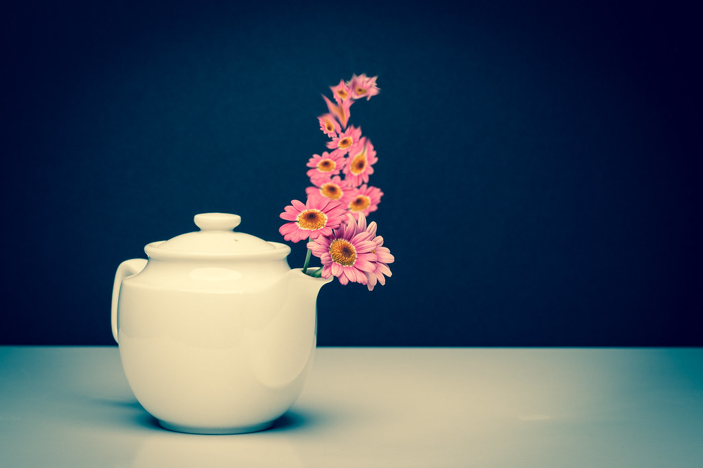
...fragrant tea by BubbleDouble, on Flickr

Darren
 
Works for me love the compersition and Lighting well done

Cheers, much appreciated (y)

lovely shot although i feel the text is in slightly the wrong place. does it really need the text?

Six of one, half a dozen of another. I was (and still am) in two minds whether to have text or not, it's one of those marmite things. Out of interest, where would you position the text? Looking at it again, I was thinking maybe a bit lower, near the horizon line...?


Thank you (y)

Darren
 
Excellent, simple and effective.

Andy
 
i like it with the text in seems to even it up if that makes sense , nice work
 
I do like this, and I think the processing is quite good, the only thing I would say is I do agree with the comments about the text not really being necessary. The image is strong enough in its own right.
 
I do like this, and I think the processing is quite good, the only thing I would say is I do agree with the comments about the text not really being necessary. The image is strong enough in its own right.

I like this a lot (y)
the simplicity adds to the overall feel to the shot.

Thank you both, much appreciated (y)

Darren
 
Excellent work, Darren. Lovely colour tones and top comp. Personally I like the text but, as you say, its a subjective matter. (y)
 
Excellent work, Darren. Lovely colour tones and top comp. Personally I like the text but, as you say, its a subjective matter. (y)

Thank you Roger, very much appreciated.

Darren
 
I really like that (y) it's simple but very effective (y) but I don't think that it needs the text :(

Matt
MWHCVT

Thanks Matt and everyone else for the comments. Here's the version without the text...


IMG_7588.jpg by BubbleDouble, on Flickr

Darren
 
I don't like Martmite...but I DO like this shot.

For what it's worth I don't think it needs the text as the image is pretty self-explanatory.

I would make a great print for a cafe / bistro.
 
Agree with the masses. Really like this. Well done. Didn't mind it with the text but think, as others have said, it is very good without.
 
That looks a lot better (y)

I don't like Martmite...but I DO like this shot.

For what it's worth I don't think it needs the text as the image is pretty self-explanatory.

I would make a great print for a cafe / bistro.

Agree with the masses. Really like this. Well done. Didn't mind it with the text but think, as others have said, it is very good without.

Thanks everyone, your comments are very much appreciated and I've now come to agree with the masses that the text isn't necessary (y)

Prefer it without the text as I could not see the connection - now if you had used roses or sweet peas or something with a scent ...............................
Do you have a matching cup - if so some black tea with a few floating petals?

Most people seem to have got the connection, even those these particular flowers aren't necessarily the most fragrant, or have any real-life connection with tea...after all it's a 'creative' shot and as such, it isn't bound by any 'rules'. Alas, I don't have a matching cup, but can see where you're going....maybe next time ;)

Darren
 
Much prefer without text, and prefer the blue version, the pink one is almost blending the teapot into the background.
Looking at the slight shadow cast in the blue version, am i right in thinking you used an overhead light? I love the use of highlight areas in images to draw the eye and i have a way of doing it with reflective surfaces but a bit puzzled by this one

Thanks for the comments Simon.

Yes, it was an overhead light. It was actually a Lencarta Ultrapro 300 studio flash, but for the life of me I can't remember which modifier i was using. It was either my 22" socked beauty dish, or my 60x90cm profold softbox. I'll have another check of my notes tonight, I'm sure I jotted it down somewhere.

Darren
 
The reason i think i like the blue version so much is i think, my love of the image by Bob Carlos Clarke. Its called duty kills, has similar tonal values.
Was the first thing that came to mind seeing your shot for some reason.
Thanks for the lighting info! Top man
 
The reason i think i like the blue version so much is i think, my love of the image by Bob Carlos Clarke. Its called duty kills, has similar tonal values.
Was the first thing that came to mind seeing your shot for some reason.
Thanks for the lighting info! Top man

Thanks! I had to look that one up. Interesting photo, yet quite disturbing, at least that's my initial thoughts. And to confirm, it was a socked 22" beauty dish I used for these shots.

I really like the second one on this page, I usually try and say why something appeals to me or not but in this instance it just "does" :)

If it works for you, then who needs a reason (y)

Darren
 
Back
Top