Bloody hell Bill,I was really only after in general M8

As you mention in this thread and has been discussed a thousand times before on TP.Peoples eyes are different,as are monitors, we process from memory when we get home,we try to recall what the light was light at that time,imo no matter how good a camera and lens you have there is nothing to prove that it has captured that moment exactly how it was in real life.Some may well edit there pics using reference pictures from whatever source for all I know,does not mean to say that those are correct either,but what we should accept is if it is close enough then it is good enough. If the colours in a shot look close enough to my eye then I am happy to comment accordingly,however it is only when you get a real colour cast or that the colours are way out that I will say something with regards to that.Some interesting thoughts from you anyhow Bill, did a quick edit which to my eye on my screen is more pleasing,however I have in the past been accused of my images being too dark,you will never win as it is all too subjective.

Both images are equally good Rich, the second probably appeals to me more …… but to others maybe the first.
I agree with you Rich though about what we see, what others see, and what we see etc., on the screen
Blacks are really difficult to get true as I reckon that in many cases they are not true black in many a light
As you say I can go on a bit …… maybe it comes from the way that I was trained, (not in photography, but in finance)
Here's a Bird that most of the time looks Black and White ……….. and the cluttered background may not appeal to some ……. but I think that it is really appropriate
Not enough headroom and blown white.
Sometimes, there is a tendency not "to see the wood from the trees" in bird photography as we aim for technical perfection
That's another subject that is interesting ……. the types of backgrounds that we should aim for ……… lots prefer the smooth, blended totally OOF bg as in your Greenfinch image
I was tring to get us to talk about all these issues in this thread, particularly as when crit is posted it is always interesting to know why things are said and much of it is given and taken in the wrong way
If you look at the "people" images produced by this guy
http://www.danwintersphoto.com/#/P E O P L E/O V E R V I E W/36/thumbs
it would be good to get bird images as "different" as these are from normal people portraits - OK I know it may be impossible from a number of aspects, (not least that they are all "posed") …….. but it would be good to explore and start posting more different types of bird images, whilst maintaining alongside the usual high standard of "record shots" …. I tried to "steer" this a little by posting a few of my "art" images which most thought were crap - but that was not the point of the postings, the point was to try something different ……. just thinking aloud really, before my next (longish) holiday in January/Feb ……when I will have plenty of time to observe nature
But, as you said, there is no correct answer as there are so many variables and there seems to be "lots going on" in this image, but I quite like the branches and the way they point out from behind the bird


 Greenfinch
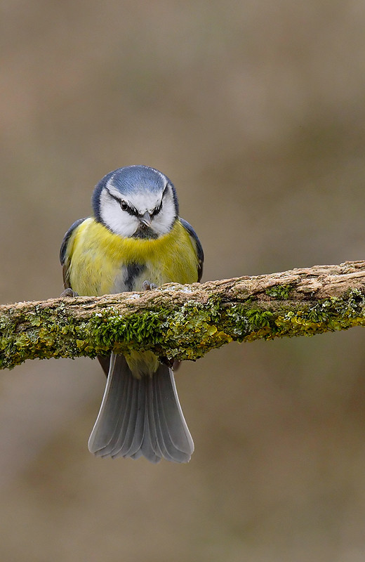 Blue tit


