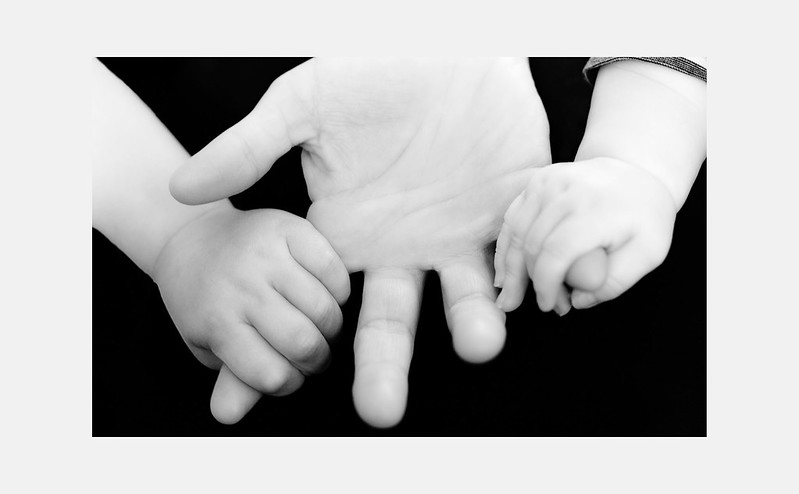
Think the highlights/whites need pulling back a little to recovery a little more detail in the hands. Think this image really needs high contrast effect imho.
Lovely idea would also consider cloning out the sleeve in the top right.
I will have to play about in photoshop and see if I can do something about the detail etc and try high contrast
Oh, its a female hand lol (one that has to wash a lot of pots and dirty clothes so not as girly looking )
This was literally just a just for fun shot. I put a black sheet over my legs to create the black background. And the light was just daylight shining through the window which explains why the right hand was loosing detail as that's where the light was shining on.
And then I fixed some things here and there in photoshop
Didn't think it would work as both kids are big wrigglers but this was a lucky shot I guess
Interesting, I tried something similar a while back and I really struggled to get the black background black while exposing for the hands. I will have to try and have another play sometime, thanks.
This site uses cookies to help personalise content, tailor your experience and to keep you logged in if you register.
By continuing to use this site, you are consenting to our use of cookies.

 422-1b-flickr by Nati81, on Flickr
")
 422-1c-flickr