Haven't posted one in a while so here's a recent wedding

Messages
3,650
Name
Andy
Edit My Images
No
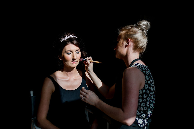
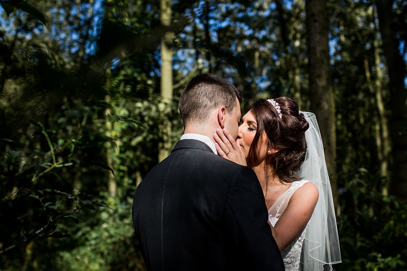
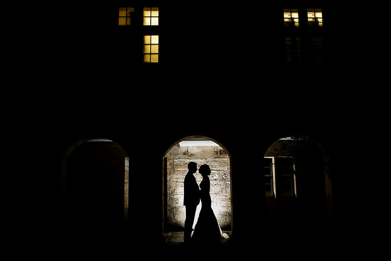
I have been playing around with light a lot more recently and so thought this wedding would be a good one to get some feedback on. Ideally feedback on the full set which is below the 3 pics :) Blog post is pretty long so won't be to everyone's taste... I'm happy with how many images I have blogged for this though, think I've come to terms with how I blog now and to some it'll be over blogged, but hey ho :D

15692090177_ecd1d03f48_c.jpg


15690538810" title="Laura & Jonathan&


15690346288_928a87060e_c.jpg


15690538810_f5e531c7c6_c.jpg


Full blog post here - http://www.andyhudsonphotography.co.uk/portfolio-item/laura-jonathan-matfen-hall/
 
Last edited:
Can't look at the full set as I'm on the train, with poor connection.

1 is really nice. I'd be tempted just to use a dark brush to hide the chair, but it's not that significant.

2 looks like the light is quite harsh, but the idea with the light is there so if it's done a few hours later it'll be great.

3 not my thing, but that's personal taste. Looks well executed for what you've gone for.

Congrats on becoming a Dad, by the way. Must be awesome/exhausting.
 
Hi Andy,

It's a stunning blog, love your images, the capture of emotion and the day as a whole. Crisp clean and tells the story, but for me, too many images - my opinion only though.

For the images posted above, the first two are not in any way the strongest from the total blog set. Also for me the arm of the MUA is dominating the shot a bit.
1. The framing is a bit loose and the shot is not flattering for the bride.
2. Great capture, maybe too much hidden face especially from the groom but with these moments it's always about the bride.
3. Love it! Maybe pose is a bit static but probably wouldn't have done it much different myself. Trying to work out if it is at a slight tilt or an optical illusion or my eyes?

Always loving your work and seeing you go from strength to strength over the years has been brilliant. Keep posting and keep developing mate, deffo inspirational.
 
Can't look at the full set as I'm on the train, with poor connection.

1 is really nice. I'd be tempted just to use a dark brush to hide the chair, but it's not that significant.

2 looks like the light is quite harsh, but the idea with the light is there so if it's done a few hours later it'll be great.

3 not my thing, but that's personal taste. Looks well executed for what you've gone for.

Congrats on becoming a Dad, by the way. Must be awesome/exhausting.

Cheers mate, god yeah I dunno how I'm going to go back to normality and working as much as normal now he's here, shattered and can't think of anything worse than working instead of being with him haha... I'm sure I'll find a happy medium but I think I've finally found something that means my workaholic nature is broken completely! Most amazing thing ever becoming a dad, feeling extremely blessed right now :)

Thanks for the comments, with 1) I actually originally edited it out but it looked too much like it had been edited out so left it in... defo see why you'd say that though as I though it too at first. 2) I tried to use the harsh light to sort of pick them out against the darker background, you're right though as I did a similar shot a few weddings back later in the day and it worked a lot better. 3) I've been spending too much time on fearless and saw this type of shot so fancied having a go... got some flash gels now so next time might try adding more colour for a more dramatic effect :)
 
Hi Andy,

It's a stunning blog, love your images, the capture of emotion and the day as a whole. Crisp clean and tells the story, but for me, too many images - my opinion only though.

For the images posted above, the first two are not in any way the strongest from the total blog set. Also for me the arm of the MUA is dominating the shot a bit.
1. The framing is a bit loose and the shot is not flattering for the bride.
2. Great capture, maybe too much hidden face especially from the groom but with these moments it's always about the bride.
3. Love it! Maybe pose is a bit static but probably wouldn't have done it much different myself. Trying to work out if it is at a slight tilt or an optical illusion or my eyes?

Always loving your work and seeing you go from strength to strength over the years has been brilliant. Keep posting and keep developing mate, deffo inspirational.

Cheers Marcus, haha yeah the over blogging thing won't be to everyone's taste, I'm happy with the amount though, can understand others not being so keen :)

Good point on the arm and the framing, there's a much closer shot of the lips being done in the blog which I think I should have probably posted instead. slight tilt on 3 you are right, tbh I tried a few rotations and nothing lines up either way, could have maybe done a minor rotate though as I might have gone for a middle ground and not really nailed it.

Thanks for the comments, very kind words indeed :)
 
I have been playing around with light a lot more recently ...

And on the strength of your blog post of this gig, I reckon that by so doing you've lost something.

But whatever. Congratulations on becoming a father, btw. If it's any help to know, becoming a grandfather is a lot easier.

Ref the three above, sorry but I'd have binned the first one. Even if that foreground shadow hadn't buggered it up, all I'd have is a snap of the bride with her eyes shut and a slap artist with no face.

My biggest problems with the second one are The Dreaded Dangly Bit and that sunlight behind them. I'd have got her to sort that hair our before we started on the posed stuff, but even if I hadn't, I'd be kicking myself now for that bright background, without which it would have far more impact. And I'd certainly zap the highlighted seam up the back of his jacket.

And I'm afraid the last one doesn't do a thing for me, simply because to my way of thinking none of the elements of which it's comprised hang together. Maybe if those windows were symmetrical and lit pretty much the same? And if your flash hadn't lit that light panel above them? I dunno though. It just seems like a lot of farting about for the sake of a shot which was bound to be iffy.

I've seen far better stuff from you :)
 
Love the pics and the whole blog post. Yes it's a little lengthy but for the couple, family, friends and potential clients it gives a real good look of the day and what they would get from booking. I like the contrast between the light and dark, works well in my opinion :)
 
Really like them Andy - kudos for trying something new too. Brave considering how sleep deprived you must be too :) (been in your shoes twice recently).

Re the last shot - maybe try and crop right in to just the archway their standing in a cloning out the light above them. Makes for a nice kinda minimalist shot. Might work, might not, worth a try.
 
What a cracking set, and i didn't get bored looking through them. Like whats been said before, the images you posted up dont do the rest of the set justice.

You made good use of available light to produce some great exposures. I also like your editing, clean and classic i would describe it.

Good work, i would be chuffed to bits if these were mine.
 
And on the strength of your blog post of this gig, I reckon that by so doing you've lost something.

But whatever. Congratulations on becoming a father, btw. If it's any help to know, becoming a grandfather is a lot easier.

Ref the three above, sorry but I'd have binned the first one. Even if that foreground shadow hadn't buggered it up, all I'd have is a snap of the bride with her eyes shut and a slap artist with no face.

My biggest problems with the second one are The Dreaded Dangly Bit and that sunlight behind them. I'd have got her to sort that hair our before we started on the posed stuff, but even if I hadn't, I'd be kicking myself now for that bright background, without which it would have far more impact. And I'd certainly zap the highlighted seam up the back of his jacket.

And I'm afraid the last one doesn't do a thing for me, simply because to my way of thinking none of the elements of which it's comprised hang together. Maybe if those windows were symmetrical and lit pretty much the same? And if your flash hadn't lit that light panel above them? I dunno though. It just seems like a lot of farting about for the sake of a shot which was bound to be iffy.

I've seen far better stuff from you :)

Cheers for the comments mate, some good points on those pics that i'd missed. Interestingly the last one I have actually shopped symmetrical windows above earlier today before you posted so I definitely agree there :)

So with regards the full blog post what do you think is lost?
 
Really nice blog Andy.

Certainly don't think its too long, I didn't get bored looking through. Nice variety of guest shots and it all looks fun.

Definitely don't think the 3 above do the blog any favours however...

My favourites :
1) http://www.andyhudsonphotography.co.uk/wp-content/uploads/2014/11/LauraJonathanwedding023.jpg
2) http://www.andyhudsonphotography.co.uk/wp-content/uploads/2014/11/LauraJonathanwedding053.jpg

Yeah probably not a great choice of the 3 pics to post in hindsight... as for your favourites? 1) I sort of forgot about but seeing it just on it's own I'm seeing where you are coming from, quite pleased with that one now :)

Cheers for the comments.
 
What a cracking set, and i didn't get bored looking through them. Like whats been said before, the images you posted up dont do the rest of the set justice.

You made good use of available light to produce some great exposures. I also like your editing, clean and classic i would describe it.

Good work, i would be chuffed to bits if these were mine.

Thanks Dan :)
 
Just checked out the blog and they're all absolutely ace mate - like others have said, didn't get bored looking through or skip bits like I do with most blogs.

Ps that evening room looks like a mare to shoot - I've got a wedding there next year and my bumcheeks clenched just looking at that! :)

Cheers mate... haha yeah nowhere to bounce flash, dark... hard work! There are little pockets of light here and there so try and look for people standing in those bits or it'll be ISO's of 20,000 + :)
 
Wowza that blog post looks ace Andy. I love the 'pockets of light' as you put it that you have used. Definitely something I aspire to. Really enjoyed looking through those. :)
 
Back
Top