Critique Heading Home?

Messages
3,467
Name
Mark
Edit My Images
Yes
I'm undecided about this, limited to the 50mm lens I'm not sure the boat is big enough in the scene, thoughts please.

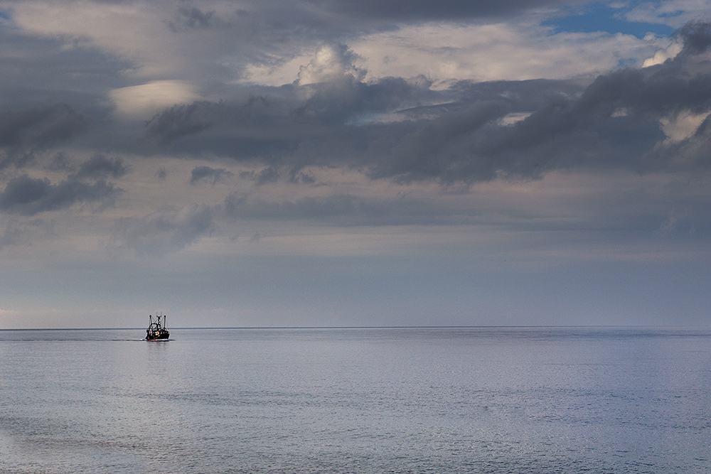
IMG_1936-2 by NnG Photography, on Flickr

Thanks

Mark
 
My guess is that you were going for the minimalistic look ? It would have been nice to have the boat a bit larger in the frame and with a splash of colour, and possibly a seagull or similar on the rhs to balance the photo....just a thought.
 
Nice shot, but would agree with Rory, plus I don't think the horizon is straight.
 
I think it works , shows how vulnerable a little boat can be in the vast sea's
 
Thanks all, sadly no gulls were present but I take your point. I'll check the horizon again as it did need a straighten.
I was hoping for the small boat in vast sea image, just maybe the boat is to small.
Appreciate the comments
Mark
 
I'm wondering if cropping out the patch of blue sky at top right might make a difference? I can see why you have composed the shot to add this splash of colour to the sky, but I'm finding that it draws my eye away from the boat.
 
It's fine, stop agonising. Listen to this guy:
I think it works , shows how vulnerable a little boat can be in the vast sea's
Leave it EXACTLY as it is! Since people seem all too ready to advise about cropping this or cloning that, it might be advisable to investigate their credentials before you take notice.
 
Last edited:
It's fine, stop agonising. Listen to this guy:

Leave it EXACTLY as it is! Since people seem all too ready to advise about cropping this or cloning that, it might be advisable to investigate their credentials before you take notice.

I disagree with you on this entirely.
Don't post something called critique if you don't want people to express their opinions.
 
  • Like
Reactions: ST4
I asked for comments as I wasn't convinced it worked. Thank you to every one who has commented so far. Our opinions are just that, let's not fall out over a photo.
Thanks
Mark
 
I agree that the boat could do with being a little larger in the frame.
The rest I like as is.
 
Just did a quick test crop (admittedly in powerpoint as I'm at work) and dont think cropping the blue out makes any difference. Plus it kinda suggests that better weather is on the horizon which fits with the heading home theme.

Personally, I like it. If it was an oil painting there would be a lot of people raving about the different shades of grey and textures etc. As a photo the same still applies for me.
 
Thanks both, the more I look at it the more I like it!
 
It's fine, stop agonising. Listen to this guy:

Leave it EXACTLY as it is! Since people seem all too ready to advise about cropping this or cloning that, it might be advisable to investigate their credentials before you take notice.

I know the planet in which we live on is round however to the human eye the horizon does have some distance before it curves away, And no doubt I have got that fact wrong Rog too?, I'm sure you will have the answer in words as per? link...................


https://www.flickr.com/photos/rogwhit/14468251375/
 
Last edited:
  • Like
Reactions: ST4
Ok I've checked the horizon it's on the huh (Norfolk saying) by 0.39degrees, corrected it on the original. Well spotted those that did!
 
I like it, actually i like it alot.. minimal is a great thing and it works well, great sky with hints of light.. (y):D
 
It's an interesting image. The textured sky looks great. Re the comments re people's credentials made earlier. Have a look at their Flickr links, websites and you can see the calibre of their work

If you were to crop, I couldn't say crop a lot off, the sky is too interesting
 
Back
Top