Critique I SOLD one!! :) Help choosing photos for club exhibition PLEASE!!

Choose the best 5

  • 1

    Votes: 1 12.5%
  • 2

    Votes: 0 0.0%
  • 3

    Votes: 4 50.0%
  • 4

    Votes: 4 50.0%
  • 5

    Votes: 2 25.0%
  • 6

    Votes: 1 12.5%
  • 7

    Votes: 1 12.5%
  • 8

    Votes: 5 62.5%
  • 9

    Votes: 1 12.5%
  • 10

    Votes: 1 12.5%
  • 11

    Votes: 2 25.0%
  • 12

    Votes: 1 12.5%
  • 13

    Votes: 0 0.0%
  • 14

    Votes: 0 0.0%

  • Total voters
    8
  • Poll closed .
Messages
2,812
Name
Mike
Edit My Images
Yes
So our club exhibition is coming up and we have to submit five photos of which the committee will choose three for the exhibition. The problem is I will have missed the critique sessions before handing the five in. So I have a big ask from you all. Please vote for five photos and give any critique that any of those five may need to 'tweak' them. #6 and #7 are slightly different edits of the same photo

Loads of thanks in advance, Mike
1
4.jpg


2
4.jpg


3
Motherandbabygifaffev2compleatedbutlayermerged_zpsa7a76960.jpg


4
4.jpg


5
4.jpg


6
4.jpg


7
SunsetoverAxeEstuarycrop_zps0e044702.jpg


8
4.jpg
 
Last edited:
They all seem to lack sharpness/clarity on the subject. The car shots would be my choice from the above images but the softness spoils them for me. What lens are they taken with?
 
Thanks.
1,2,9,10,11,12,13,14 sigma 150-509
3 canon 55-250
4,5,6,7,8 tamron 17-50

I have reduced the quality in PSE9 and then hosted on Photobucket for putting on this thread. I wonder if that would make any diference? Some are on my 500px page at full quality. I will also admit some haven't had any USM. Thanka for your comments.
 
They all seem to lack sharpness/clarity on the subject. The car shots would be my choice from the above images but the softness spoils them for me. What lens are they taken with?

I think this may be down to how I have hosted on Photobucket, so I have changed all except #3 and #7 for ones that are hosted on 500px. Do you think they look better now? I think some still need a bit of USM though s many thanks for bringing this to my attention.

Photoshop
BTCCWelch12_MG_1056_zpsafabd0c9.jpg


500px
4.jpg
 
Last edited:
This is going to sound harsh but I don't think any of those photos are that good and that might be why so few people are responding. I feel really bad saying that so to try and be more constructive:

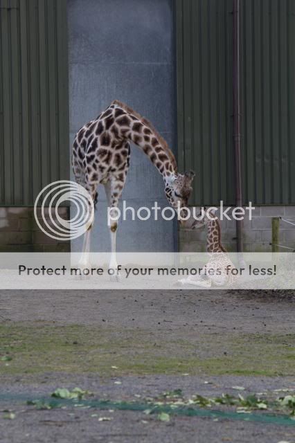
The giraffe could have done with being a bit closer and angled so as to avoid the background getting in the way. Having the wall edges right near the faces is distracting.

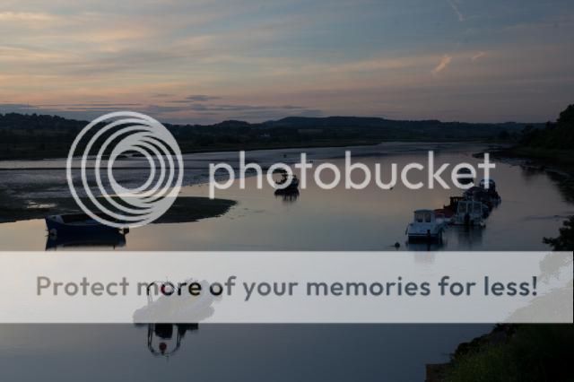
The boat photos are too dark. Some sort of grad filter would have helped expose the sky and foreground better.

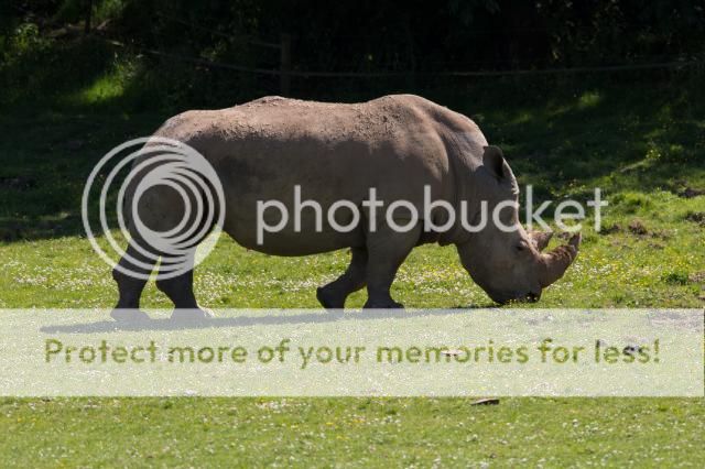
The rhinos still don't look that sharp and you were obviously dealing with bright sun making things difficult (such as the shadows).

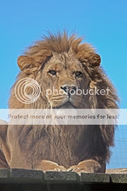
I'd say the lion is the best of the bunch but needs a bit of processing to make it pop a bit more.

Sorry again but hope that helps a bit
 
I wouldn't say any of the car shots are soft, though the 500px is a wee bit clearer.

3 and 14 are the best from that lot, whether they are worthy is another matter, sorry.
 
The little one in the 14 is cute and the lion in the 11 as a good posture need a bit more peeps in post processing.
 
111 views yet only 19 votes. :(

Well look I voted for 3, 4 and 8.

Frankly I struggled to get to 5 and so sorry for not voting any further. Exhibition work for me is a sub-set of my competition work and has to be of the highest quality not only against my own standards but also against the other images that might be part of the exhibition. As you missed the critique sessions then it will be hard for you to gauge where these images fit in with the others that your club are considering. Obviously I'm doing this cold and don't know the standard of your club, the type of exhibition, or what else might be going in. All very much IMHO therefore.

This is timely however as over this weekend the club I go to (Marwell Photographic) held their exhibition at the wildlife park and I had 13 images out of a total of about 180 exhibited. Now obviously there were a lot of animal images given the site of the club and exhibition but there were also lots of floral, architecture, travel, portrait and transport images. Much of them had been seen at club competitions over the last 12-24 months and many were high scorers in those.

It would probably be heresy for me to agree with the comment above about not entering wildlife park images because I'm at Marwell, but I also don't agree with it anyway - you can produce excellent photography of captive animals and in fact I had two studio lit captive birds of prey in my set. Unless your exhibition is for non-captive animals only they are an entirely valid subject and I hasten to add that i think your giraffe image is your strongest, possibly made stronger because it is in a man made environment. What I would say is that the other animal images are not very strong at all hence me leaving them out of my voting.

My critique on them to back all of this up would be as follows:

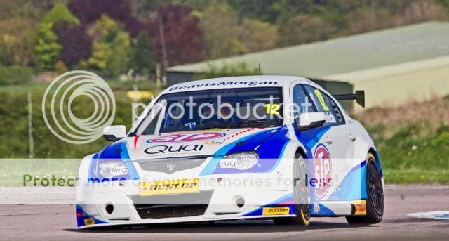
1 & 2 - Frozen action motorsport, with a distracting background wouldn't make my cut - they need better light, better background and/or some movement through panning or slow shutter technique to produce something competition/exhibition quality.

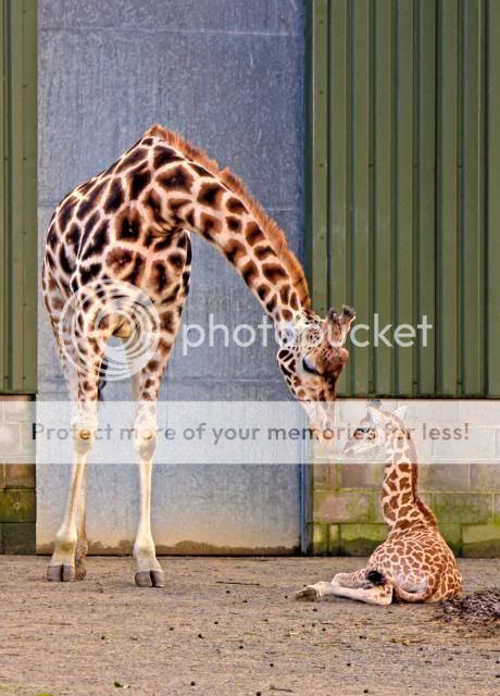
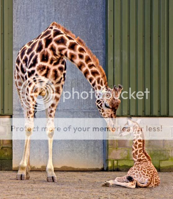
3 - as mentioned your strongest image. I like the shapes the giraffes make, contrasted to the linear structured background and the connection between the two. If you could lose the "brown matter" by the infant in PS and replace with the surface on the rest of the image, and knock out the brown blobs in the foreground it would make it cleaner and less distracting.

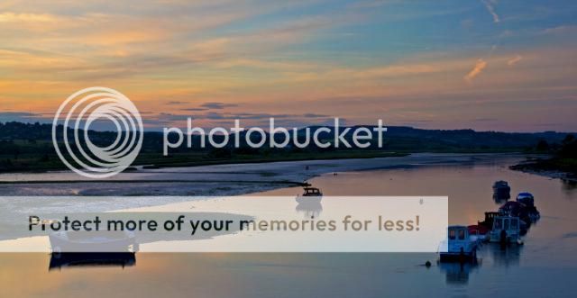
4 - The bridge and river I felt was your second strongest shot. Not much you can do to it now and a nice enough scene.

5, 6 & 7 - Not for me. No interest in the sky and a loss of detail in the water and the boats. Nothing stands out in silhouette to merit the exposure. There isn't anything to stop someone walking around to make them look at these... sorry.

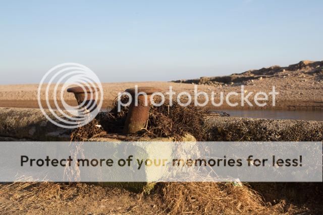
8 - Was my 3rd choice. I quite like and it has some potential in shape and texture, B&W is definitely the right approach but I felt it needed more contrast and a better conversion to B&W to make the most of it. I'd play with the crop on the top and RHS trying to keep the main structure off centre.

9, 10, & 13 - I see a lot of wildlife images and for me again these don't scream exhibition standard. Half animal shots sit between a portrait and an image of the animal in situ and they don't work for me.

11 - More like a portrait, but the light is very flat, the lion appears disinterested and with the absence of eye contract and expression it isn't holding my attention.

14 - Well you have the whole deer and some light in the eye but there is too much stick around in the frame including blocking the face and again little to keep the attention due to the lack of eye contact, or emotion.

Hope this additional information helps.
 
THANK YOU, ALL OF YOU :ty:
I have to be honest I find people only tend to critique good photos on this site, but I would rather have honest critique than none at all or how can you improve? And surely that's the point

I have panning shots of cars and whole animals so I may take another look at those.

To be honest I know my photos aren't the best by the way I don't get the 'nice' comments when I post on here and the likes and favs I get on 500px. I need to improve but I couldn't quite put my finger on what's wrong.

So thank you for your honesty because saying they aren't that good and why so is better than not saying anything (y)
 
Last edited:
Hi Mike, since you're looking for an honest critique, I'll give you my thoughts, for whatever they're worth...

1&2 - they look decent, but fairly standard car shots. I find the backgrounds a little distracting and therefore actually like the panning shots you posted later a bit more.

3 - A fairly nice shot, but a let down by the fact that it's so obviously in a zoo, and yes, the pile of organic matter on the right doesn't help. I know that it's hard to get great shots in a zoo, but sometimes you've just got to accept that you're not gonna get a killer shot, given the circumstances. Your alternative is to wait around for several hours until the subject is in the right position against the right background.

4 - Actually quite a nice shot, and would probably be my pick of the bunch, but I find it overprocessed. I'm not sure whether you've tried a bit of HDR, or if you've upped the clarity, but something is overdone.

5&6 - As others have said, they're underexposed. A fairly nice scene otherwise. You would probably have found that if you gave it a bit more exposure then you would have lost some of the interest in the sky. There is a skill to shooting evening shots, and it's not so much how you shoot them, as when. You needed to wait a little longer for the sky to get a little darker, then there wouldn't be so much contrast between the sky/water and everything else - much easier to expose for.

7 - As above. I can see that you've tried to bring out some of the details in processing, but it just looks false to me.

8 - Firstly, sorry, but I just don't like the subject matter; there's very little of interest and the messy weeds just kill it dead for me. But, there are a few other pointers....you're subject is bang in the centre of the image, try moving it left of right. Also, the very middle of your subject is in shadow, so it doesn't hold your eye. Thirdly, I'd inject some more blacks into your conversion, at the moment it seems to be varying shades of grey.

9. Not a bad shot, bit of a shame about the bright sunlight causing such a contrasty image, but other than that OK. Not much to hold my interest though, I'm afraid.

10 - As above, but I think there maybe a bit of movement in there too, it looks a bit blurred?

11 - Again, not a bad shot, but he's staring off into the distance, so again doesn't really hold my interest. Would have been much better had you have been able to attract his attention to look directly at you. Also, have you done something to him in processing? It looks as though you've reduced the contrast in his mane to make his face 'pop'. It doesn't work and just looks washed out.

12 - Sorry, I really don't like the processing on this one. again, you've either HDR'd him, or upped the clarity? Anyway, it looks false. Also, his eye is in shade, which is a shame and the photo seems to have been taken from a bit above him, which I don't particularly like.

13 - Not a bad shot, though I feel that the composition is a bit jarring. I think it would be better if you'd have included more of his body, perhaps in landscape format, rather than portrait. Also, looking at his eye, it looks like he is going to sleep.

14 - Pretty good. Probably my favourite, though I'm not sure whether his head is slightly blurred? I would also clone out the sticks in the foreground, as well as the one behind him, and the part that is just below his jaw.

I'm sorry this is mostly negatives, but I hope that you will take it in the spirit in which it is intended :)

You have given me some very useful pointers. Thank you so much for spending the time to tell me :)

None of them are HDR but I think I'm having trouble with my post processing. I have got a book on it and am starting to get to grips but it seems there's a lot of improvement to be made lol.
 
Last edited:
No problem, I hope it in some way helped.

I think the thing to remember is that occasionally a great photo will just fall into your lap. Most of the time though you either have to work, or wait. Sometimes, no matter what you do, a great (nor even good) photo is just not there to be had. There's no point worrying about those times; you've just got to recognise them, and move on.
 
So I have been giving a lot of though to the critique everyone has been good enough to give and had a god at re-editing/replacing some of the photos.

I know some have you have put a lot of time in to this thread already and may end up banging your head on the desk when you see these but I really do appreciate your honest feedback. I have also been trying to take new photos, but the light was too flat, however it's Thruxton BSB on Sunday so hopefully I'll gt some half decent shot from that.

All these are hosted on photobucket.

So I started with this one. I removed the droppings as suggested. The pile by the calf's bottom was actually wood chip as there is a tree just out of shot, but I can see how it can look otherwise so took it out. I also cropped the top and bottom to make them look closer.
Motherandbabygifaffev2recrop_zps2de2accb.jpg


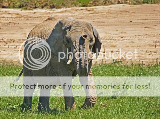
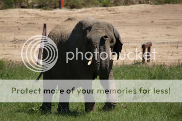
Next I has a go at BUTA the elephant. I used a different photo which included the whole animal and one where she was looking towards me and doing something to create interest. I cloned a fence out that was between her and the sand. I wondered if a bit more contrast??
ElephantafricanfemaleBUTA2_MG_1466_zps441ed812.jpg


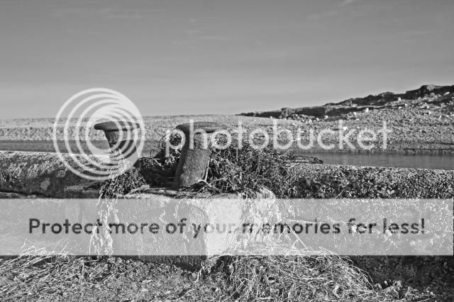
I also had another go at the mooring posts. This to is a different photo so the posts arent so central. I read some stuff on this from my PSE9 book and added a ngrad effect and the converted to black and white using gradiant fill and levels.
MorringpostsNEW_MG_1544_zps753a1874.jpg


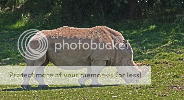
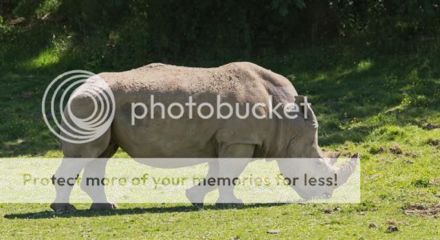
The rhino is also a different photo to include the whole animal...
Rhino3_MG_1498_zps0c43368d.jpg


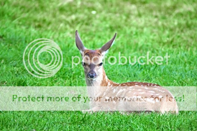
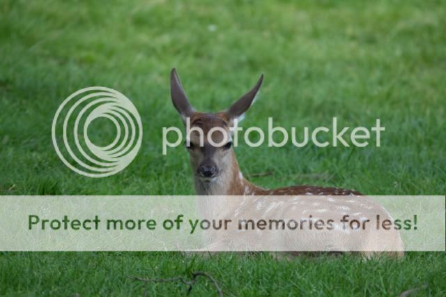
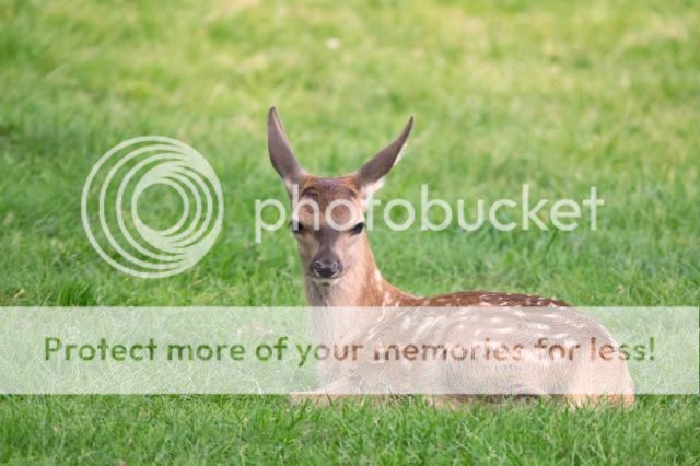
...as is the fawn. I used a photo where he is looking at me and I cloned out the sticks. I have been having trouble getting grass to look right though with all the photos containing it.
Fawn2a_MG_1419_zps392a434c.jpg


Lastly the lion. I have been advised by someone on here to leave contrast alone with furry animals. This is a different photo and although he's not looking at me it's more towards me.
LionatNoahsArk4v2_MG_1489_zps529fd322.jpg


I also thought I'd throw this in to the mix,but I should've edited the stick out of his head I suppose lol
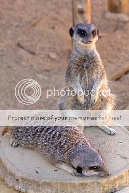
Meerkats_MG_1507_zps058a80bc.jpg


Thanks for looking again :)
 
I don't normally get involved in these sort of discussions as it is very much down to personal taste but.......

Can I ask what camera you are using, are you shooting in raw or jpg and what sw are you using to process them?
Also, do you have a calibrated screen to view them on?

I ask because the biggest problem for me (in pretty much all the pictures) is that they look very over processed. As an example, I think the 1st car in post 13 is the strongest here. But even so, on my screen, I can see a dark halo round the front offside wing and light halo round the rear spoiler etc.
I quite like the modified version of the giraffes but personally I would tone down the contrast and sharpening a lot. Ditto the rhino, it has a holo all the way round it which makes it look very artificial.

Would it be worth posting the original, un-edited version so we can judge what is inherent in the picture and what can be sorted by processing?
 
Thanks. I'm using a canon 60d Raw. Calibrated monitor. Photoshop elements 9. I know exactly what you mean about thee pp. I'm having real trouble with it I think. I will post some camera raws tomorrow.

Which part of pp causes halos? Is it shadows and highlights?

Thanks
 
Last edited:
I haven't used elements for a while, I almost excusively use lightroom now as I just find it quicker and easier. I *think* you are right in that excessive use of the shadows/highlights can cause halos. I know I used think it a problem but interestingly I haven't seen that problem for a while so I guess lightroom does it better/differently?

I am sure when you post some raws you will get plenty of advice on how to process them. Hopefully that advice will not be too conflicting ;-)
 
So I've started again with the rhino and the fawn and I really have been over doing it. I think because I see the changes gradually as I do it I dont realize how far I've gone. I think from now I'm going to keep checking the original to make sure Im not over tweaking.

I have gone right back to raw with the elephant and it has a pink halo from camera,which is weird.
 
Mike, halos are generally caused by over sharpening. Can you post one with no sharpening applied (assuming these have been sharpened), so we can see the difference?
 
Halos can also be caused by over compensation with the tone controls - setting highlights and shadows on min & max, then winding up the white and black point. Some of these look like they're pushing into HDR territory, so my guess is that you're pushing the tone controls too hard. A lot of the tones - especially the lion, rhino and elephant - also don't look 'solid', possibly caused by a lack of contrast, and I agree some (like the elephant and rhino particularly) look over-sharpened. The meerkats looks the best on the animal images in terms of processing.

Hope this is useful.
 
First I heres the redone rhino and fawn. When I went back to the locked layer I realize just how much I had over done it... the old ones look horrible lol
OLD
Fawn2a_MG_1419_zps392a434c.jpg


NEW
Fawn2b_MG_1419_zps75b14d5a.jpg


OLD
Rhino3_MG_1498_zps0c43368d.jpg


NEW
Rhino3a_MG_1498_zps1aa641cf.jpg
 
I haven't used elements for a while, I almost excusively use lightroom now as I just find it quicker and easier. I *think* you are right in that excessive use of the shadows/highlights can cause halos. I know I used think it a problem but interestingly I haven't seen that problem for a while so I guess lightroom does it better/differently?

I am sure when you post some raws you will get plenty of advice on how to process them. Hopefully that advice will not be too conflicting ;-)

Here's some of the RAWs
So this is how the photos loadied into Camera Raw. All I've done is made them sRGB and jpeg. Hosted on PB

_MG_9176_zps1bea94bc.jpg


_MG_1599_zps2543cbaf.jpg


_MG_1544_zps9fae0d41.jpg


_MG_1466_zps3cff8acc.jpg


_MG_1498_zps607d547e.jpg


_MG_1424_zpsd7246ba9.jpg


Thanks for any advice :)
 
agree. Much much better :)

one further comment. As you are learning about pp etc I would be careful which images you select to start with as I don't think you have helped yourself here.
I am definitely not an expert but have been processing my own images for quite a while now and I know I would struggle to make most of those "pop out" as you would like.

eg.
giraffes: light looks very grey and flat and the image is generally under-exposed. So you will need a lot of adjustment to lighten it up and increase the contrast etc.
elephant and rhino: looks like very harsh overhead sun, again maybe a bit under-exposed (perhaps trying to preserve the highlights?). Anyway, I think you will really struggle to get any detail on the animal sides without it looking artificial. I suspect you have gone as far as you can with your re-edit of the rhino.
Actually, having seen the original your original edit of the giraffes looks better than I would expect.
Deer: I just downloaded your raw original and had to boost the exposure by over a stop to get it looking anywhere near right (ie. like your re-edit). So again, you have done a good job with the re-edit considering what you were starting with.

So my advice is to keep your PP within the bounds of what you have done with your re-edits but also concentrate on getting the image as close to what you want out of the camera.

hth.


That's very helpful, thank you.

I have been trying to avoid blown out highlights. If I take a photos and the review on camera starts flashing at me I reduce the shutter speed/exposure compensation. When I took the cars at Thruxton I had awful trouble because it was a really nice day and I wanted to lower shutter speed for panning, I kept getting frozen wheels. I used to think it was easier to darken a photo than brighten it but have been told it the other way around. As Im sure you are aware, the RAWs look nothing like what I saw on the screen after the shots because of the jpeg review.

Thanks again for those useful tips and the time you've spent on the deer, I really appreciate it.
 
I know what you mean about blowing highlights. It can take a lot of practice to learn how your camera deals with different scenes and adjust it accordingly.
I think the general principle is to "expose to the right". meaning the highest exposure that doesn't blow the highlights. that way you get the maximum details in the shadows and the most tolerance to editing. On the other hand, you can attempt to lighten shadows but blown highlights are generally gone for good. Sometimes a difficult juggling act!

Until recently my main camera was a Nikon D300. I found that if the highlights started flashing in preview then I was unlikely to be able to recover them much when processing. On the other hand, if I under expose I get the problem you have, if I try to lift the image in PP it starts looking muddy and badly defined. So on this camera I really do need to be careful with the exposure.
I now also have a Nikon D7100 and it behaves very differently. Blow highlights are easier to recover and its metering appears more consistant so it is easier to get it right in the first place. It also appears to lift the shadows more anyway so I need to less PP than on the D300. However if I do underexpose it is just as hard to recover the image.....

I don't know Canons but I think your 60D is a slighty newer generation than my D300 but I suspect they are similar in that you need to think a bit more about exposure.

One thing I did learn with my D300 is that you can ruin a good shot by being scared of flashing highlights. ie. sometimes it is better to lose some highlights than under-expose and have half the image in a muddy mess of shadows.

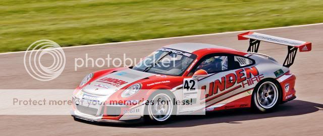
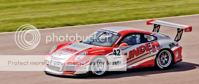
So, for example, on your thruxton shots you needed to either except you would get blow highlights from the sun reflections or that the shadows would be dark. I think you have some good images there (especially the 1st porsche) but have perhaps falled into the trap of wanting your cake and eating it. ie. no blow highlights but also the side of the car that is in shadow looking almost as bright as if it was in sunlight - I am not sure you can manage both. As for panning, I think you have done a very good job on that porsche. The track, grass and wheels show a good sense of speed where the body looks nice and sharp. Given the reflections on the nose look close to being blown out I suspect you have also got the exposure pretty much as good as was possible so if you tone down the processing and allow the shadows to be deeper I think it will look very good.

Like I said though, I am no expert so I would love for someone else to give their perspective on this.........
 
Thanks for all that advice. I had another go at the car but I cant help thinking I've made it worse.

OLD
4.jpg


NEW
BTCC13Porshe_MG_0165_zpsf2f3b8a6.jpg


So I've dakened the shadows and used a wider crop. I think it looks over done though. And it looks more sautrated from Photobucket than it does on my PSE9 :mad:

Like I said though, I am no expert so I would love for someone else to give their perspective on this.........
I think they are fed up with it now. I wouldnt blame them lol
 
Last edited:
In your original post, number 14, the deer chewing on the stick. I believe that you have a good shot in there. I don`t like the square crop as the subject is too central for my tastes, I prefer them with a bit more room around them,especially to the left of its head in this case.

It is a perfectly natural shot, there may be a bit of movement blur on the head,difficult to say for sure on a small image posted on here, but that does not detract from the image.

With a bit of work, I think that could be a lot better.

I don`t "do" cars or zoo animals,sorry.
 
Last edited:
Mike, I think there's a few points I want to make. Firstly, sometimes you're not gonna get a perfect photo. You just have to accept that.

Some of your originals look either soft or blurred. Forget them, there's nothing you can do to save them.

With regard to the blown highlights issue, it is a difficult issue to tackle. However, my advice would always be to expose for your subject. If you're taking a photo of a lion, and to get the exposure right for that lion it means the sky will be burnt out, you have four choices - accept it as it is, change your point of view or focal length so there is no sky in the shot, shoot it as an HDR, or go back at another time/day when the lighting may be more favourable.

To be honest, 95% of the shots I shoot I never bother editing, because I want perfection and I know those shots just don't have it in them. So try not to get too disheartened if you're not getting the results you want straight away.
 
Thanks Melanie :)
I am a perfectionist, im a self emploied car valeter so i have to be. Takes me an age to paint skirting boards lol. Thats why after seeing people say my photos arent right im so keen to sort it lol.
Thanks again.
 
Last edited:
Back
Top