Hi Mike, since you're looking for an honest critique, I'll give you my thoughts, for whatever they're worth...
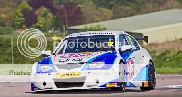
1&2 - they look decent, but fairly standard car shots. I find the backgrounds a little distracting and therefore actually like the panning shots you posted later a bit more.
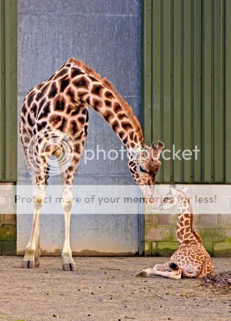
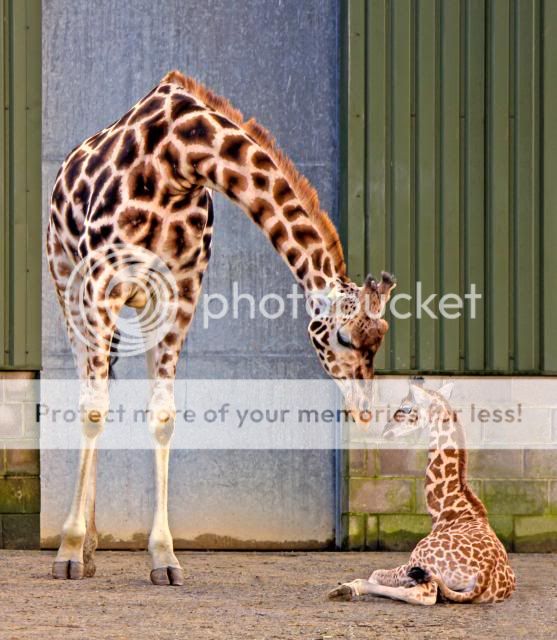
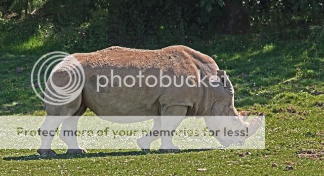
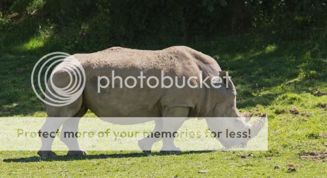
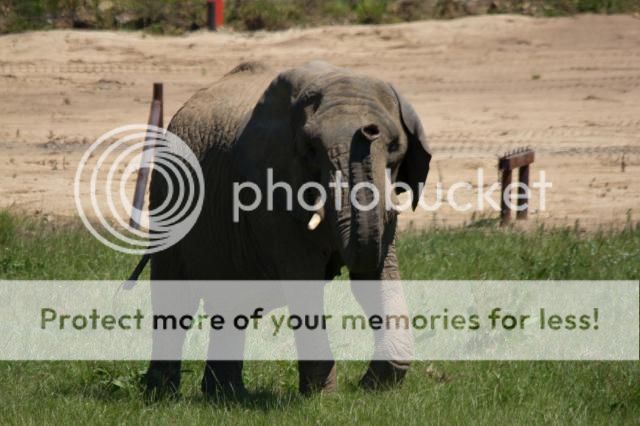
3 - A fairly nice shot, but a let down by the fact that it's so obviously in a zoo, and yes, the pile of organic matter on the right doesn't help. I know that it's hard to get great shots in a zoo, but sometimes you've just got to accept that you're not gonna get a killer shot, given the circumstances. Your alternative is to wait around for several hours until the subject is in the right position against the right background.
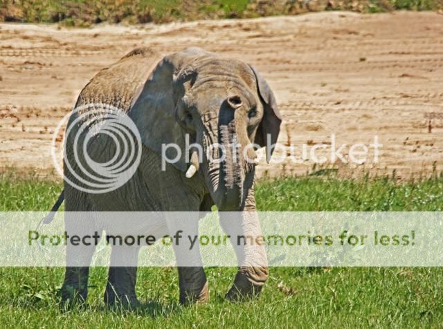
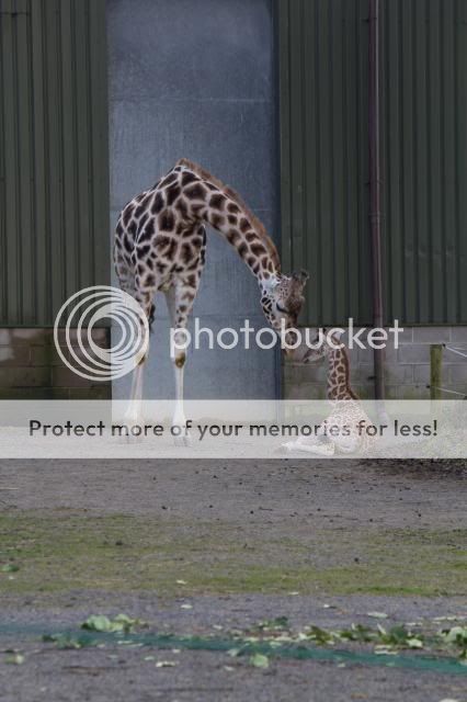
4 - Actually quite a nice shot, and would probably be my pick of the bunch, but I find it overprocessed. I'm not sure whether you've tried a bit of HDR, or if you've upped the clarity, but something is overdone.
5&6 - As others have said, they're underexposed. A fairly nice scene otherwise. You would probably have found that if you gave it a bit more exposure then you would have lost some of the interest in the sky. There is a skill to shooting evening shots, and it's not so much how you shoot them, as when. You needed to wait a little longer for the sky to get a little darker, then there wouldn't be so much contrast between the sky/water and everything else - much easier to expose for.
7 - As above. I can see that you've tried to bring out some of the details in processing, but it just looks false to me.
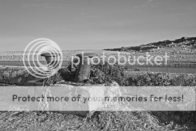
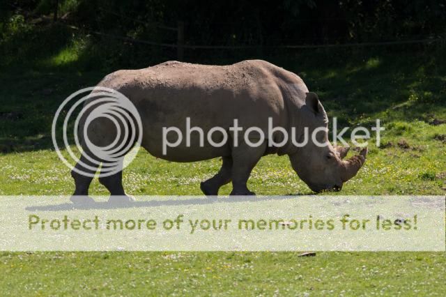
8 - Firstly, sorry, but I just don't like the subject matter; there's very little of interest and the messy weeds just kill it dead for me. But, there are a few other pointers....you're subject is bang in the centre of the image, try moving it left of right. Also, the very middle of your subject is in shadow, so it doesn't hold your eye. Thirdly, I'd inject some more blacks into your conversion, at the moment it seems to be varying shades of grey.
9. Not a bad shot, bit of a shame about the bright sunlight causing such a contrasty image, but other than that OK. Not much to hold my interest though, I'm afraid.
10 - As above, but I think there maybe a bit of movement in there too, it looks a bit blurred?
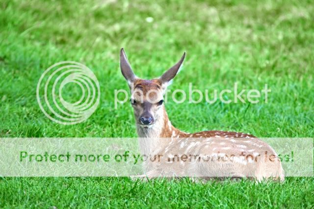
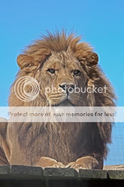
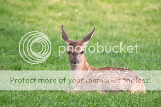
11 - Again, not a bad shot, but he's staring off into the distance, so again doesn't really hold my interest. Would have been much better had you have been able to attract his attention to look directly at you. Also, have you done something to him in processing? It looks as though you've reduced the contrast in his mane to make his face 'pop'. It doesn't work and just looks washed out.
12 - Sorry, I really don't like the processing on this one. again, you've either HDR'd him, or upped the clarity? Anyway, it looks false. Also, his eye is in shade, which is a shame and the photo seems to have been taken from a bit above him, which I don't particularly like.
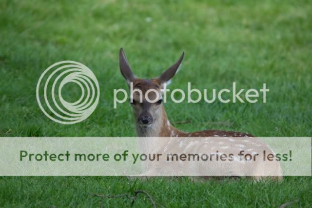
13 - Not a bad shot, though I feel that the composition is a bit jarring. I think it would be better if you'd have included more of his body, perhaps in landscape format, rather than portrait. Also, looking at his eye, it looks like he is going to sleep.
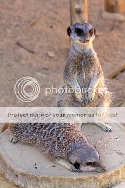
14 - Pretty good. Probably my favourite, though I'm not sure whether his head is slightly blurred? I would also clone out the sticks in the foreground, as well as the one behind him, and the part that is just below his jaw.
I'm sorry this is mostly negatives, but I hope that you will take it in the spirit in which it is intended
")