- Messages
- 20,926
- Name
- Steve
- Edit My Images
- Yes

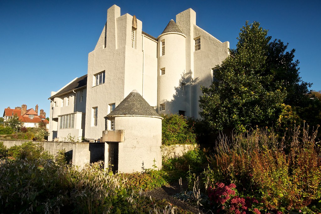
It's a bit tight up against the top of the frame for my taste - it needs some room breathe.
Colour version is the better of the two, though if you were to boost the yellows in the b/w version to brighten the trees a tad, I might prefer it.
")
FWIW, I'd also be tempted to correct the perspective to get the verticals upright, but that is something of an architectural convention.
I don't know whether you can get round the other side of the house to replicate this Mackintosh drawing
http://designmuseum.org/__entry/4350?style=design_image_popup