I think these panoramic image shapes are very hard to compose for; the simpler rule of thirds, leading lines etc are much harder to apply successfully. I think you need interest at various parts of the frame, and a way to connect them.
In the first, it seems like the main interest is the foreground. Perhaps better light on that and a tad of separation might work?
The second I quite like, but the flower is badly blown; I guess it's over exposed and the information all lost. For digital "expose to the right" seems the rule, ie make the exposure so the histogram almost (but not quite) touches the right hand edge. Here I think you've exposed beyond the right, and the histogram would have shown a pile of over-exposed pixels. Nevertheless, I like the interaction between the in-focus flower and the out of focus background on this one.
No3... too central left to right, and the sign too low in the frame? The twigs or whatever bottom right suggest why you might have framed it this way (also to get the birds a reasonable size), but I don't think it's worked out.
No 4 maybe works out best of the set. The figure is perhaps a bit close to the bottom though nicely place left to right; I'd suggest experimenting with a crop that left out some of the left and some of the top, which would make the white wash area more prominent. That might work to bring the eye back to the lonely figure, rather than getting a bit lost in the blue lines in the top half as now. But there's a nice atmosphere and good colours.
Not sure no 5 works at all, although the diagonal nature of the beach and waves should offer some potential. It's all a bit parallel. The kids' footprints enter from bottom right, not a natural lead-in point for the eye. They look like kids having fun, which is nice.
But in the end, these are your shots, and if they do what you want, that's all that counts. The vision that can see no 2 and no 4 is worth nurturing, though!


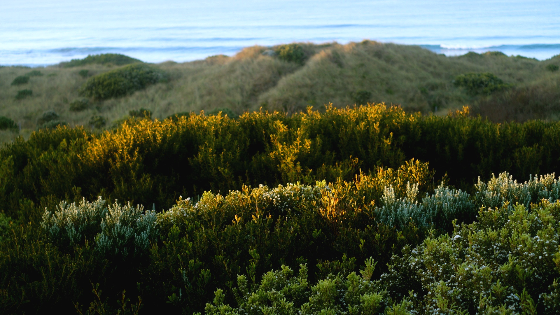 Secondary Dunes by Mr.Dunne, on Flickr
 Spring 2 by Mr.Dunne, on Flickr
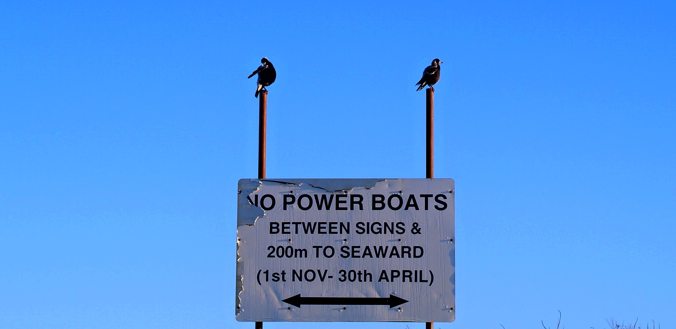 No Respect by Mr.Dunne, on Flickr
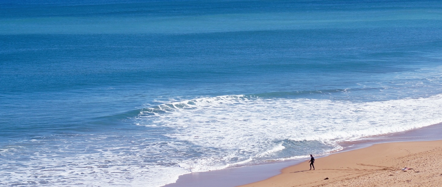 Forever Alone by Mr.Dunne, on Flickr
 Rules of Summer by Mr.Dunne, on Flickr
") .
.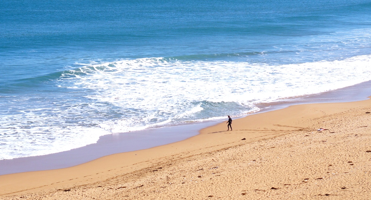 Forever Alone Recrop