Intro and Critique Request

Messages
493
Name
Craig
Edit My Images
Yes
Hi, I've been loitering for ages reading and enjoying the forum but I'm resolving to try to take my photography a bit more seriously this year and try to put myself out there to take the opportunities that present themselves. I've owned a DSLR, a nikon D5100 initially, since Christmas 2012 and it's been great for family stuff but I'm a bit OCD with hobbies and find myself researching, learning and wanting to do more all the time. I'm drawn to portraiture and am finding new stuff all the time that just continually blows my mind and am definitely drawn to lighting with Joey L being my most stand out photographer so far. I'm fairly late to the party being 34 and living in Dumfries it's been easier to make excuses not to take photos than actually push myself.

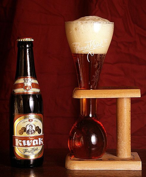
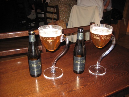
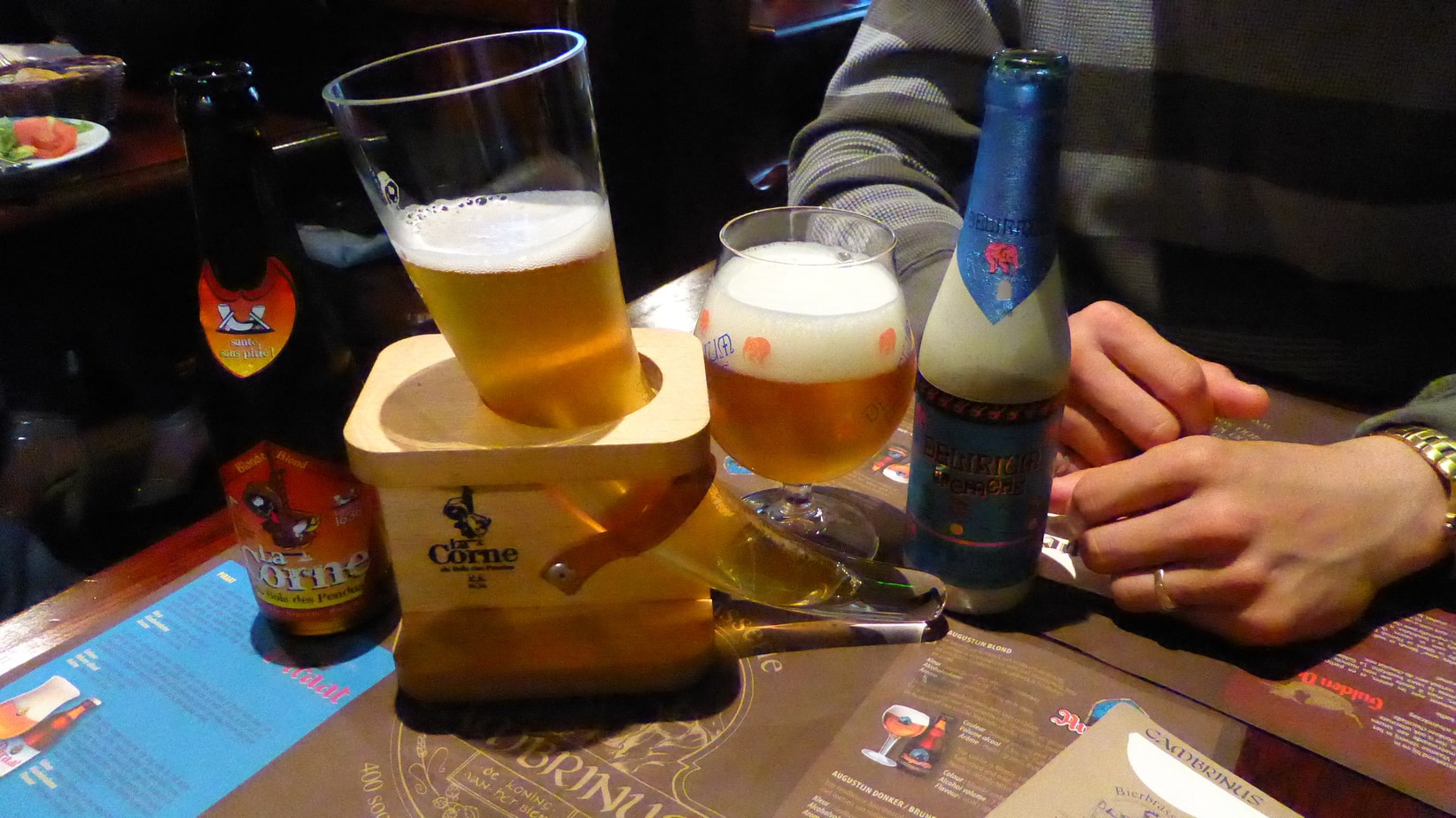
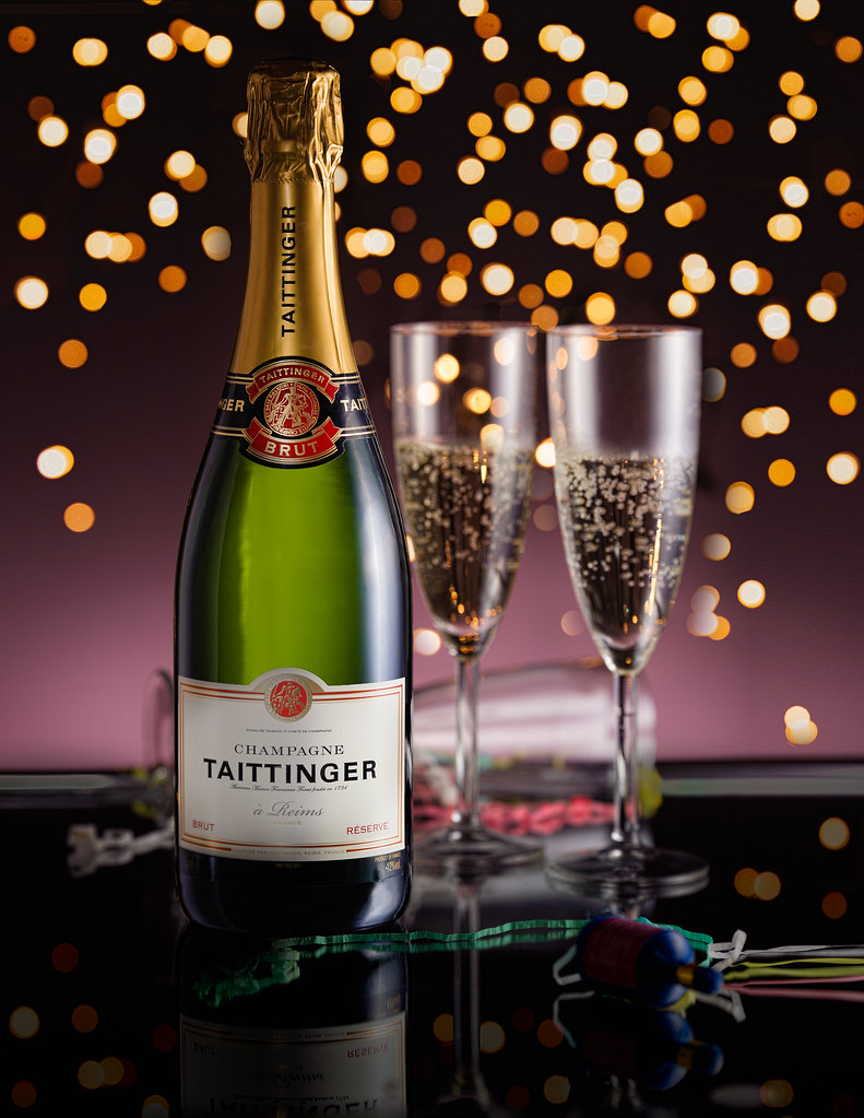
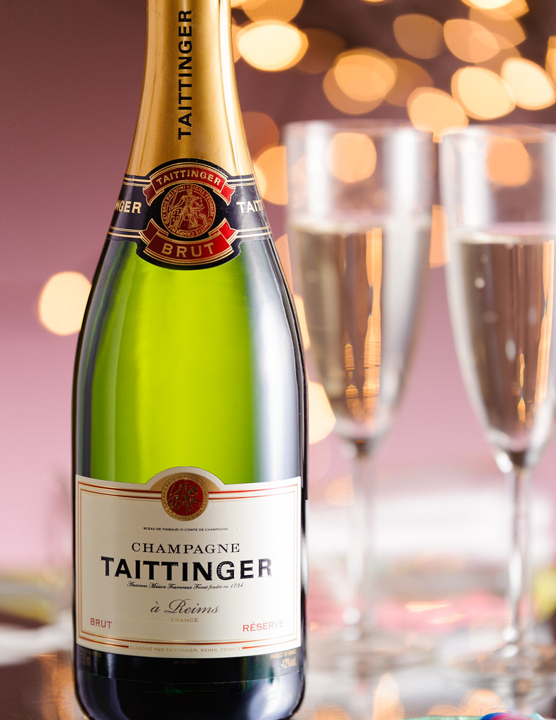
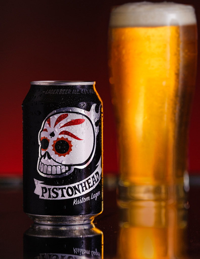
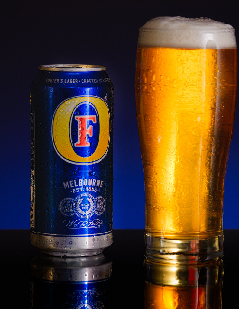
So in the spirit of growing I'm gonna start posting and my first is going to be to share some of my photos and ask for a critique. I really want to get into portraiture but inspired by some Karl Taylor tutorials my first photo shoot this year has been product inspired. It's my first real attempt at photographing products so would love to get some honest critique on how it looks.

I'd planned a whole 3 hours to myself with no wife or baby today and hope to do this once a week, ambitious or what! They're in reverse chronological order I feel I rushed them a bit still but with a one year old time is always an issue unfortunately. These were shot using 4 yongnuo flashes in my living room. All had similar setup, yn565-ex camera left in lumiquest softbox fired through a scrim. yn560-iii through shoot-through umbrella high camera rear for fill. yn560-ii in rogue grid firing camera rear to accent front of bottle and labels. gelled yn 560-iii firing from floor on grey pop up background.gold cards cut to shape behind bottles and white fill card reflecting from camera right.

Anyway if anyone can offer any advice it would be welcomed, cheers.


10410294_10204958688499641_3709391548929735783_n.jpg


10860993_10204958689099656_5591689624359227188_o.jpg


10914896_10204958688259635_6872517468508407558_o.jpg


1888996_10204958687819624_6832173699767632716_o.jpg


10841928_10204958687859625_8365056627823433147_o.jpg
 
Last edited:
Well done for posting images for critique. The first one has the correct depth of field to create the bokeh effect which I can never do so well done. I would have also like to see the champagne bubbles more in focus but you may have lost the bokeh that way. The second and third really don't stand out as much as the 1st one. They have less impact. The fourth one for me could loose the grey band between the background and the table. The final one unless its my eyes, seems a little slanted to the left. Just my opinion though. I love still life images with shiny reflections.
 
I like number 1 - the best of the set for me.
Number 2 has something on the front glass near the top - not a photography issue but setup. My eye was drawn to it.
The head on the pint in number 4 is too big (that was the first thing I thought when I looked at the picture - so it distracted me from the "product")
The JD shot is nice - lighting / background work well.

Dave.
 
Last edited:
Firstly thanks for the comments guys I took them on board and made edits based on your feedback, I reuploaded the files without realising it would break the original post...oops!

here's the original files for those who missed them, I can't see how to edit the original post.

***Just found the edit button so put them back in the OP***
 
Last edited:
I'd agree with all the comments, the two beer ones were very rushed and I'm not overly happy with them in general but I've tried to make edits in photoshop to improve the issues raised. I've also made some edits to the others to hopefully help improve them. Here's the edited images with the changes...

15989948498_e522e5e639_b.jpg


16175512911_b8338abfa7_b.jpg


16177384535_ce28b6172f_b.jpg


15557595673_97e3bf14cb_b.jpg


16151584156_5f4aaf816f_b.jpg
 
You're not so far from me Craig, over here 16 miles from Castle Douglas.

You've put a lot of work into these shots. That first one looks particularly good. Great colour throughout. What camera and lens set-up are you using? Just watch your choice of lens, focal length, plus the distance from the focal point, don't optically distort the subject very slightly. I imagine I can see a little of that, but I'm maybe talking rubbish. Wouldn't be the first time!
 
Thanks, these were shot with a Nikon d700 and tamron vc 70-200 think most were shot at f4 shortest was around 120mm with cans and close up one at 200. Tbh honest I was too close to the subject and was at vurtually closest focus for most of these which I don't think helped optically. The lens is fairly new to me and i underestimated how far away the min focus is compared to my 50mm which ive used for so long. I think the jack photo is slightly oof because of this. I need to slow down more but its hard when you're working against the clock of your 1 year old arriving home.

Yeah castle Douglas not far at all, was there quite a lot last summer is a lovely place. I'd like to get more into my landscapes as there's some stunning places in d&g but just been more drawn to studio style stuff.
 
Some zooms especially can distort in typical ways, but I was on the wrong track thinking something like a 50mm on a crop sensor.

It's tough when we have so many demands on our time, but the results you're getting are certainly worth the effort. And we do have some lovely locations on our doorstep. I've a feeling you might be taking your family on the the occasional photo hike!
 
really like the first champagne one, and the colours on the jack photo make me want to go and pour some :)
 
Cheers Matt, I can empathise with the Jack, I'd to smell it while shooting and couldn't have a drink as had to drive to pick up my wee boy after I finished :(. Was absolute torture!
 
My only comments - other than "good shots!" - is the cropping of the fosters pic isn't quite right. It feels a bit too close to the edge which makes the glass look like it's on an angle. Probably a trick of the eye caused by the shape of the glass in comparison to the straight edge of the pic. Also, it would probably look better if set up like the others. ie. the can in the front with the glass a few inches behind it.

why am i thirsty all of a sudden? :beer:
 
Thanks John, yeah definitely see what you mean about the glass looking off straight. The problem I found most with the beers was the size difference between the glass I had and the cans, may need to do some shopping for better glasses for next round.
 
...may need to do some shopping for better glasses for next round.

Try it with the Belgian Beers, pretty much every beer seems to have its own dedicated and branded glass shape... some of them are brilliant photo prop's in their own right...

for example the Kwak "Coachmans Glass" - comes with it's own wooden stand - originally in the days of the old horse drawn carriages, it was a glass given to the driver of the Mail Coach - at that time the driver wasn't allowed to leave his coach, so one particular innkeeper had a special glass blown that could be hung on the coach. In this way, the coachman had his Kwak beer safely at hand.

494px-Kwak.jpg


there's plenty of other wierdies as well

beermaniahousebeer.jpg


1127.jpg


13809111.jpg
 
Back
Top