I can see four different crops that I prefer to the whole image (I'm only looking at the first one at the start of the thread). Of those four, the one that gives the strongest image to me requires removing the top of the frame to leave just the merest hint of sky above the right hand peak that comes out from the water in the centre (meaning most of the land mass on the right hand side is out of frame, or about the top quarter of the image). Couple that with a small crop at the bottom to remove the distracting and out of focus lighter pebbles (one about a fifth of the way in from the left, the other almost in the bottom right corner).
These together make more of the low viewpoint, and give more of an impression of the eye skimming across the water. This effect just doesn't exist for me in the original.
The second image has a more drastic crop on the bottom than I'm suggesting.


 Ennerdale-golden-hour by alf.branch, on Flickr
")
 Ennerdale-golden-hour-crop
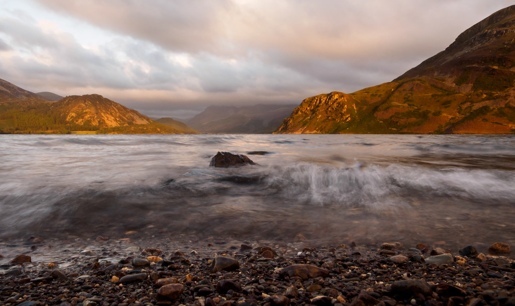 Ennerdale-golden-hour-2
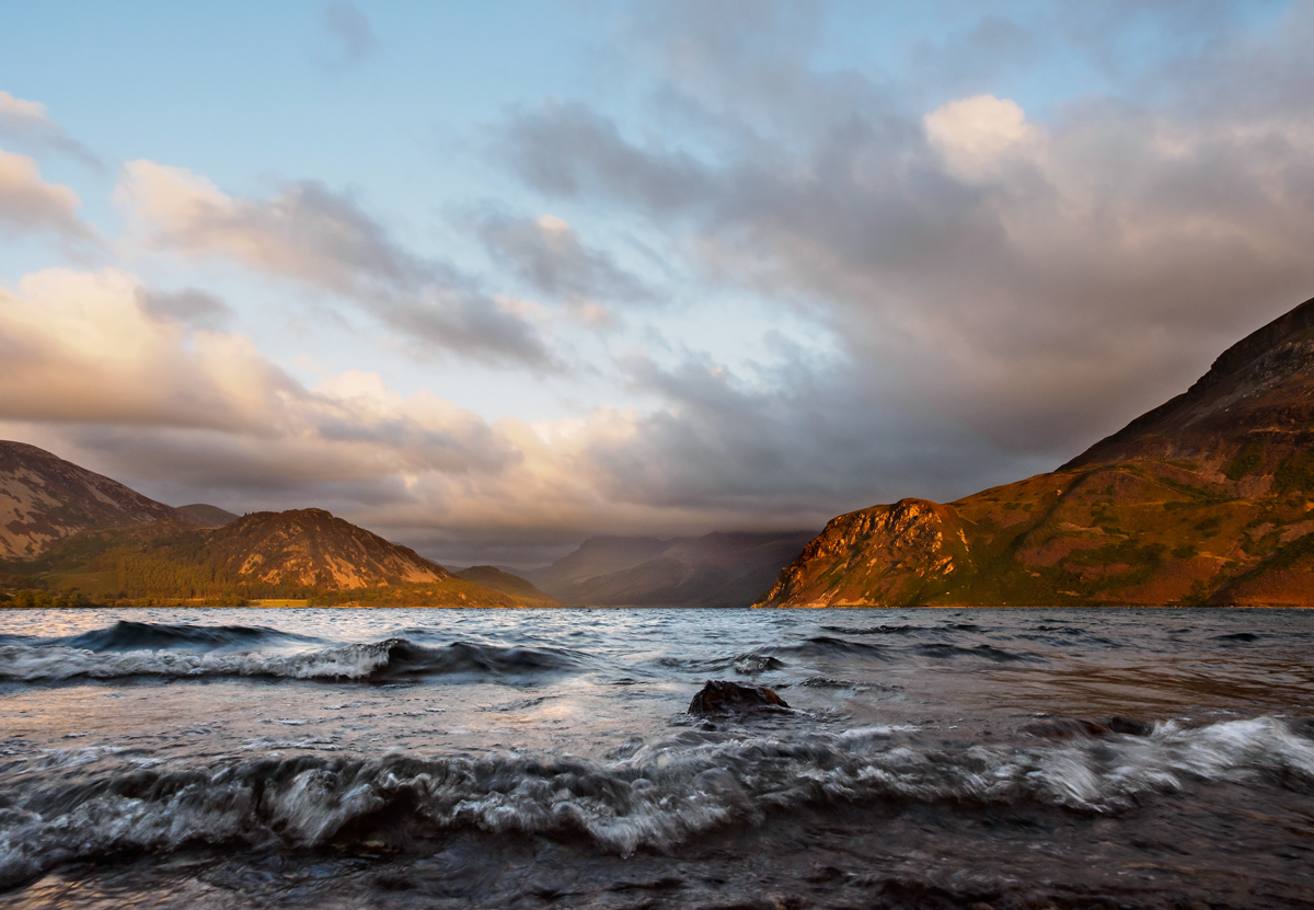 Ennerdale-golden-hour-3
 Ennerdale-golden-hour-2 crop
 Ennerdale-golden-hour-crop2