You are using an out of date browser. It may not display this or other websites correctly.
You should upgrade or use an alternative browser.
You should upgrade or use an alternative browser.
Morning Thistle
- Thread starter Carlh
- Start date
Peter B
Double Numpty
- Messages
- 5,969
- Name
- Peter
- Edit My Images
- Yes
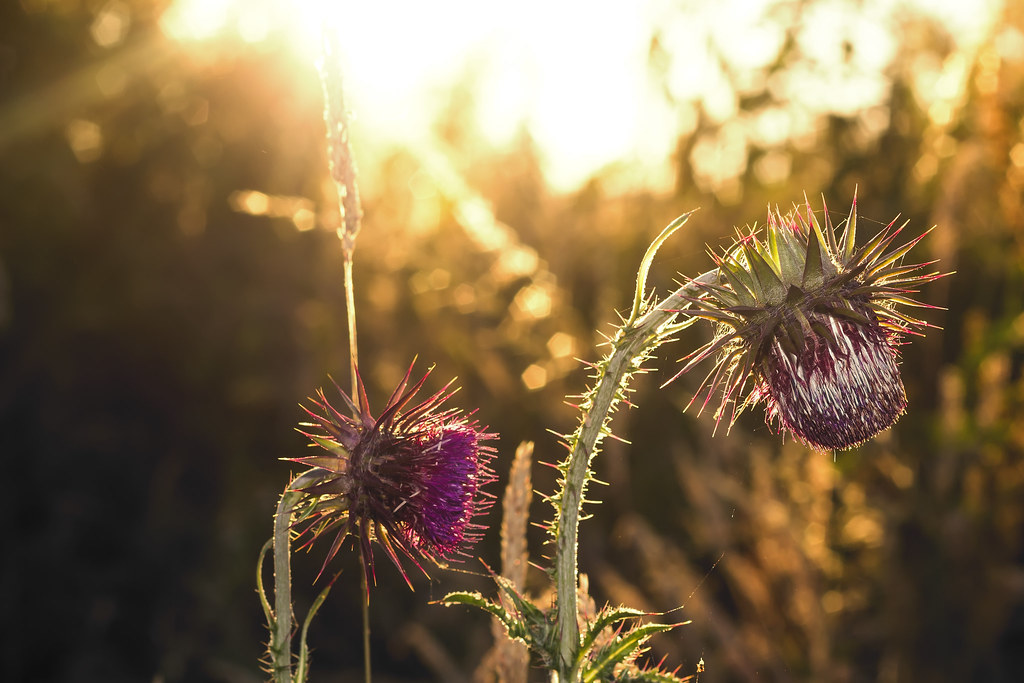
Maybe the flower head on the right looks too bright compared with the one on the left? It's almost as if you had used a refector to bounce light back on to the RH one, especially as we can plainly see that you have shot into the sun.
- Messages
- 8,261
- Name
- Carl
- Edit My Images
- Yes
Cheers graham, hahahah, i got a bucket of flower photos to go through so might see more arty-farty flower pics from me soonmy oh my, looky here, Carl has gone arty...lol
As it goes tho it aint that bad, maybe the sun is a bit strong in the photo, maybe its possible to tone it down a little.
Nice one Carl
Maybe the flower head on the right looks too bright compared with the one on the left? It's almost as if you had used a refector to bounce light back on to the RH one, especially as we can plainly see that you have shot into the sun.
agree, not sure if its that I dont like though, something else. I'll probably wake up a 2am tomorrow morning and have a moment lol
- Messages
- 3,616
- Edit My Images
- No
Compositionally, I think there's a little room for improvement, and I think perhaps a tiny bit higher so there's a touch less sun at the top but as far as the shot as a whole goes, I really like it. It has a very similar feel to Cancun's "close-up" shots in the Macro section (those into the sun shots he does).
But yeah, I like it.
But yeah, I like it.
- Messages
- 135
- Name
- Scott
- Edit My Images
- No
Lovely warmth and colour. Maybe try a square crop, if you have a little more above or below. As it is, I think the light half way up on the left edge, and the light spot towards the left corner, on the bottom edge needs removing.
- Messages
- 8,261
- Name
- Carl
- Edit My Images
- Yes
I think that might be it!!You say 'something's missing' and I think you have hit the nail on the head with that,objects or things tend to look better in odd numbers,3 or 5 of these thistle heads would look much better IMO.


