
- Messages
- 485
- Name
- Phil
- Edit My Images
- Yes

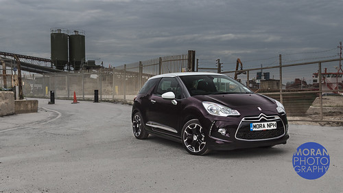
Thanks for the constructive critI quite like the location and don't mind the colour filters, only problem with it is the composition. Car and logo well over to the right and lots of dead space to the left, would be better to have the car on the left.
Also the lampost breaks the clean horizon line (and is cut off at the edge of the frame) I'd PP it out.
Quite like the logo as well, but I think having it in blue for this shot doesn't go.
Scott
 IMG_9661-Edit-3-Edit-Edit.jpg by moranphoto1979, on Flickr
Much! Nice shot. I'm of the school and believe if you don't have anything nice to say... Shut up. ..
Nice effort mate.
Much! Nice shot. I'm of the school and believe if you don't have anything nice to say... Shut up. ..
Nice effort mate.