

- Messages
- 733
- Name
- John
- Edit My Images
- No
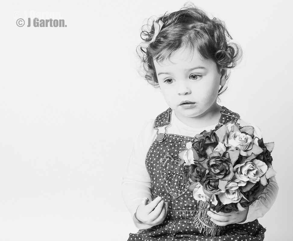
Hi, i had a mate round yesterday who didnt mind me taking a few shots while he was here and this morning i took a few shots for a friend of my niece's children.
Any comments and critique are more than welcome, good or bad.
1.
 DSC_8502-4 by J.Garton, on Flickr
2.
 DSC_8479 by J.Garton, on Flickr
3.
 DSC_8588 by J.Garton, on Flickr
4.
 DSC_8586 by J.Garton, on Flickr
5.
 DSC_8551 by J.Garton, on Flickr
6.
 DSC_8537 by J.Garton, on Flickr
Any comments and critique are more than welcome, good or bad.
1.
DSC_8502-4 by J.Garton, on Flickr2.
DSC_8479 by J.Garton, on Flickr3.
DSC_8588 by J.Garton, on Flickr4.
DSC_8586 by J.Garton, on Flickr5.
DSC_8551 by J.Garton, on Flickr6.
DSC_8537 by J.Garton, on Flickr")

 I learnt i need to limit the amount of people coming round at any 1 time.