My first go at posting a landscape

As above, lighten it up a bit. Probably crop it to more of a panoramic or look up and get more of the sky in. Theres a lot of empty water at the bottom that for me doesn’t add anything. I find the reeds in the bottom right a bit distracting
 
Last edited:
My goto PS Elements Haze Removal and Auto Fix...I know but I'm old

full
 
My goto PS Elements Haze Removal and Auto Fix...I know but I'm old

full

That's opened the image up quite a bit. If the 'auto' settings viusally moved sliders then, for the benefit of the OP, it would be good to say how they changed.
 
@herdwicksheep Well done. I like it a lot. In know there are suggestions for improvement which will hopefully be learning points for you, but personally I'd be really happy to compose and achieve a shot like that. Good work.
 
That's opened the image up quite a bit. If the 'auto' settings viusally moved sliders then, for the benefit of the OP, it would be good to say how they changed.
Not sure how to do it with a jpeg in Elements apart from the histogram. I'll have to have a play.
 
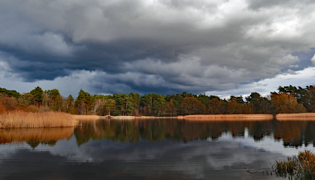
It seems to have been very grey lately, but this afternoon there were bursts of sunshine and some interesting clouds over Frensham Little Pond, so I got a few shots. This one F11, 1/100s, ISO 100 with my Canon EOS M100 and EF-M 15-45mm at 15mm. Any critique appreciated, thanks.
View attachment 415525
Nice work.

For me it just lacks interest, in a scene like this I'd probably aim to try a telephoto and pick out some details, there's a bit of light and some nice reflections to play with here. Zooming in on a small selection of the trees, with a bit of the moody sky may lead to a much higher quality of image.
 
Its a nice scene, I wonder if it could stand a little brightness boost?

Great first effort, but I have to agree with above. Maybe mess with the tones a bit, brighten it up and crop it more.

I'm by no means an expert, but I've just very quickly had a go on photoshop on my phone. If this was my image, I'd aim for something like this. Again I'm no expert so tell me to sod off if you don't like it

1000004353.jpg
 
Last edited:
Hahaha this is the fun of critique, everyone has their own opinion and the only one that matters is yours. It's nice to get feedback that can help you achieve what you want. My opinion is from a very amateur viewpoint.
 
Thanks everyone for taking the time to comment and play with the image. Here's a bit of info re what I did when processing the raw. Tiny rotation and a small crop, pulled more detail out of the highlights, a little out of the shadows and boosted the contrast slightly. I worry about boosting things too much and making everything garish, but yes, it does need more brightness. I prefer my crop - I like the cloud reflections and the reeds at the bottom right and it feels a bit more "balanced" to me, but I guess that's just personal. Hadn't thought of dehaze but I should hve tried that, the modified version does have more punch. Really appreciate seeing how others see an image too.
 
I agree with the comments on processing but other than that f11 seems a little extreme to me and I'd have used a wider aperture as there's nothing close to the camera.

The scene and composition is very nice. Well done :D
 
It's a good starting point. I feel it needs a boost in exposure, and personally I would lose around 1/3rd from the right hand side, as all the interest in the image is the light on the trees and reeds to the left hand side of the image plus the sky. Out of all the offerings your original processing is the most natural which suits the scene. A wee exposure boost and it'll be a decent first go.
 
A postscript: Thanks to you all for your input and suggestions. I had another play with my image but I'm afraid I'm rather stubborn - tried most of the ideas but couldn't really find anything I liked much better than my original, other than brightening it a tiny bit and cropping off a (very) little more. That, I thought, was he end of it.

But then there was the dreaded camera club competition and I was really stuck for images so in the end thought I'd use this. Judges' personal views all vary I know, but it got some really nice comments about being a balanced composition, with the grasses bottom right working as not too bright or distracting and him feeling that the colours weren't over-pushed. He did though feel that it was just lacking something to add to the interest and suggested a boat with someone in a red jumper. 18/20

Here's the final version.

IMG_5927_rhsbsc2.JPG
 
Back
Top