

You are using an out of date browser. It may not display this or other websites correctly.
You should upgrade or use an alternative browser.
You should upgrade or use an alternative browser.
weekly Phil-D's TP52 - 2014 week 52 Support added (archive shot)
- Thread starter Phil-D
- Start date
 First time here for me, just hope I can keep it up
- Messages
- 9,095
- Name
- Mandy
- Edit My Images
- Yes
Welcome my first time doing this I look forward to following your work.
- Messages
- 8,398
- Name
- Lynne
- Edit My Images
- Yes
Welcome to the madhouse Phil........ look forward to seeing your images ")

- Messages
- 4,088
- Name
- Graham
- Edit My Images
- Yes
Well done Phil - do try and see it through... it is well worth it when you do...
I would say be as flexible with the themes as you need to, give yourself a rest every so often by shoeing in a great shot you have taken during the week anyway, and don't get behind. Also I think you learn as much by looking and commenting on others, as you do by receiving comments on your own.
I would say be as flexible with the themes as you need to, give yourself a rest every so often by shoeing in a great shot you have taken during the week anyway, and don't get behind. Also I think you learn as much by looking and commenting on others, as you do by receiving comments on your own.
OP
- Messages
- 7,499
- Edit My Images
- Yes
So.........here we have it, my first image of 2014 TP52's, the bonus round 'odd'
Nothing special, but if I start low things can only get better
Straight away and if truth be known I have no idea why, when I read 'odd' I thought of numbers and a game I played a lot as a kid with mi dad, dominoes!
All comments and critique welcome, I try not to take photography too serious but I'm keen to keep learning
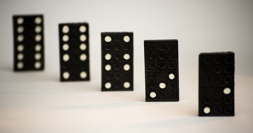
Odd 1st '52 by Phil D 245, on Flickr
Nothing special, but if I start low things can only get better
Straight away and if truth be known I have no idea why, when I read 'odd' I thought of numbers and a game I played a lot as a kid with mi dad, dominoes!
All comments and critique welcome, I try not to take photography too serious but I'm keen to keep learning
Odd 1st '52 by Phil D 245, on Flickr
Last edited:
- Messages
- 4,088
- Name
- Graham
- Edit My Images
- Yes
Well done Phil sir! even beaten Andy (@posiview) to the first post of 2014..
If you whack it into the pictures thread with a link back to yours, it does make it easier for everyone to keep track of what's what! (also you'll be first).
Great start, well on theme, good use of DOF, spot on focus point on the 3. Arrangement is key for these type shots and you've done well here. Was there not a 5 domino?? You could always clone a dot into the middle of the 4 before anyone notices..
Well done! still got 52 to go though.
even beaten Andy (@posiview) to the first post of 2014.. If you whack it into the pictures thread with a link back to yours, it does make it easier for everyone to keep track of what's what! (also you'll be first).
Great start, well on theme, good use of DOF, spot on focus point on the 3. Arrangement is key for these type shots and you've done well here. Was there not a 5 domino?? You could always clone a dot into the middle of the 4 before anyone notices..
Well done! still got 52 to go though.
- Messages
- 81
- Name
- Nick
- Edit My Images
- No
I really like the interpretation of the theme, its an odd number but its also the odd one out!
I like how you selected focus on the 3 domino, it does a good job of drawing the viewers attention but doesn't blow the other dominoes out so much you can't see what they are. The 6:6 domino is blown out but the other dominoes being viewable makes it easy for your mind to fill in the detail. I would like for the 3 domino to to be a little more sharp though. 1/13 of a second is quite slow for the shutter speed, did you use a tripod? It might be worth using "mirror up" on the shutter release. Just suggestions, I'm still not certain its not just me eyes deceiving me. If its my eyes ignore me Other that that the lighting is excellent, the backdrop is white but not blown out (which I like) and the framing is good.
Well done, good entry for the practice week. I look forward to your main 52
I like how you selected focus on the 3 domino, it does a good job of drawing the viewers attention but doesn't blow the other dominoes out so much you can't see what they are. The 6:6 domino is blown out but the other dominoes being viewable makes it easy for your mind to fill in the detail. I would like for the 3 domino to to be a little more sharp though. 1/13 of a second is quite slow for the shutter speed, did you use a tripod? It might be worth using "mirror up" on the shutter release. Just suggestions, I'm still not certain its not just me eyes deceiving me
. If its my eyes ignore me Other that that the lighting is excellent, the backdrop is white but not blown out (which I like) and the framing is good.Well done, good entry for the practice week. I look forward to your main 52
OP
- Messages
- 7,499
- Edit My Images
- Yes
Well done Phil sir!
If you whack it into the pictures thread with a link back to yours, it does make it easier for everyone to keep track of what's what! (also you'll be first).
Great start, well on theme, good use of DOF, spot on focus point on the 3. Arrangement is key for these type shots and you've done well here. Was there not a 5 domino?? You could always clone a dot into the middle of the 4 before anyone notices..
Well done! still got 52 to go though.
Graham, thanks again for the encouraging comments
and I'd actually forgot about the other thread and putting a link in 
but rectified now
cheersI really like the interpretation of the theme, its an odd number but its also the odd one out!
I like how you selected focus on the 3 domino, it does a good job of drawing the viewers attention but doesn't blow the other dominoes out so much you can't see what they are. The 6:6 domino is blown out but the other dominoes being viewable makes it easy for your mind to fill in the detail. I would like for the 3 domino to to be a little more sharp though. 1/13 of a second is quite slow for the shutter speed, did you use a tripod? It might be worth using "mirror up" on the shutter release. Just suggestions, I'm still not certain its not just me eyes deceiving me
Well done, good entry for the practice week. I look forward to your main 52
Nick, thanks also for the comments
I did use a tripod, with 2 second timer set. I've got to be honest, I've heard of the term but I wouldn't know how to set 'mirror up' on the shutter release but I'll make a point later today to try learn about the technique , cheersEdit:- Nick, I've had a quick look and on the D3100 mirror lock up is automatic when having it on live view, I think this is the only way to 'lock the mirror up'. I'll bear it in mind next time I'm shooting something like this on the tripod
, cheers
Last edited:
- Messages
- 9,095
- Name
- Mandy
- Edit My Images
- Yes
Nice start good interpretation off the word odd, I do like the composition of the image I think it works very well. Keep up the good work I am still thinking off something to do.
OP
- Messages
- 7,499
- Edit My Images
- Yes
Nice start good interpretation off the word odd, I do like the composition of the image I think it works very well. Keep up the good work I am still thinking off something to do.
Thanks Mandy, I've got to admit, I hope the ideas for the next 52 come to me as easy as this one did.............but I can't see it some how
- Messages
- 9,095
- Name
- Mandy
- Edit My Images
- Yes
Thanks Mandy, I've got to admit, I hope the ideas for the next 52 come to me as easy as this one did.............but I can't see it some how
I know exactly what you mean I have dropped by on Flickr to follow you.
OP
- Messages
- 7,499
- Edit My Images
- Yes
Thanks Andy.
The orange cast was actually intentional. The doms were front lit by natural light so I placed an old torch ( not one of these modern blue light things) to the right and behind to try get get the shadows.
I did realise it didn't work too well ................I was trying to keep it quiet
Looks like am busted
The orange cast was actually intentional. The doms were front lit by natural light so I placed an old torch ( not one of these modern blue light things) to the right and behind to try get get the shadows.
I did realise it didn't work too well
................I was trying to keep it quiet Looks like am busted
OP
- Messages
- 7,499
- Edit My Images
- Yes
A good take on the theme Phil, b+w suits the dominoes. A five in there would be a good alternative lay out, there seems to be a bit of distortion on the dominoes, which kind of works as the theme is odd!
Thanks Micheal, I suppose I could say, the fact there's 5 dominoes, makes up for it
- Messages
- 14,766
- Name
- Michael
- Edit My Images
- No
Thanks Micheal, I suppose I could say, the fact there's 5 dominoes, makes up for it
Didn't notice and I counted them

OP
- Messages
- 7,499
- Edit My Images
- Yes
very nice depth of field - what lens did you use ?
Cheers Tim, I used a Nikon 55-200mm VR with a tripod
I couldn't remember the focal length but exif says 130mm. There was a thread I remember reading about using longer focal lengths closer to the subject to achieve a better affect (well I hope that's right
), it seems to have worked well on this image anyway- Messages
- 8,398
- Name
- Lynne
- Edit My Images
- Yes
Hi Phil
off to a flyer I see......
No real crit over & above what has been said , like the DOF , another vote for mono though, the slight cast niggles , as does the spacing a tad but then Als not the only one with OCD's
off to a flyer I see......
No real crit over & above what has been said , like the DOF , another vote for mono though, the slight cast niggles , as does the spacing a tad but then Als not the only one with OCD's
OP
- Messages
- 7,499
- Edit My Images
- Yes
Hi Phil, nice interpretation of the theme, it might have worked better in B+W just to take that slight colour cast away
the other crit would be the spacing of the doms, needs to be perfect its an ocd thing
Hi Phil
off to a flyer I see......
No real crit over & above what has been said , like the DOF , another vote for mono though, the slight cast niggles , as does the spacing a tad but then Als not the only one with OCD's
Thanks for the comments
I am guilty of not being very accurate with the spacing, didn't give it that much thought, but now its been mention its quite noticeable. I've made a note if I do anything similar, cheers Happy New Year everyone, all the best for TP52 2014

- Messages
- 868
- Name
- Jason
- Edit My Images
- Yes
Good work Phil...off to a flying start.....Good use of DOF.....and I like the spacing, although not equal across all dominoes, there is still a symmery in that you have a equal (if larger gap) each end. Also shadows are nice and not to owerpowering which would spoil.
Last edited:
- Messages
- 13,760
- Edit My Images
- Yes
Hi Phil - Welcome to the 52
Well, what can I say... a great start, lovely DoF, bang on focus and real nice composition, looking forward to seeing your next 52 shots
Well, what can I say... a great start, lovely DoF, bang on focus and real nice composition, looking forward to seeing your next 52 shots

OP
- Messages
- 7,499
- Edit My Images
- Yes
Nipped out earlier and took this , thought it might suit b&w, not something I've done a lot of.
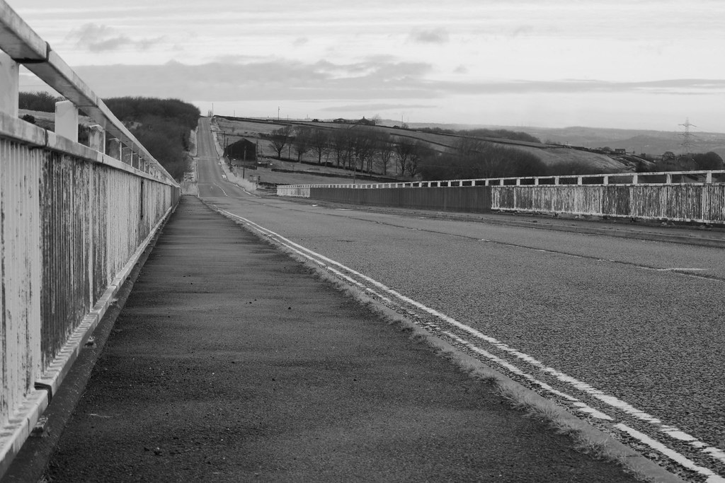
TP52 Linear lines by Phil D 245, on Flickr
TP52 Linear lines by Phil D 245, on Flickr
Last edited:
- Messages
- 9,095
- Name
- Mandy
- Edit My Images
- Yes
I do like the b&w conversion on this and plenty of lines indeed.
OP
- Messages
- 7,499
- Edit My Images
- Yes
Really good Phil. Lines everywhere!!
Cheers, David
"Odd" ... like it, the concept & the DoF
"Linear/Lines" ... nice, as minnnt say, lines everywhere. My original plan for "Linear/Lines" was double yellows and to do a pleasantville job, but too late now as I think we can only post one pic.
Thanks for comments on both images David
Think you can post more than one image per subject if you want I do like the b&w conversion on this and plenty of lines indeed.
Thanks Mandy
Happysnapper79
Suspended / Banned
- Messages
- 710
- Name
- John
- Edit My Images
- Yes
verticals, diagonals and horizontals everywhere.
Well done.
Well done.
OP
- Messages
- 7,499
- Edit My Images
- Yes
verticals, diagonals and horizontals everywhere.
Well done.
Thanks John, to be fair, I hadn't thought of the verticals in the railings
Loads of lines
The conversion works well, really adds to it.
Cheers Mark, I've mentioned on another thread that b&w seems to suit this weeks theme