Critique Photos from Exmoor Zoo & Coombe Martin Dino and Wildlife Park with my new Sigma 150-500

Messages
2,812
Name
Mike
Edit My Images
Yes
We recently spent the week on Exmoor which gave me the perfect opportunity to spend time with the family and try my new Sigma 15-500. Please critique as you see fit, it all helps me to improve ;)

Coombe Martin
1
Lion_MG_9818_zps13c27214.jpg


2
_MG_9840MeerkatCR_zpsfab45dda.jpg


Exmoor Zoo
3
_MG_9928capybaraCR_zps3f75e434.jpg


4
_MG_9891CheetahCR_zpsdbaff8d0.jpg


5

_MG_9905PumaCR_zps3af95f03.jpg


Thank you for looking.
 
Last edited:
I have noticed the colour isn't quite right, they are little more saturated in Photoshop. They look the same as above on Photobucket. Is it Photobucket or is it because I process in Adobe RGB?
 
Any critique please folks? Am I on the right track or are these rubbish? I like them, but that doesn't mean they're any good.
Thanks :)
 
As you said earlier, the colouring doesn't look right ... maybe a photobucket problem.

In general, they all look a little flat and maybe soft, but as ever, that could be my un-calibrated monitor. There's some nice poses but some shots are 'affected' by unnatural distractions such as fences etc ... but they're are in a zoo, so can be expected.
Any chance of re-hosting them on flickr and giving a clue or two on settings?

Thanks :)
I dont have flickr :wideyed: but i do have 500px so i'll host them on their and/or change to srgb. I'll also recalibrate my monitor. When next on the desktop.
 
The bottom ones are how I see them in photoshop so from now on I'll be saving my web jpegs as sRGB but keeping the TIFFs as Adobe 1998 RGB.
It's amazing how the little things make a difference.

Oh and these are all on Photobucket. I read the upload on 500px again and that also says to use sRGB.
 
you faiked to use a shallow enough dof to get rid of the cage wires in the lion shot and i dont like the blue bar going into his head.
the lion itself loks good though
 
I have now sharpened the images using a method from a book I recently purchased and it's made a big difference in my opinion
So here's the lion photo in the 3 stages
Lion_MG_9818_zps13c27214.jpg

Lion_MG_9818CRsrgb20cont_zps8c681dae.jpg

Lion_MG_9818CRsrgb20contSharpen_zps72b516ba.jpg


Thanks for looking.
 
you faiked to use a shallow enough dof to get rid of the cage wires in the lion shot and i dont like the blue bar going into his head.
the lion itself loks good though

Thanks
You are right about the dof. I used f8 but could've only gone to f6.2 because the lens was at 500. I was going to try and sort it in pp was was worried about loosing fur detail. I have to admit I thought it being a zoo animal would make it acceptable so thank you for telling me it's not. I'll defiantly remember for future shots :)
 
You have been busy Mike :)
As for the processing, What programme do you have?
you shouldn't need to sharpen in 3 stages.
You have also been slapping the Lion with the saturation tool
(or something similar) by the looks of things.
If its one of the CS, 3/4/5/6
All you need is the USM tool,
to sharpen
 
Than
You have been busy Mike :)
As for the processing, What programme do you have?
you shouldn't need to sharpen in 3 stages.
You have also been slapping the Lion with the saturation tool
(or something similar) by the looks of things.
If its one of the CS, 3/4/5/6
All you need is the USM tool,
to sharpen

Thanks Cobra for your time, yours look much more natural :ty:

I'm using Elements 9 at the moment

Basically after adjustments in RAW I sorted the white balance using levels
Then because it looked flat I upped the mid-tone contrast
To sharpen I used this method that I got from a book called: The Photoshop Elements 9 Book for Digital Photographers by Scott Kelby & Matt Kloskowski
- copy layer
- filter - stylize - emboss
- height 5 px
- on the layers pallet click the menu where it says normal and click hard light
- adjust opacity as required

I have notice that by unclicking the levels layer it does look better

I think one problem I may have is adding too much contrast to make the photos look less flat, but in turn do you think it's making them look wrong/overworked?
 
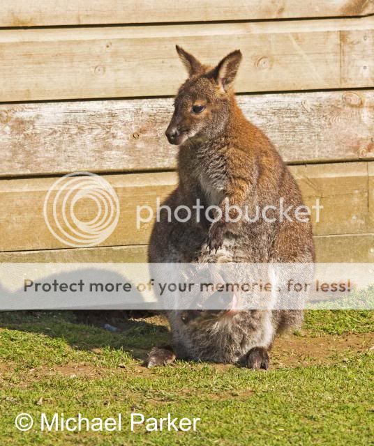
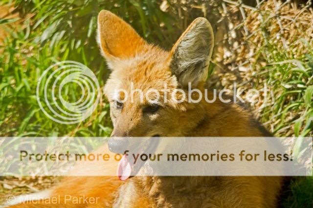
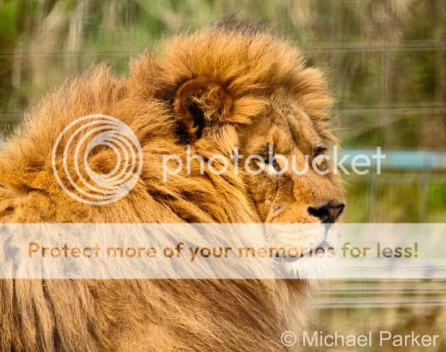
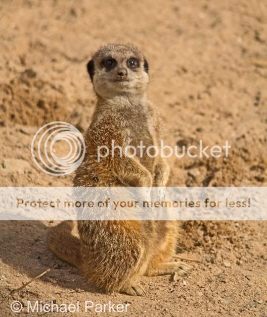
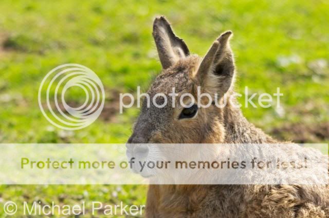
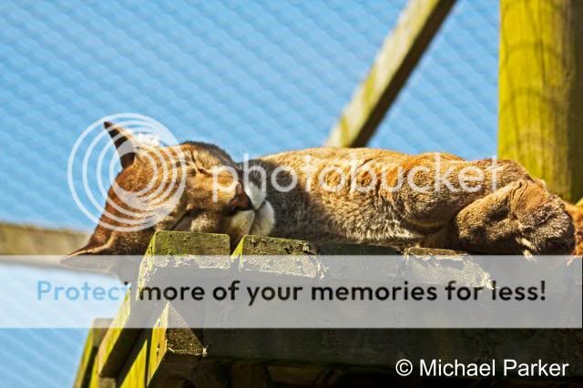
Its all very subjective Mike ;)
I personally wouldn't "push it" that far, but if it suits your style,
then fair play to you (y)

I can't really help with the "Elements"
Its been bloody years since I used it,
and don't have it installed any more so I cant check either.
However if memory serves,
there is a USM tool there?
(Sharpen)
Levels won't sort out a WB "issue"
They just brighten the image.
You can complety drop the Stylise / emboss step.

For WB "issues" I use ACR for that, but I doubt that you have it.
So a "coloured filter" (I'm sure that's there somewhere)
will do the trick. Orange to warm up, Blue to cool down.
(I used blue BTW)

If you have it, ( i think you do) just shadows / highlights tool,
(From the "adjust" drop down box,) on the out of camera image,
and see how it looks from there.

You may need to go to contrast / or exposure for the finals,
But I find that shadows highlights and maybe levels is plenty.
Once done, just sharpen using USM, again I *think* thats there as well.

Hope that helps?

Oh one last thing, set your white balance (in camera) to cloudy, and leave it there under all conditions.
 
Last edited:
Thanks for the advice. I've just spent another 2 and a half to 3 hours on this photo but to be honest I've been learning sat here with my book while doing it. I spent a lot of time going over all the adjustments in RAW and learning more about what they did and then took Cobra/Hissys advice with the filter etc. I still want to make improvements on the back ground but its bed time now lol. This may seem a long time on a photo but I want to nail PP as I think it's letting my photos down at the mo.
Thanks all :D
Lion4_MG_9818srgb_zps58e8dd21.jpg
 
Last edited:
You are getting there Mike (y)
I didn't see that lion, but it does still look a little on the "Golden" side"
Nothing wrong with the sharpness or anything else for that matter :)
TBH I'd leave the background alone.
 
You are getting there Mike (y)
I didn't see that lion, but it does still look a little on the "Golden" side"
Nothing wrong with the sharpness or anything else for that matter :)
TBH I'd leave the background alone.

I have to agree with the snake re. leaving the background.
The cloning draws the eye more than the faint fencing does.
I rather like the colour on your last one though.
 
You are getting there Mike (y)
I didn't see that lion, but it does still look a little on the "Golden" side"
Nothing wrong with the sharpness or anything else for that matter :)
TBH I'd leave the background alone.
I have to agree with the snake re. leaving the background.
The cloning draws the eye more than the faint fencing does.
I rather like the colour on your last one though.

Thanks for your advice guys, I have been listening. Sorted the background and upped the blue filter. And I swear if I ever see a damn lion again....lol
4.jpg


Hope it's not too much on the blue now. But please say if it is.
 
Last edited:
Its not blue Mike, but TBH you still seem to be over saturating.
Anyone else or is it just me?

I de-saturated the lion,
and I smacked the back ground with the blur tool, quickly too.
Thoughts?

View attachment 10434
 
Prefer your first effort Chris, this one just looks too harsh colourwise
 
I've just done a -20 on a saturation layer and it looks soooooo much better. I haven't got any other saturation layers so it must be something I did in RAW. So used to bumping the sat up a bit in landscapes lol
 
I've just done a -20 on a saturation layer and it looks soooooo much better. I haven't got any other saturation layers so it must be something I did in RAW. So used to bumping the sat up a bit in landscapes lol
LOL It probably works for landscapes (But how the hell would I know :D)
As for the RAW files, is it saving a sidecar file?
(xmp for canon)
The thumbnail will look normal, but when opened it shows the xmp as the "true file"
You can safely delete these and go back to the original (out of camera) RAW file.
Maybe that's what's happening?


Ahh right. I'll check. Thanks

I've had so many crits say bump up the sat, or bump up the contrast. But I suppose with animals it makes them look unnatural?

Also could i ask how you blured the background without effecting the hairs? When i did it i used the selection tool and it took an age and still clipped hairs.

Sorry to be a pain, youve been very helpful. (y)
 
Last edited:
Ahh right. I'll check. Thanks

I've had so many crits say bump up the sat, or bump up the contrast. But I suppose with animals it makes them look unnatural?
Absolutely it does.
But but it does work with most genre except animals & people (mostly)
Normally.
With animals its just a shadows highlights or levels tweak.
Maybe a bit of "exposure" depending on how much I've screwed up on the day :D
Then a bit of sharpening (I use Un-sharp mask in CS5)

Also could i ask how you blured the background without effecting the hairs? When i did it i used the selection tool and it took an age and still clipped hairs.
Sorry to be a pain, youve been very helpful. (y)
LOL no worries Mike
If you look closely I didn't go near the lion ;)
it was just a quick demo with a large brush.
But if I was taking a lot of time over it,
run over the large area's with a large-ish tool,
then use a very small tool to get the bits near the lion.

Hope that helps :)
 
Absolutely it does.
But but it does work with most genre except animals & people (mostly)
Normally.
With animals its just a shadows highlights or levels tweak.
Maybe a bit of "exposure" depending on how much I've screwed up on the day :D
Then a bit of sharpening (I use Un-sharp mask in CS5)


LOL no worries Mike
If you look closely I didn't go near the lion ;)
it was just a quick demo with a large brush.
But if I was taking a lot of time over it,
run over the large area's with a large-ish tool,
then use a very small tool to get the bits near the lion.

Hope that helps :)

It does, thanks. Of course if I'd used a lower fstop it wouldn't have been a problem lol.
 
It does, thanks. Of course if I'd used a lower fstop it wouldn't have been a problem lol.
Not Necessarily ;)
It also depends on the distance from the back ground, (or the fore ground for that matter)
the subject is.
TBH Wire fences are a right royal PITA!
If you possibly can, find a different angle to shoot from and avoid them altogether.
Yes I know that can be pretty impossible, unfortunately.

But don't get disheartened, you are coming along nicely (y)
 
just noticed this thread sorry:D
The Lion is excellent you did the right thing getting rid of the blue bar on the right
I always go to a wide as possible on the aperture but as you say it would have been difficult to get all of the Lion in focus
as Chris said fences are a nightmare I try to avoid them in the background too
even with the background its an excellent portrait worth spending time on, love his expression
I think Chris's first edit is spot on:)
Thank you (y)
 
Back
Top