Hi Rob,
The colour palette in the second is very good and it all ties together nicely, but the reflections on the glass are letting it down for me I'm afraid. It feels like you could have done with a little more control over the lighting - what was your set up for that one?
In terms of the subject matter, as a technical exercise the focus and exposure both look good but if we're looking at it as an image in its own right it could do with a bit more interest for me rather than just being the top bit of an empty bottle.
Perhaps with beer still in it and some foam bubbling over the neck of the bottle to give it a bit more oomph???
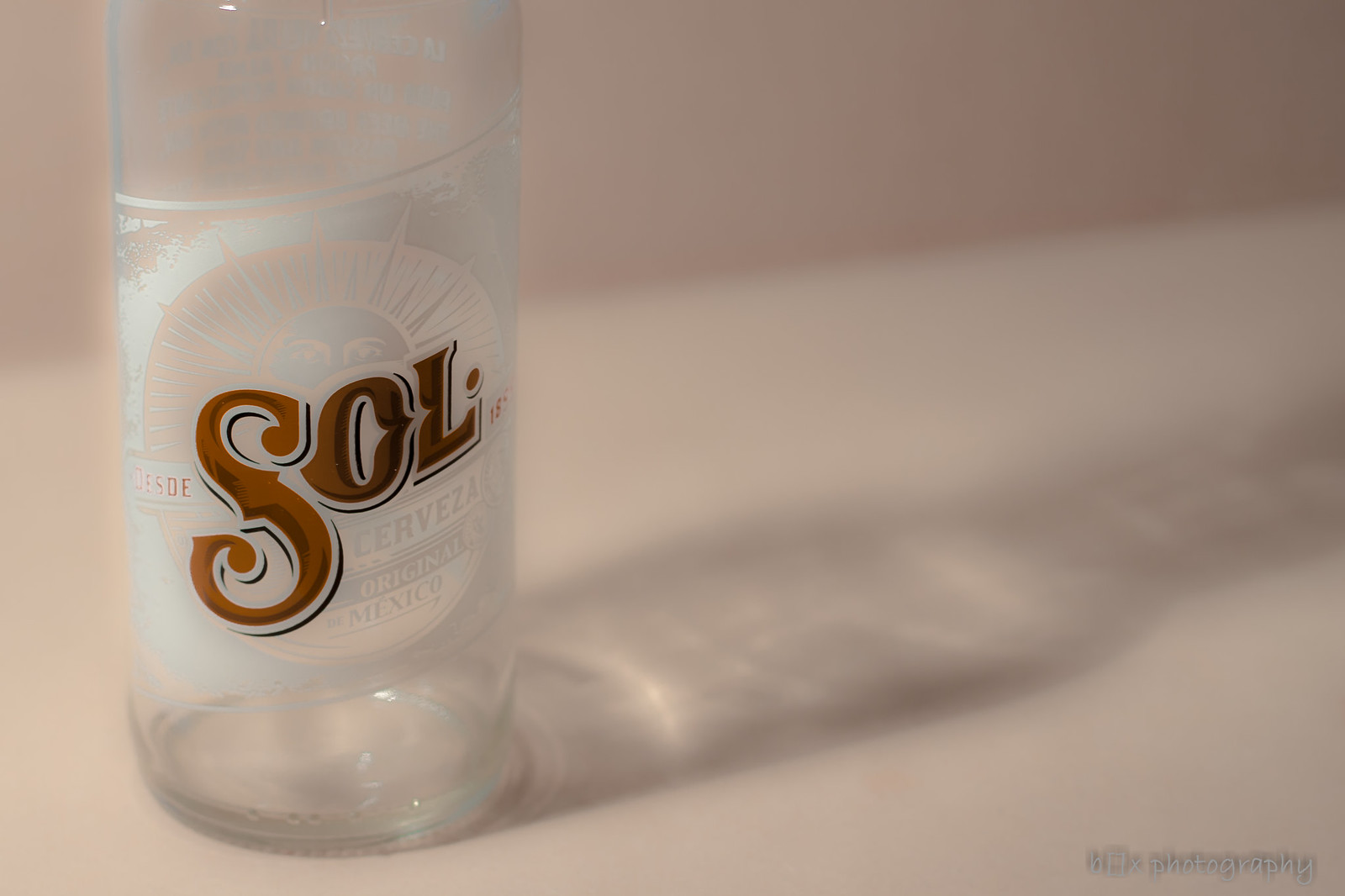
First one works much better for me.
The shadow and hint of an oof table edge in the background give it an extra level of interest.
Tricky colour palette to work with, with all the creams and whites but you've handled that well - and in fact the simplicity is very appealing.
In terms of improvements, I think you could have done with more light on the face of the bottle. See how the 'o' and 'l' are much darker then the 's'?
A simple reflector would have done the trick for you.
I'd also like to see it straightened so that the edge of the bottle is parallel to the edge of the frame.
I can see what you were going for with the processing to add some blur and brighten the bottle, but you need to be careful around the edges with that type of PP. I can see some slight 'haloing' around the LHS where you've blended it. Fiddly to get right, but you'd get a cleaner result by setting up for the effect you wanted rather than adding it in PP after the event.
Glass really isn't an easy thing to photograph though and I think you're definitely on the right track with these.
If you need any tips, there's an excellent tutorial on how to light glass in the tutorial section here - will try to dig it out for you if I get chance later.
p.s. Congratulations on the arrival of your son!!!


 sol (1 of 1) by box.photography@yahoo.com, on Flickr
 sole1 (1 of 1) by box.photography@yahoo.com, on Flickr
")