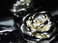
I think the blurriness gives a more painterly look, or quality, which can be good. I've messed around with this a bit and found theres a point where its slightly uncomfortable to look at, as your eyes try to focus on it. When it gets to that point, it needs to be more abstract, maybe by dropping contrast and flattening the image some more. There are other things to try, such as using the HSL sliders to reduce the range of colours, which would flatten the image as well.
There's a bit of negative space in the top left corner, this could be emphasised by making it bigger (ie crop it a bit less) or smaller (crop more) to change the way your eye travels around the image. Your call at the end of the day, I'd try both and see which I prefer.
Getting an idea for an image and trying to create it is a good outlet, and a good start here, bravo!