Critique Shadows, shadows

Messages
1,156
Name
Chris
Edit My Images
No
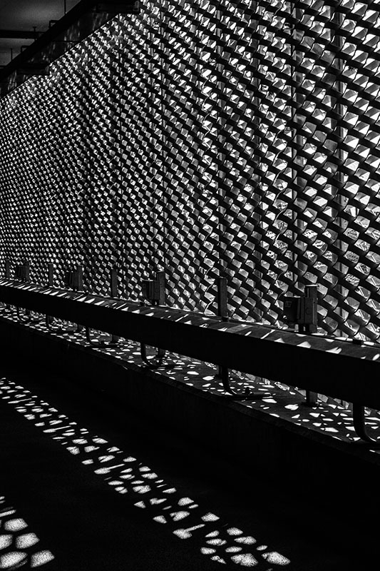
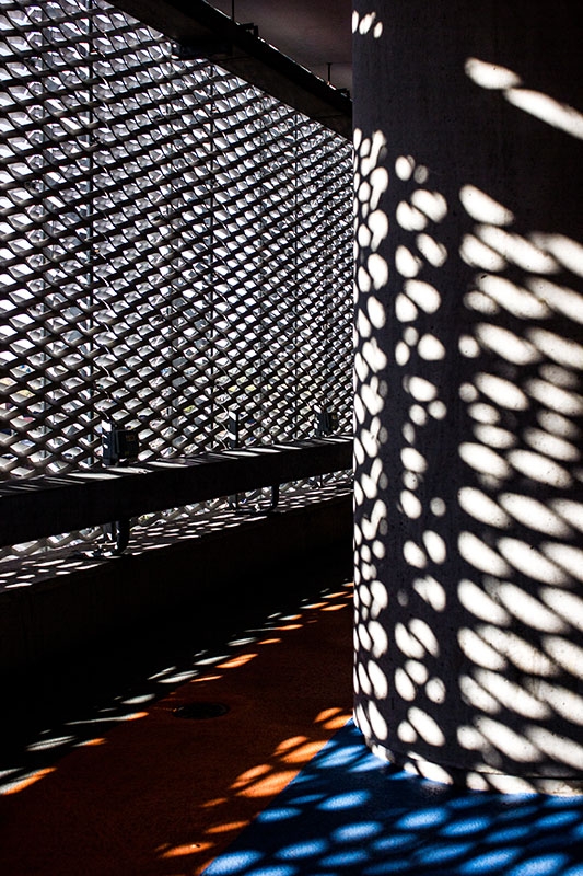
Went to Leicester on Sunday with Higher Management and while she was shopping I amused myself taking a few pictures at the Highcross car park.

Although it was around midday the sun was still very low in the sky and quite bright due to lack of clouds. So I went for shadows.

The first one is not a manipulated selective colour (don't know how to do that yet:)) - it is as taken plus tweaking.

987-1384357603-322a636de8683c3c309549b714c614d6.jpg


The second is a B&W conversion and I used the picture to try several different methods to do the conversion.

988-1384357607-db5c118486033c16c9fea982aaf381cf.jpg


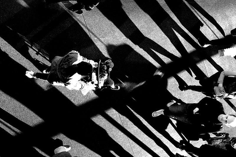
For me this is the best of the conversions I tried but I would be interested in peoples' views on this in isolation... plus any other constructive comments/criticism.
 
Last edited:
Like No1vthe shadows and lines work well although I might be tempted to lose the little triangle at the top. The 2nd one has a lot going on difficult to focus on any one thing but I don't think that detracts too much. Have to say prolonged view of no2 make me feel a little seasick :LOL:

Steve
 
Like No1vthe shadows and lines work well although I might be tempted to lose the little triangle at the top. The 2nd one has a lot going on difficult to focus on any one thing but I don't think that detracts too much. Have to say prolonged view of no2 make me feel a little seasick :LOL:

Steve

Thanks for the prompt comments.

Re No. 1 .... I did try cropping in various positions :eek:ops: ... but on balance preferred it with the top right hand corner as I felt it added more interest than it created a diversion.

For example I think this one similarly benefits from not being all the same (but as I'm having a bottle of beer I reserve the right to change my view :))

990-1384359818-e576774db8e7ebed3aaff75ec6d28fa6.jpg


On the second ..... I remember hearing somewhere that the purpose of a piece of 'ART' - of any kind - was to provoke a reaction. So I guess a feeling of sea-sickness counts as Success:LOL:
 
Last edited:
I too love one and having just put my finger over the top inch agree the triangle needs cropping.
 
I too love one and having just put my finger over the top inch agree the triangle needs cropping.

Fairy Nuff, good job we don't all agree on everything - that would be really boring:)
 
I like them both, the 2nd one is very busy and there seems to be more shadows than people which is weird, but adds to the look. in the first one I can see both points of view and maybe I would try to fill in the triangle with black, maybe clone the top of the fence. it presents an extra color that detracts from the 'mono' if you see what I mean. plus it makes the car park more visible which I think is better hidden :)
 
....................................... maybe I would try to fill in the triangle with black, maybe clone the top of the fence. it presents an extra color that detracts from the 'mono' if you see what I mean. plus it makes the car park more visible which I think is better hidden :)

Thanks for the further specific comments - not sure I fully understand regarding the first picture but I will play about with it to see which option I prefer. I might even include it in the next club open competition to get some further feedback.
 
Back
Top