- Messages
- 224
- Edit My Images
- Yes
Definitely open to feedback and critique, please let me know your thoughts 
 VanLife by Mr.Dunne, on Flickr
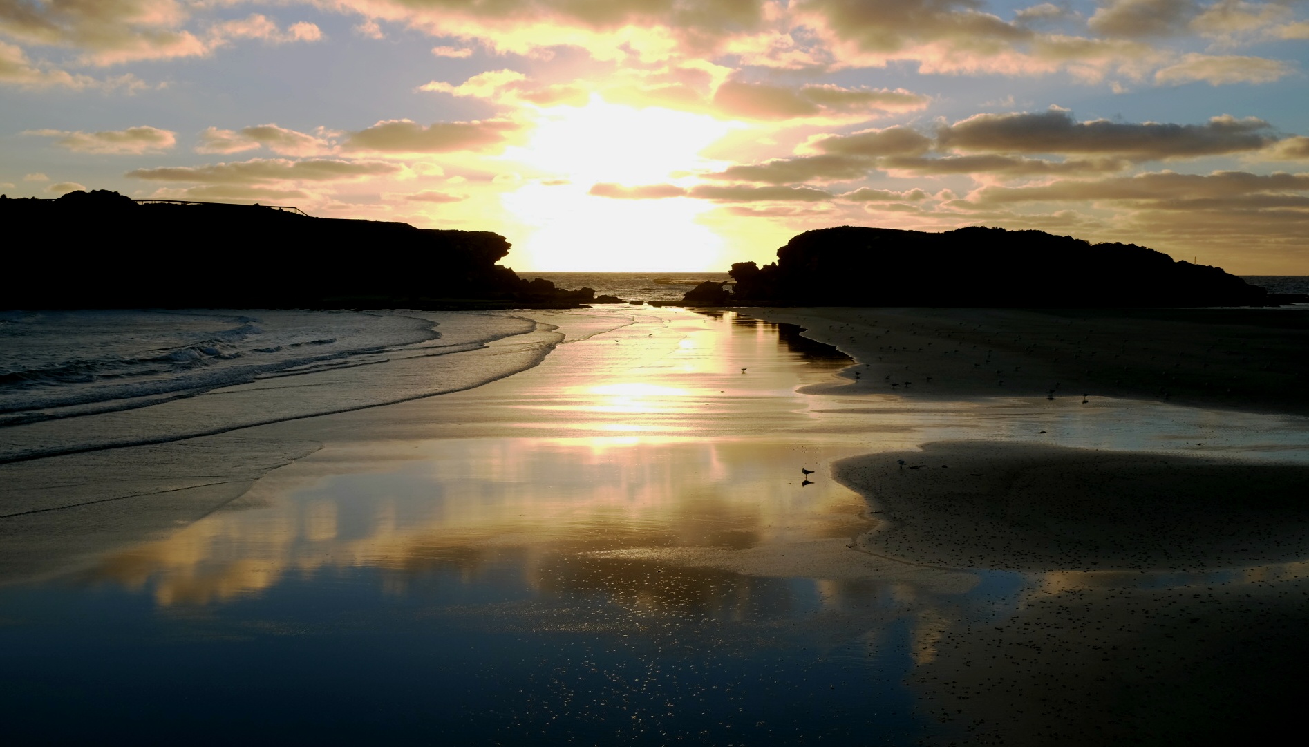 Stingray Bay by Mr.Dunne, on Flickr
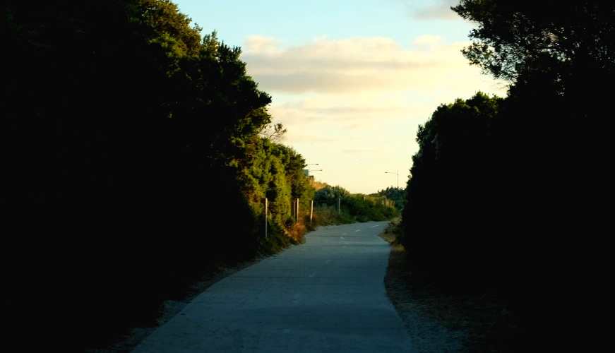 Light at the end of the tunnel by Mr.Dunne, on Flickr
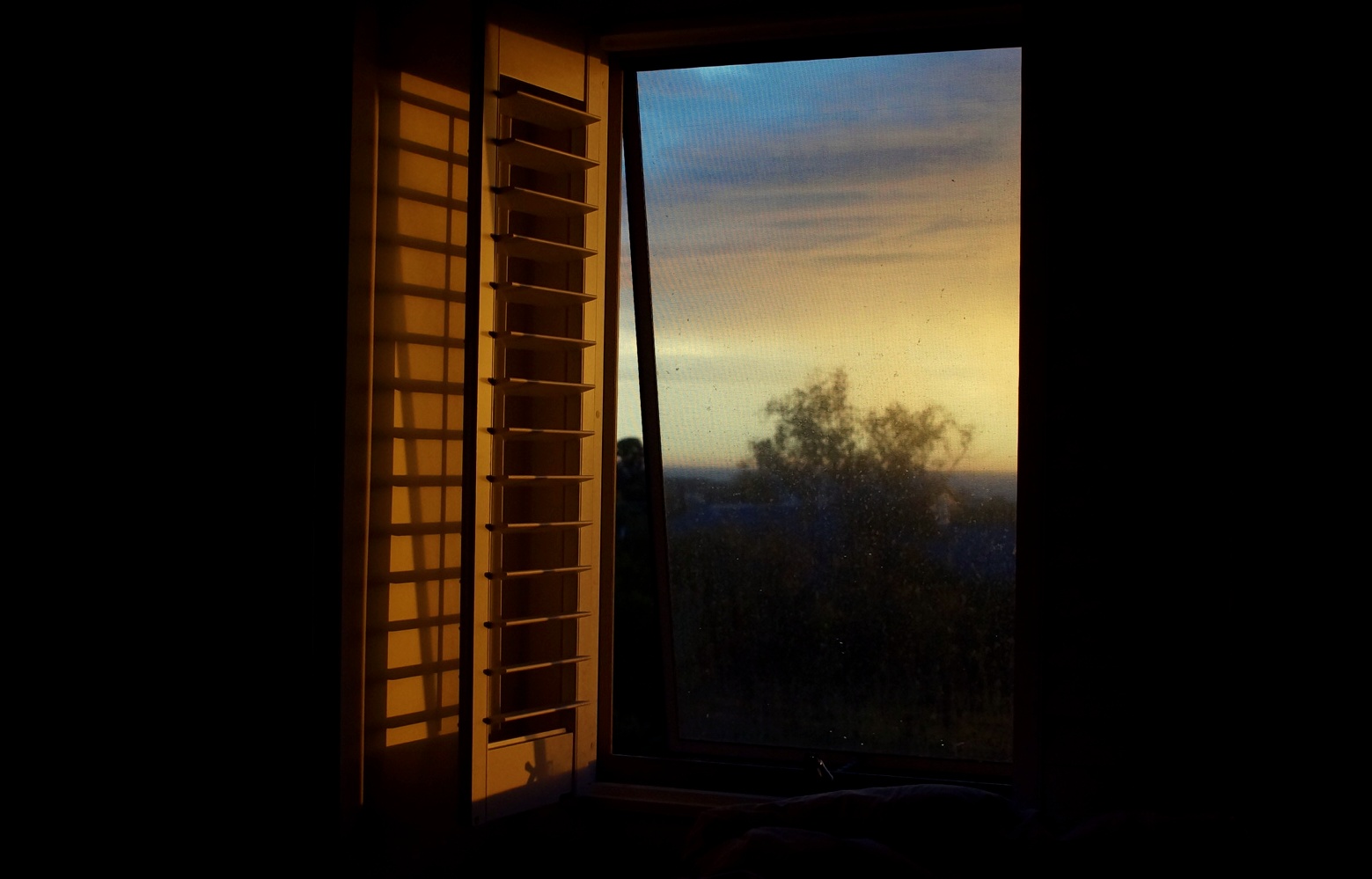 Roomy 2 by Mr.Dunne, on Flickr
 VanLife by Mr.Dunne, on Flickr
 Stingray Bay by Mr.Dunne, on Flickr
 Light at the end of the tunnel by Mr.Dunne, on Flickr
 Roomy 2 by Mr.Dunne, on Flickr
