Critique Stormy seas at St Marys, Whitley Bay

Messages
3,307
Name
Nick
Edit My Images
Yes
Had a trip down here the other night to try out my new LEE filter holder against the Cokin Z-pro one I had been using and these are the shots I came away with.
The holder makes a huge difference when coupled with the wide angle adapter ring, theres little to no vignetting at all which is refreshing as it was fairly prominent with the 100mm cokin holder.

1) 96 seconds @ f8 - ISO 200 23mm


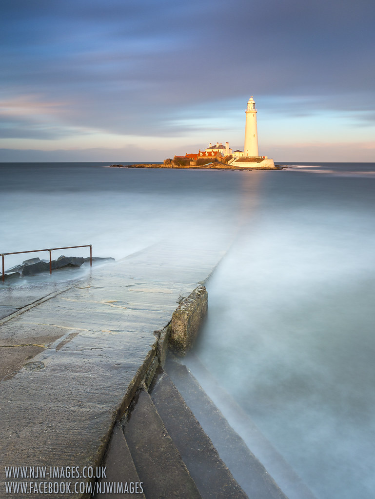
2) 102 seconds @ f9 - ISO 200 23mm


3) 1.3 seconds @ f11 - ISO 50 24mm


4) 1.6 seconds @ f9 - ISO 50 20mm
This ones processed then has a duplicate layer over the top which is desaturated and then reduced opacity, makes it look amost monotone.


Thanks

Nick
 
Last edited:
Number 3 for me, shows the power of the sea which is lost with the 10-stop. And corking light on the, urm, lighthouse! :)
 
Love them! I think the light house is over exposed in the first few to the point of being distracting but they're still really nicely composed & exposed.

You're making me want to take the tripod up to the North Wales coast this weekend. These long exposure coastal shots are still on my to-do list!

By the way. 3 has to be my fav, but only due to the water on the jetty in the 4th distracting me. Not sure if 4 would of worked nicer from a lower perspective bringing in more sky & possibly giving the light house more impact.
 
Great shots.
I particularly enjoy No.3 and No.4, and was wondering if cropping part of the lower area of 3. to give maybe a square format would give more focus to the stormy water on the end of the jetty and leads the viewpoint towards the lighthouse and cloud.
I quite like the water on the jetty in 4. as it gives some added drama and leads my eye nicely to the lighthouse, but I can see how it could be viewed as distracting - beauty is in the eye of the beholder!
 
Just sold my BigStopper - the ultra long exposure gig was a passing fad for me which was over quite quickly - shot 3 illustrates precisely the reason why I decided to get rid - you can't beat getting a bit of motion in the ocean, so to speak, as far as I'm concerned (-:
 
I'm confused. The histogram was perfect, there's no clipped highlights at all on the pics and the lighthouse isn't actually overexposed although a couple of people have mentioned that it looks it? I've looked on a few different monitors etc and I can't see it lol. Still though I appreciate the feedback :)
 
3 and 4 for me.
The first 2, whilst pretty, don't remotely say stormy to me.
 
Terrific set Nick, certainly 3 & 4 are my preferred choices with #3 edging it. I do feel it may be improved with a little toning down of the lighthouse,

Geoff
 
I'm confused. The histogram was perfect, there's no clipped highlights at all on the pics and the lighthouse isn't actually overexposed although a couple of people have mentioned that it looks it? I've looked on a few different monitors etc and I can't see it lol. Still though I appreciate the feedback :)

I loaded 1 and 3 into Capture NX2, and in the 1st the red channel is slightly clipped (and only slightly but I think enough) where as it isn't clipped in shot 3 - so that's probably what's causing it.
 
Very nice Nick

in #1 & 2 the lighthouse looks too bright and in #3 the sea is perfect but again the lighthouse is slightly too dominant as it is such a contrast to the rest of the scene.

I like how you have processed #4 - works very well and would look nice in a full B&W too (y)
 
I think Adrian pin points it, when it comes to the comments about 'over exposure'. It's not that it's overexposed it's just that it looks brighter against the more subtle background colours. Possibly because of the way the light is hitting it. So it makes it dominant and makes it pop. ( just like colour popping ). I think it would be a travesty to mute that golden light hitting the lighthouse, yes it does look a little bright but then it would look bright against that background. Ok maybe (if you must bend to convention and slip the lighthouse down half a stop).
I'm gonna be a pain in the ar** an say I like each one for different reasons!
1. I really like the way the colours stand out on the island, and the lovely subtle colours in the sky. As with No 2 love the underwater causeway peering up through the water, stretching out toward the lighthouse, also in the first two that nice little eddy current running round the RH side of the island. Buildings not quite as sharp.
2. This is really nice, love the colour and the light. I prefer this landscape view if I'm honest and the detail in the buildings is sharper here too. The eddy current stands out nicely here too. The shutter speed police will grumble about these I've no doubt.:).
3. Great change in the sky here almost evenly divided ether side of the lighthouse, with that thin ribbon of cloud joining the two. This shot is great with the lovely movement in the sea, you can also pick up some of those golden highlights hitting the water if you look close. With nice sharpness in the buildings again.
4. Interesting processing, semi mono shot. Love that sea running up the causeway, nice heavy looking sky. Business like lighthouse shot, very nice.

All 4 have appeal in different areas, nice exposures Nick, well shot!
 
Back
Top