

You are using an out of date browser. It may not display this or other websites correctly.
You should upgrade or use an alternative browser.
You should upgrade or use an alternative browser.
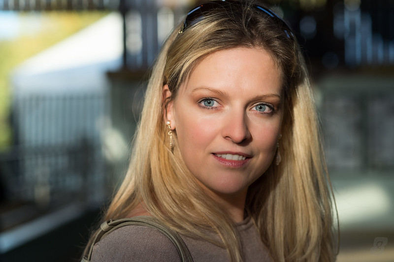
Tammy in natural light, but which crop?
- Thread starter gbmphoto
- Start date

On the Huh
Little Ball of Fur
- Messages
- 4,404
- Name
- Zulfi
- Edit My Images
- Yes
The skin thing...Quite subtle compared to others, I suppose it is noticable to other 'tographers than Joe public, but not too badly done imho.
Crop?... like both but prefer the tighter one.
Crop?... like both but prefer the tighter one.
- Messages
- 3,533
- Name
- John
- Edit My Images
- Yes
#2 for me also. Would suggest, getting rid of the yellow top left corner, it's quite distracting.
- Messages
- 4,517
- Name
- droj
- Edit My Images
- No
Not sure how to explain this so I'll just give the subjective version - composition-wise the first looks a bit disorganised and theres some contest between the face in particular and the surrounding 'clutter'. The second looks far more integrated and I'd say that it achieves a good dynamic repose. Does that make sense?
The yellow mentioned above is fine, it provides a nice little counterpoint. You can be too anal about things like that - it's better to retain a little freedom, and the result may be more life-like.
The yellow mentioned above is fine, it provides a nice little counterpoint. You can be too anal about things like that - it's better to retain a little freedom, and the result may be more life-like.
Last edited:
OP
- Messages
- 1,564
- Name
- Graham
- Edit My Images
- No
The skin thing...Quite subtle compared to others, I suppose it is noticable to other 'tographers than Joe public, but not too badly done imho.
Crop?... like both but prefer the tighter one.
Thanks Zulfi
") I tried to be as subtle as I could...
I tried to be as subtle as I could...
OP
- Messages
- 1,564
- Name
- Graham
- Edit My Images
- No
#2 for me
Thanks Bryn
OP
- Messages
- 1,564
- Name
- Graham
- Edit My Images
- No
#2 for me also. Would suggest, getting rid of the yellow top left corner, it's quite distracting.
Thanks John, I contemplated desaturating that, cloning it out or leaving it in and decided to just leave it be. It doesn't distract my eye too much, but I guess it's subjective too...
OP
- Messages
- 1,564
- Name
- Graham
- Edit My Images
- No
Not sure how to explain this so I'll just give the subjective version - composition-wise the first looks a bit disorganised and theres some contest between the face in particular and the surrounding 'clutter'. The second looks far more integrated and I'd say that it achieves a good dynamic repose. Does that make sense?
The yellow mentioned above is fine, it provides a nice little counterpoint. You can be too anal about things like that - it's better to retain a little freedom, and the result may be more life-like.
Thanks Rog, it makes perfect sense. The tighter crop is also my preference, but I wonder if you would say the same if I had not included both images for comparison? On it's own, #1 doesn't seem too cluttered, does it?
Also, I guess cropping into the head like that might not be to everyone's tastes.
OP
- Messages
- 1,564
- Name
- Graham
- Edit My Images
- No
They both look cool to me.
On this occassion I do prefer the first__Sorry to throw a spanner into the works but c'mon theres not much in it
Gaz
Haha, no spanner
it is just a 'slightly' different crop
OP
- Messages
- 1,564
- Name
- Graham
- Edit My Images
- No
They both look good to me,I don't get the plastic y skin bit? just an excellent shot of a good looking woman, for me the first one.
Thanks Derek, not too sure about the plastic skin bit either :shrug:
- Messages
- 11,756
- Name
- David
- Edit My Images
- No
@gbmphoto Tight crop for me. The first, wider image has clipped the top of her head. My rule is, crop it, or don't, but snipping bits off just looks sloppy, so as you've clipped the top of her head in a way that can't be explained away as a creative choice... and instead is just poor framing, I'd crop it tight.
BTW.. I know the thread isn't about your retouching, but it's the first think I noticed. She LOOKS retouched. Retouching should either be overt, and well done, as in fashion photography, or invisible. This image clearly wouldn't be appropriate for the full on treatment, so it should be invisible. I can tell it's retouched, so therefore the retouching has failed. The crop is the least of this image's problems. I'm baffled some people can't see this. However, given that some can't spot that this is over-retouched, I seriously think you should be listening to those that CAN spot it.
How are you retouching? The biggest mistake most people make is to under-estimate how much retouching they're actually doing.... or use all these silly "skin softening" techniques on the interwebz... they suck, and looks crap invariably. You don't need to use any of that.
Last edited:
OP
- Messages
- 1,564
- Name
- Graham
- Edit My Images
- No
To me the skin looks too blurred ,and the eyes have been whitened too much ,
just looks unatural IMHO.
Thanks for coming back to reply @wambam
OP
- Messages
- 1,564
- Name
- Graham
- Edit My Images
- No
@gbmphoto Tight crop for me. The first, wider image has clipped the top of her head. My rule is, crop it, or don't, but snipping bits off just looks sloppy, so as you've clipped the top of her head in a way that can't be explained away as a creative choice... and instead is just poor framing, I'd crop it tight.
BTW.. I know the thread isn't about your retouching, but it's the first think I noticed. She LOOKS retouched. Retouching should either be overt, and well done, as in fashion photography, or invisible. This image clearly wouldn't be appropriate for the full on treatment, so it should be invisible. I can tell it's retouched, so therefore the retouching has failed. The crop is the least of this image's problems. I'm baffled some people can't see this. However, given that some can't spot that this is over-retouched, I seriously think you should be listening to those that CAN spot it.
How are you retouching? The biggest mistake most people make is to under-estimate how much retouching they're actually doing.... or use all these silly "skin softening" techniques on the interwebz... they suck, and looks crap invariably. You don't need to use any of that.
Thanks for commenting @Pookeyhead - it really wasn't about the retouching, but I welcome any feedback that helps me to grow and improve. I'll probably be shot at dawn if Tammy ever logs in again and sees this, but here is the image just with exposure/levels adjustment and the Retouched version - close up.

SOC

Retouched
Now it is plain to see that the retouched version has, well, been retouched. However, I don't think it's as extreme as some people are saying here. Take the eyes for instance - yes, the irises are clearly different but the whites are hardly any different. If you look at the skin, you can still see some imperfections, wrinkles, etc. but the blotchiness is nicely smoothed out.
I am not a Photoshop guru - I use it for things that I can't do in Lightroom, but I just can't get on with it when it comes to retouching. I use Portrait Professional for most of my skin/face retouching and have got some great results from it (IMHO).
I get that it's not to everyone's tastes, but let me tell you, if Tammy had to choose between the two, she would choose the retouched version every day of the week. That's something that I see a lot of on these threads - we tend to crit other's work through our photographer's eye and that certainly helps people like me who have been around a while and can choose what advice to take and what advice to park. My first retouched photo was PLASTIC with a capital P and the advice and crit I got when I posted it (and a few more afterwards) helped me to see the error of my ways, but I think I have improved tremendously at it and I definitely dial those sliders down way more than I used to.
Hope that came across ok - it's not that I don't value feedback like this, but I wanted to show that it's really subjective.
- Messages
- 11,756
- Name
- David
- Edit My Images
- No
Now it is plain to see that the retouched version has, well, been retouched. However, I don't think it's as extreme as some people are saying here. Take the eyes for instance - yes, the irises are clearly different but the whites are hardly any different. If you look at the skin, you can still see some imperfections, wrinkles, etc. but the blotchiness is nicely smoothed out.
That's where I'll have to disagree. The smoothing stood out to me quite plainly. I was also noticing something very strange with the mouth and teeth, but that's not on your crop. The smoothing actually make it look blotchy to me, as it's not consistent. It's been applied more in some places than in others, so I can see where it's been smoothed. Basically, unless you are being blatant with your retouching as in a high end fashion shoot where no one expects reality, retouching should be invisible. If you can see it, you've failed. It's as simple as that. There's no need to use ANY smoothing. "Smoothing" is a lazy way of retouching. It's popular because it's a global adjustment instead of a lot of fine, painstaking work locally. It sits well with the slider moving generation, but unfortunately... it's just crap. It's not the smoothness of the skin that's the issue here, it's highly localised redness and blotchiness.. and of course, a few spots, dried skin and open pores. "Smoothing" attempts to "cover them" instead of actually retouching them, and it also usually fails miserably at removing the redness. Look at the examples on the Portrait Professional website... they LOOK retouched.
I am not a Photoshop guru - I use it for things that I can't do in Lightroom, but I just can't get on with it when it comes to retouching. I use Portrait Professional for most of my skin/face retouching and have got some great results from it (IMHO).
There's a reason Photoshop is an industry standard, and that's because it is quite simply the best tool for the job when it comes to retouching. However, it takes skill, practice, and time to get the results, which is where some people lose interest. There are no short cuts I'm afraid. Programs like portrait professinal try to be just that, but they are compromises. They try to retouch making global changes instead of highly localised ones, and that I'm afraid, will never be as successful.
I get that it's not to everyone's tastes,
Retouching of natural portraits, shouldn't be about taste, it should be about it being invisible unless you had the original to compare it with.
but let me tell you, if Tammy had to choose between the two, she would choose the retouched version every day of the week.
Of course!... it's the lesser of two evils
.. and it's not bad at all. That's something that I see a lot of on these threads - we tend to crit other's work through our photographer's eye and that certainly helps people like me who have been around a while and can choose what advice to take and what advice to park. My first retouched photo was PLASTIC with a capital P and the advice and crit I got when I posted it (and a few more afterwards) helped me to see the error of my ways, but I think I have improved tremendously at it and I definitely dial those sliders down way more than I used to.
Good. However... when do you decide to stop listening? Can I suggest it's when people stop noticing the retouching? When they do, then you've probably got it right.
Hope that came across ok - it's not that I don't value feedback like this, but I wanted to show that it's really subjective.
And I want to show that it's not subjective. If you know that it's been retouched, then it's failed. Tammy will know of course, no matter how superb the work is, but no one else should be able to... surely that's what you're aiming for with a natural portrait like this. I don't know Tammy - For all I know, she could have the most flawless skin in the world, but I KNEW that image was retouched. You really don't want people seeing it. If they see it, then it's failed, and that's not subjective.
Portrait Professional blows. Sorry.. it just does.
Spend some time getting to grips with photoshop.. it's well worth the effort.
Have a try at this.... You won't have the files to work with this (they were only stock library shots anyway), but you can work with the shot of Tammy.
https://dl.dropboxusercontent.com/u/23953768/Week 17 - Believable Retouching.pdf
Last edited:
- Messages
- 31
- Name
- Dean
- Edit My Images
- Yes
I think it’s the tonal grad on the face that stands out to me, I’d be tempted to up the lower part of the shot a quarter stop? LR has a great grad tool for that.
The softening technique has softened the larger tones a tad too much - which is heavily contrasted to the sharp highlights? Which makes the retouching stand out as - well - retouched?
She’s also a nudge off looking at the lens - looking picture left slightly. The second looks better as it seems to be following the two thirds rule?
Last edited:
D
Dinsdale
Guest
I like ~2 myself.