

You are using an out of date browser. It may not display this or other websites correctly.
You should upgrade or use an alternative browser.
You should upgrade or use an alternative browser.
Critique The Fence
- Thread starter Tannachy
- Start date
 The Fence
- Messages
- 299
- Name
- Gerry
- Edit My Images
- Yes
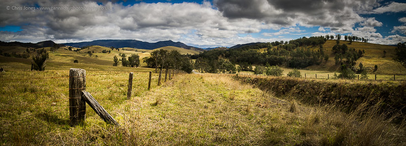
The only critique I can make is it is really good.
- Messages
- 20,926
- Name
- Steve
- Edit My Images
- Yes
The sky is too dark relative to the foreground. The lead in is great but the sky just doesn't look natural
Yep, very true. A little heavy handing with the PP. Although it is worsened by the slight vinaigrette I added. Thanks.The sky is too dark relative to the foreground. The lead in is great but the sky just doesn't look natural
I think the lean is the lie of the land... As for the oversharpened, very much so, in bed with tired eyes. Something I'll fix. Thanks.I like it, 1950's Hollywood. I wish I could do it.
Tends to lean from left to right and looks over-sharpened, but I still wish that I could do it.
- Messages
- 29,465
- Name
- Bat-Frog
- Edit My Images
- No
Yep, very true. A little heavy handing with the PP. Although it is worsened by the slight vinaigrette I added. Thanks.
I think the lean is the lie of the land... As for the oversharpened, very much so, in bed with tired eyes. Something I'll fix. Thanks.
Salad dressing on your images will never enhance them
 (Sorry, couldn't resist)
I quite like the shot. Agree that it's a tad over PP'ed.
I'd like to have see it shot from a lower perpective though....perhaps from lying down looking along the path.
- Messages
- 175
- Name
- frank
- Edit My Images
- Yes
As the light is coming from the right i would expect it to carry through but with the slight touch of vinqette has spoilt it a tad which made me look for other areas of PP but overall a good capture , i agree with the clouds too much those would look better in Mono.....cheers
- Messages
- 18,182
- Name
- Geof
- Edit My Images
- Yes
Salad dressing on your images will never enhance them

you brute...doncha know 'es an ozzie
Just plain old Photoshop CC.which stich programme did you use, old chap...its good
It's not exactly 3:1 but it could be cropped to it with no noticeable difference.sky is overdone IMO but a nice scene and love that sized crop, 3:1 is it?
- Messages
- 18,182
- Name
- Geof
- Edit My Images
- Yes
Just plain old Photoshop CC.
you may find microsoft ICE...free of some use..
http://research.microsoft.com/en-us/um/redmond/groups/ivm/ice/