

- Messages
- 414
- Name
- Neil
- Edit My Images
- Yes
these are my first go at using grad filters on the camera and the longer exposures required show me I need a better tripod.
All crit and comments welcome.
first two are before and after sunset at Trevose Head. third is overlooking Treyarnon Bay.
 Trevose Head lighthouse. by NikonNeil, on Flickr
 trevose head lighthouse by NikonNeil, on Flickr
 on the edge by NikonNeil, on Flickr
and could not resist a shot of a surfers dog.
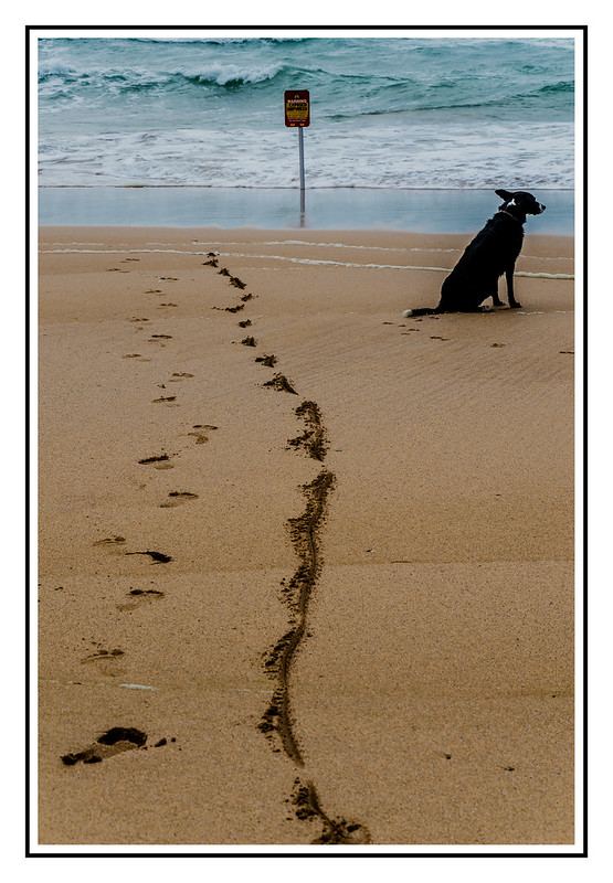 surfers dog by NikonNeil, on Flickr
All crit and comments welcome.
first two are before and after sunset at Trevose Head. third is overlooking Treyarnon Bay.
Trevose Head lighthouse. by NikonNeil, on Flickrtrevose head lighthouse by NikonNeil, on Flickron the edge by NikonNeil, on Flickrand could not resist a shot of a surfers dog.
surfers dog by NikonNeil, on Flickr