

- Messages
- 109
- Name
- Daz
- Edit My Images
- No
I'm trying out some different PP techniques. These two were done with Topaz Simplify.
 Rosguill Boatyard by Daz Brown Photography, on Flickr
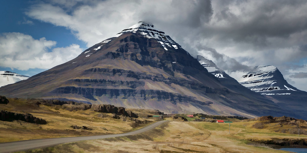 The Pyramid by Daz Brown Photography, on Flickr
Rosguill Boatyard by Daz Brown Photography, on FlickrThe Pyramid by Daz Brown Photography, on Flickr