Tunnel vision.

Messages
365
Name
Robert Hofstra
Edit My Images
No
One of Rotterdams subway stations.
DSC_3308_zpsec84ec1c.jpg
 
Hi, Robert, I'm a fan of this genre. The symmetry is just about right and you have some nice detail.

I tend to prefer these in B&W and having converted it does worker better, for me, in B&W. It also removed the green graphics, that draw my eye.

I also removed the two people to emphasise the symmetry.

Cheers and any more?

Cheers.
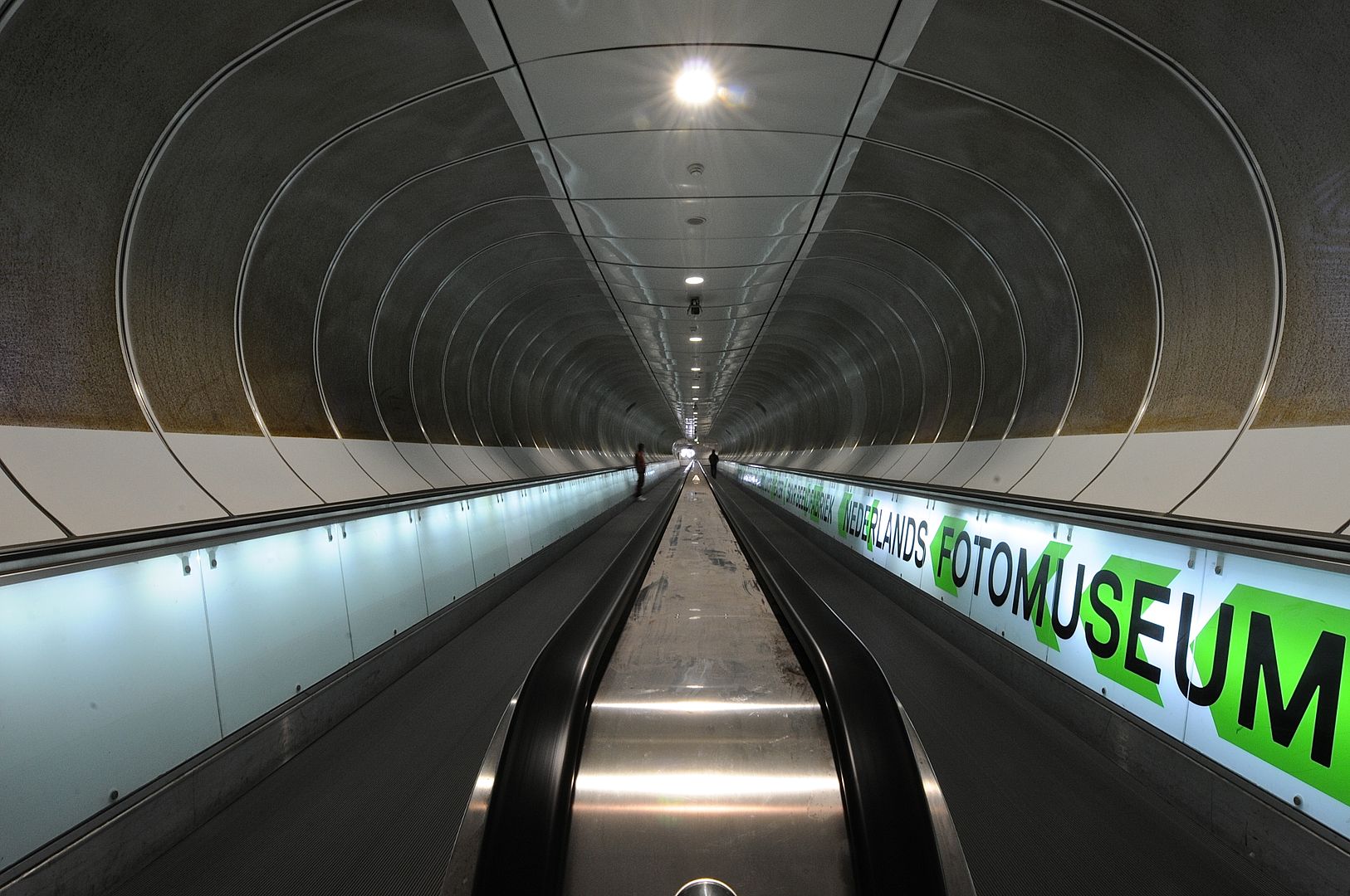
 
I disagree Andy I think the two people help to give the image a bit character and nicely in the distance so they don't impose. The writing also helps to soften the stark symmetry but agree the green should taken down or even changed to a grey.
All a personal opinion of course, and I agree with Andy, also liking the image even if with a difference in the detail.
 
OK, now this is getting creepy! I was at that subway station yesterday too. The writing on the right hand side is very eye-catching and it is a shame these isn't anything on the left to balance it (not your fault obviously). I also think a good B&W conversion might work well.
 
Back
Top