Vampire Hunter

Messages
108
Name
DILLIGAF
Edit My Images
No
W7XArB9.jpg
 
I like this - it is unusual and has atmosphere that (I think ) you are wanting to create ie vampiry/something a bit frightening/threatening. I like the impression of mist/fog at the bottom. Maybe a gravestone would be a good addition if you happened to have one spare:)

The main reason for the large amount of black space above the guy's head seems to be simply to get your logo in (which I can't actually read). For me, the top part could probably be cropped by about half - but maybe that would then make the figure too central in the frame.

I think the general idea is great and I guess you could probably develop it into something really good.
 
hi thanks :) the maain reason for the space was i wanted it to make the woodland look vast and make him

look insignificant in a very dark overbearing and forboding forest :)

i guess i wanted the forest to be the main focus of the portrait with the guy just a small part of it

and the logo was originally white in the white mis :) and its 2 made up words Aetherial Picotmancy (you would really only understand what it means if your into steampunk)
 
Last edited:
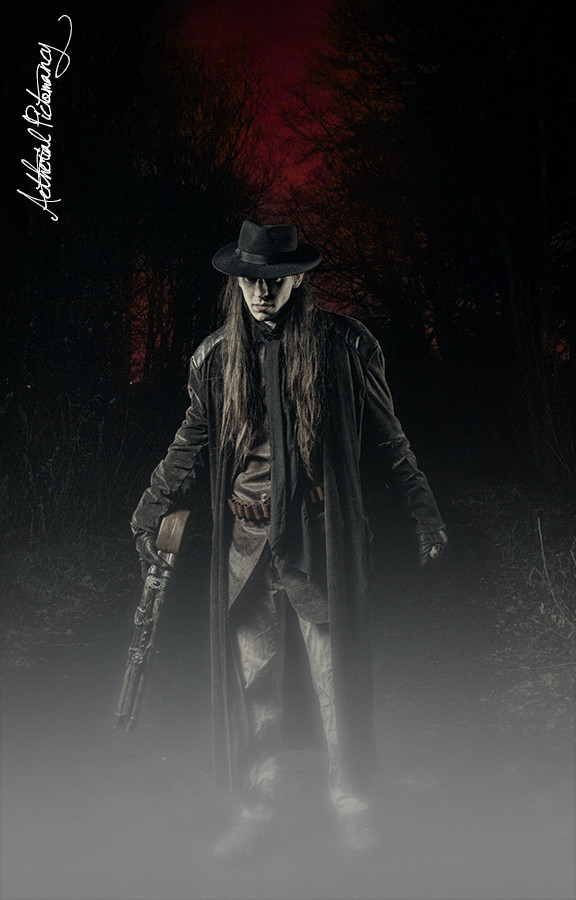
love the idea. couple thing bother me tho which i would probably do different. I agree too much space at the top....( and i too am having difficulty making out what your watermark says) and the line of fog for me is too solid.... fog and mist undulate it looks like you have used a graduated layer and fogged it.... i would make the whole fog more transparent in places and more uneven...and lower down.... i think it owuld look much more natural... the rest i really like and i love the concept and styling.
just read the reason for the amount of space.,,,perhaps it would work better if there were more detail in the space above as it is the red in the middle is really the only thing that has much detail in and so its not really using the forest its just blackness... just a thought
 
Last edited:
Thanks for responding - I guess the logo doesn't need to be readable so long as it is recognizable and I also guess your clients have seen it already.

Re the forest/background/red - they totally passed me by and even now I can just about make out the red bit. If they are clear on the hard copy /a properly calibrated screen then fine (mine isn't calibrated and is just a laptop)
 
yeah the name looks fine in the poster print and u can see the red a lot clearer on my retina display on my ipad than on my laptop.

also @Fiona the mist was the lesser of two evils. the model for the shoot turned up having forgotten his shoes so hes wearing trainers, much to the directors anger lol :) i kept out the way while he ranted
 
Last edited:
Back
Top