

- Messages
- 8,261
- Name
- Carl
- Edit My Images
- Yes
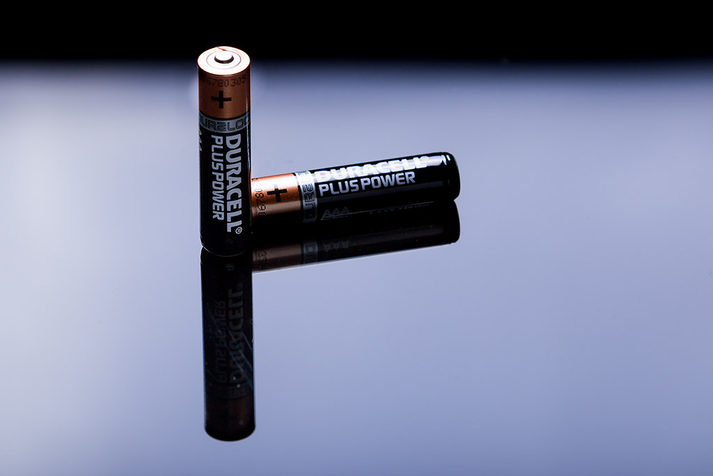
Its my 2nd attempt, so feel free to nit pick at anything - I want my next set to be <flawless> (if thats possible).
1..

2..
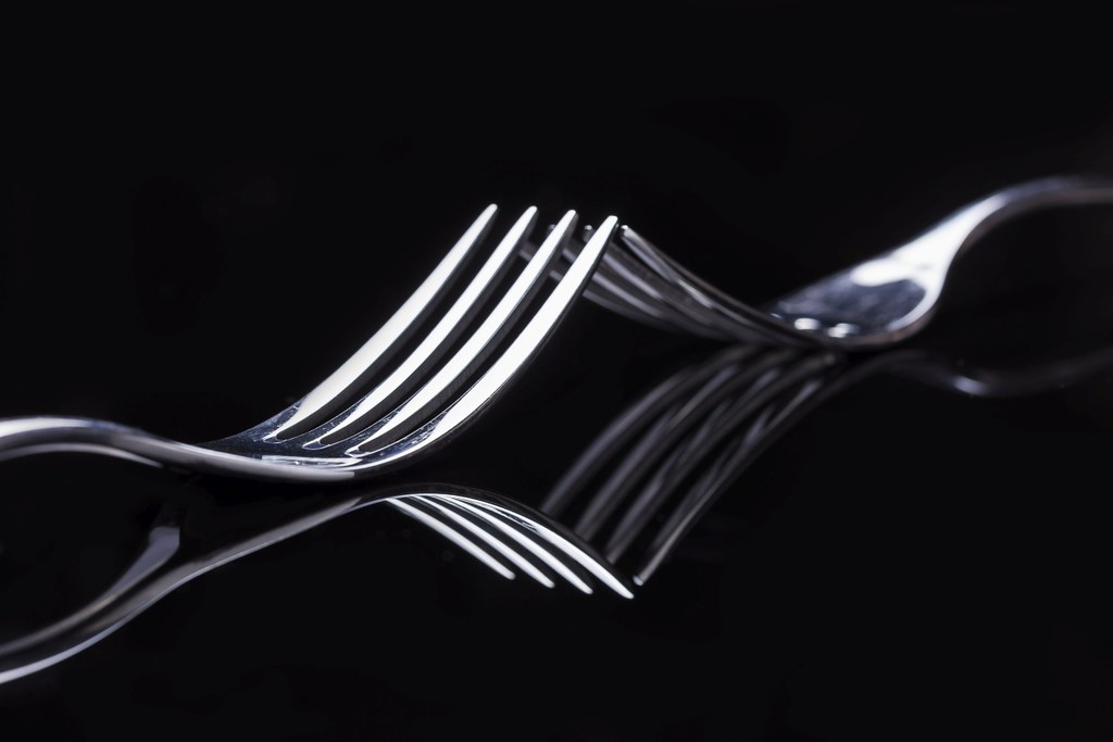
3..
4..
5..
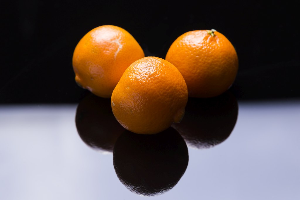
6..
Cheers for popping in.
Lessons I learned: Higher aperture (closed more, maybe F16/F18 or even F20), clean my lenses and blow any dust off that might be on the sensor. Also, keep cleaning the perspex. Every little mark shows up... (I cleaned most of the marks off with the spot removal or clone tool).
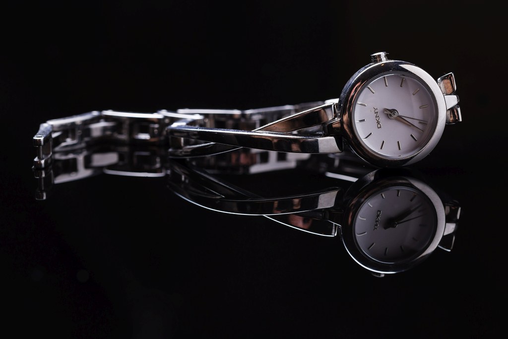
1..
2..
3..
4..
5..
6..
Cheers for popping in.
Lessons I learned: Higher aperture (closed more, maybe F16/F18 or even F20), clean my lenses and blow any dust off that might be on the sensor. Also, keep cleaning the perspex. Every little mark shows up... (I cleaned most of the marks off with the spot removal or clone tool).
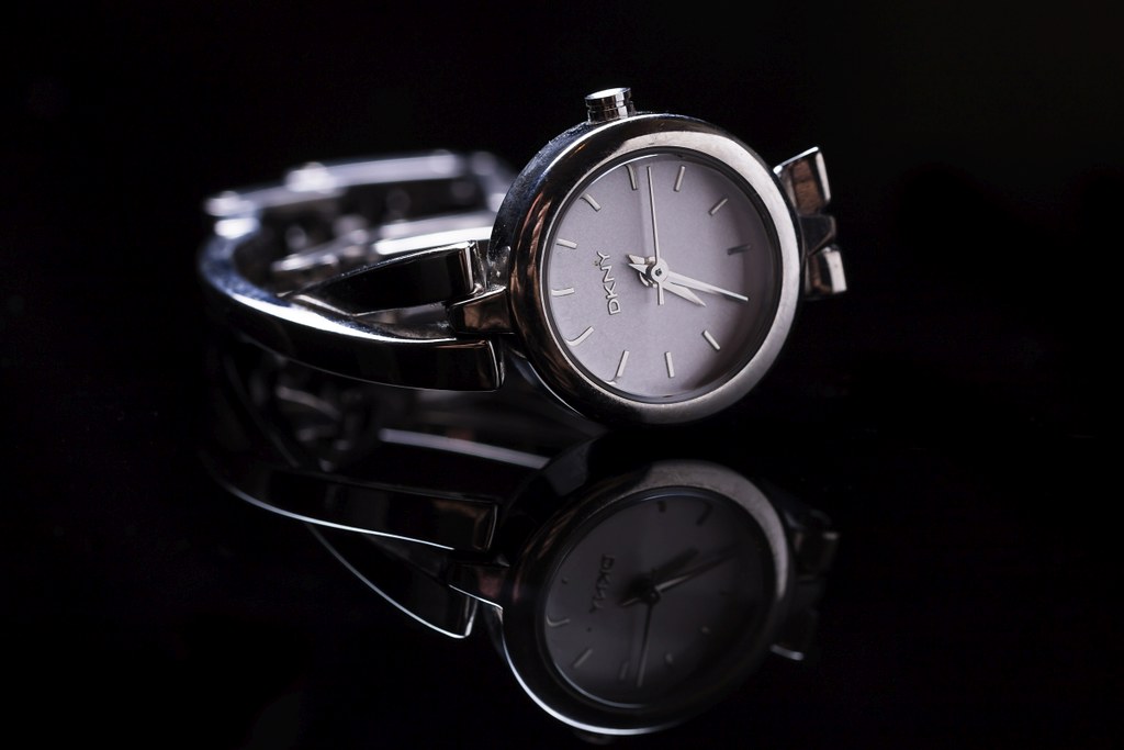
") you have cut the shadow at the front. Maybe a light above with a big sheet of muslin in a frame check out Garry's
you have cut the shadow at the front. Maybe a light above with a big sheet of muslin in a frame check out Garry's 
