

You are using an out of date browser. It may not display this or other websites correctly.
You should upgrade or use an alternative browser.
You should upgrade or use an alternative browser.
weekly Zebs 52 week Challenge Week 16 Pride Added
- Thread starter zeb
- Start date
- Messages
- 2,820
- Name
- Mark
- Edit My Images
- Yes
I like your vice shot, but do find it a little cluttered; it takes too much effort to work out what it's about IMHO.
Bit worried about the amount of vice related paraphernalia you have readily to hand as well")
Bit worried about the amount of vice related paraphernalia you have readily to hand as well
OP
- Messages
- 1,139
- Name
- Trevor
- Edit My Images
- Yes
Lovely magical sunset in a great location.
Cant make up my mind about vice. Get the idea but perhaps too many items in one heap. Gambling, sex, drink. A man with many vices! lol. Well lit and shot though + meets the theme
All bar the lotto tickets were borrowed honest
Magical - Lovely shot that... very magical !!!
Vice - Lots in the shot that's for sure, but nicely set-up, I like the black background and definetley on theme
Looking at it now I think the shot without the cards and lotto tickets would have worked better
Magical - gorgeous, very magical and I think its a great shot.
Vice - I like the idea, well lit and a good selection of stuff. But I think if anything I would have taken it from above.
Tried a few different angles as well as from above but this one seemed to work best for me but I know what you mean.
Vice is certainly on theme but..........
I think it needs a tighter (though not too tight) crop.
I also can see where one of your layers you've used hasn't been completed or finished off? IE I can see where you've either brushed in or out or erased on one layer (perhaps to get the black even?) but there's evidence on the upper half and the lower left corner?
I do like the clarity of the actual "vice" though, just some more practice in post processing needed.
PS. I love the high heel shoe in the shot, dont know why, but it just "speaks" to me LOL
Your right about the crop looking at it now but I think I rushed this one a bit due to being late posting.
As for the layers I cant see them on my laptop but I had the same problem the other week and could only see the problem on my sons screen I will have to bear this in mind when working on a black background in future.
OP
- Messages
- 1,139
- Name
- Trevor
- Edit My Images
- Yes
As mentioned by Paul above, on theme yes but I find this a bit cluttered.
Not really up to the standard that we've seen from you on previous weeks Trevor, apologies if that sounds harsh its not intended to be. Iain
Think you are right there Iain, no need to apologise at all, I couldnt get the shot I wanted I had the girl the Ferrari and location sorted but I didnt have a night free to shoot it so had to come up with this quickly.
I like your vice shot, but do find it a little cluttered; it takes too much effort to work out what it's about IMHO.
Bit worried about the amount of vice related paraphernalia you have readily to hand as well
Vice, looks quite good to me, I wonder if it would work with a bit of a rotation?
Thank you for all your comments see above post
- Messages
- 6,408
- Edit My Images
- No
'Magical' - really nice image. I love the slow moving cloud so good choice of camera speed, nice colours too.
'Vice' - bang on theme, the black background works well with the props - it's all there !
Nick
'Vice' - bang on theme, the black background works well with the props - it's all there !
Nick
OP
- Messages
- 1,139
- Name
- Trevor
- Edit My Images
- Yes
Week 14 Entrance.
Was a bit stumped this week I would have liked to have shot a church through the main door but could'nt find one with the main front door open.
This is my next choice the entrance to Portsmouth Harbour with the sun setting to the left and the cross channel ferry arriving, the walls on the right are know locally as the hot walls with the spinnaker tower in the background.
Canon 5d mk2: 17-40mm L. f/9 at 1/160 ISO 200

Week 14 Entrance by zeb2012, on Flickr
Was a bit stumped this week I would have liked to have shot a church through the main door but could'nt find one with the main front door open.
This is my next choice the entrance to Portsmouth Harbour with the sun setting to the left and the cross channel ferry arriving, the walls on the right are know locally as the hot walls with the spinnaker tower in the background.
Canon 5d mk2: 17-40mm L. f/9 at 1/160 ISO 200
Week 14 Entrance by zeb2012, on Flickr
D
Deleted member 3428
Guest
Nice one Trev,you must have been standing on Victoria Pier l reckon.
- Messages
- 2,820
- Name
- Mark
- Edit My Images
- Yes
Ah, home
Nice shot, extremely well timed, and you did well to keep detail in the shadows.
PS, I know a bloke called Trevor who lives in Portsmouth, it's not you is it?
Nice shot, extremely well timed, and you did well to keep detail in the shadows.
PS, I know a bloke called Trevor who lives in Portsmouth, it's not you is it?
- Messages
- 8,398
- Name
- Lynne
- Edit My Images
- Yes
Hi Trevor
Vice....I quite like this one ( only seen your edited version I think?)...good selection of vice's , bit of a mess which is another vice...yeah...like it
Entrance....thats one big ship....right on theme , nicely exposed...possibly a little lighter on the ship but only possibly...yup , another from me
Vice....I quite like this one ( only seen your edited version I think?)...good selection of vice's , bit of a mess which is another vice...yeah...like it
Entrance....thats one big ship....right on theme , nicely exposed...possibly a little lighter on the ship but only possibly...yup , another
from me*Sarah*
Peel Me!
- Messages
- 1,873
- Name
- Sarah
- Edit My Images
- Yes
Hi Trevor, what a good idea for entrance! You've done well with what looks like tricky lighting.
It seems ages since we last went down to Portsmouth for the kite festival, you never know we might even get there again this year for it and have a meet at the same time!!!
It seems ages since we last went down to Portsmouth for the kite festival, you never know we might even get there again this year for it and have a meet at the same time!!!
- Messages
- 13,760
- Edit My Images
- Yes
Entrance - A well caught shot, nicely exposed, liking the detail in the wall and the light coming from behind the ship
OP
- Messages
- 1,139
- Name
- Trevor
- Edit My Images
- Yes
Week 15 Soft
Firstly apologies to anyone that I have not got round to comment your thread, but have been so busy at work I really havent the energy at night but hope to make amends next week and get back to normal.
This week was tough, tried a few things but wasnt happy with them as they just didnt say soft that clearly to me, so I ended up with this one.
Comfort makes your clothes soft and its dropped into a very soft blanket so soft that it collapses in on itself, (as the advert of a long time ago although I think that was Lenor fabric conditioner)
Trying to create enough blur from the bottle dropping into a soft blanket and getting some movement in the blanket itself proved very hard to do in a single still shot, not a 100% happy with it but I'm not going to have time to do anythink else so this is it.
Constructive C&C welcome
Canon 5d mk2: 17-40mm L. f/22 at 8 Secs ISO 100. With natural light

Week 15 Soft by zeb2012, on Flickr
Firstly apologies to anyone that I have not got round to comment your thread, but have been so busy at work I really havent the energy at night but hope to make amends next week and get back to normal.
This week was tough, tried a few things but wasnt happy with them as they just didnt say soft that clearly to me, so I ended up with this one.
Comfort makes your clothes soft and its dropped into a very soft blanket so soft that it collapses in on itself, (as the advert of a long time ago although I think that was Lenor fabric conditioner)
Trying to create enough blur from the bottle dropping into a soft blanket and getting some movement in the blanket itself proved very hard to do in a single still shot, not a 100% happy with it but I'm not going to have time to do anythink else so this is it.
Constructive C&C welcome
Canon 5d mk2: 17-40mm L. f/22 at 8 Secs ISO 100. With natural light
Week 15 Soft by zeb2012, on Flickr
- Messages
- 2,820
- Name
- Mark
- Edit My Images
- Yes
I agree it could have done with less wall and more bottle, but it's a great shot, and I think you've done really well to get the bottle face on with the right amount of motion blur.
OP
- Messages
- 1,139
- Name
- Trevor
- Edit My Images
- Yes
Week 16 Pride
Well someone had to do it didnt they.
Well it is my pride and joy since i bought it just so in love with it, Nothing to describe really only that its my first go at light painting.
Constructive C&C welcome
Canon 7d: 70-200mm L. f/25 at 30 secs ISO 100 Light painted.
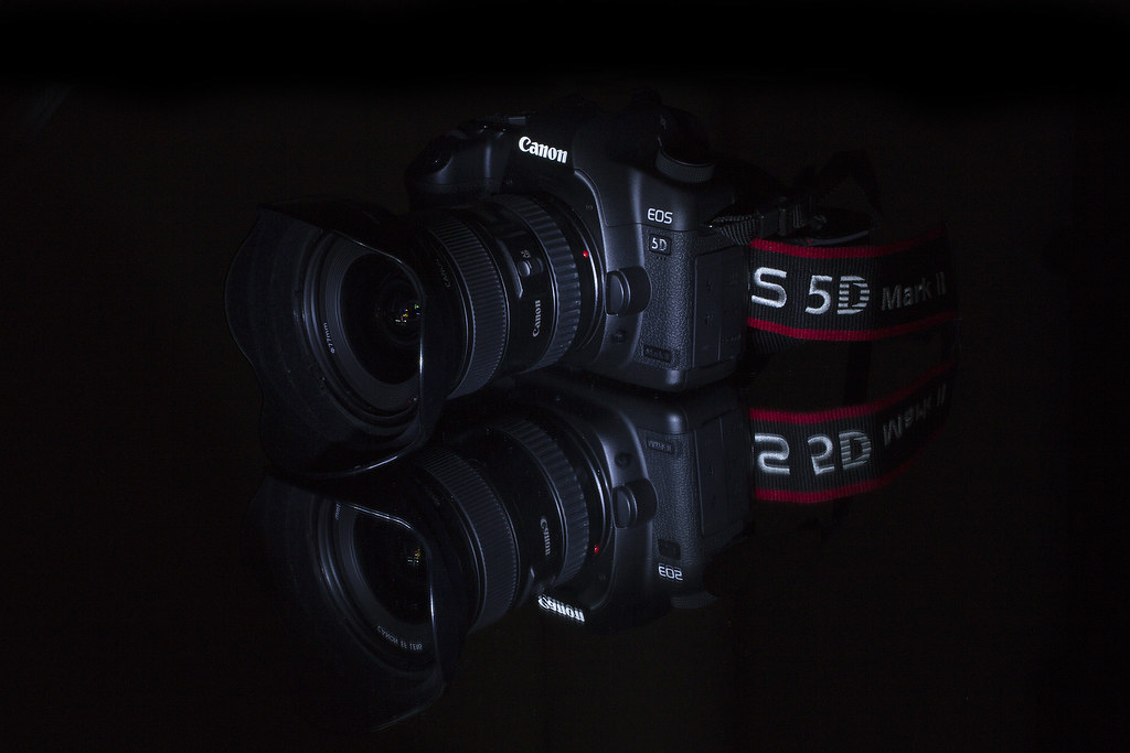
Week 16 Pride by zeb2012, on Flickr
Well someone had to do it didnt they.
Well it is my pride and joy since i bought it just so in love with it, Nothing to describe really only that its my first go at light painting.
Constructive C&C welcome
Canon 7d: 70-200mm L. f/25 at 30 secs ISO 100 Light painted.
Week 16 Pride by zeb2012, on Flickr
Last edited:
- Messages
- 13,760
- Edit My Images
- Yes
Hi Trevor
Soft - Once I spotted the blur after a couple of seconds, I think it's a good shot, well captured and great idea
Pride - (Now there's one of my idea's gone ) Looks a cracker, nicely set up, light painting looks real good and good reflection
Soft - Once I spotted the blur after a couple of seconds, I think it's a good shot, well captured and great idea
Pride - (Now there's one of my idea's gone
) Looks a cracker, nicely set up, light painting looks real good and good reflection- Messages
- 19,461
- Name
- Andy
- Edit My Images
- Yes
Hi, there, missed a few 
Entrance, yip that's one hell of an entrance. I'd have been tempted to crop a tad off the sky as it wasn't working for you. LH side of the boat feels a bit close to the LH side. Overall it's well composed for such a large composition.
Soft, I did a similar one for last year's 52 and it was quite hard. You've got fabric softener and soft blanket so nice one. For me, even though I can see the motion blur the bottle does look static.
Pride...is a good one (but it's a canon...). You've done well with the light painting and I'm a sucker for reflections. Just the lower reflection a bit close to the edge and not sure what that is on the top BG?
Cheers.
Entrance, yip that's one hell of an entrance. I'd have been tempted to crop a tad off the sky as it wasn't working for you. LH side of the boat feels a bit close to the LH side. Overall it's well composed for such a large composition.
Soft, I did a similar one for last year's 52 and it was quite hard. You've got fabric softener and soft blanket so nice one. For me, even though I can see the motion blur the bottle does look static.
Pride...is a good one (but it's a canon...
). You've done well with the light painting and I'm a sucker for reflections. Just the lower reflection a bit close to the edge and not sure what that is on the top BG?Cheers.
- Messages
- 4,828
- Name
- Alan
- Edit My Images
- Yes
Hi Trevor
Entrance - good idea for the theme and well composed .. You have done well with the lighting to expose the elements as well as you have. Good bright shot
Soft - extremely good idea. Probably better to take off the top line of dots on the background. Somehow there seems to be too much of the blanket oof as such a size of bottle would probably not have that much effect. Also the lines of colour falling with the bottle seem too uniform. That all being said, what you have tried seems to be very difficult and may be one that needs more time to get right - and as you have said, time has been at a premium for you this week. Really good effort which is bang on theme.
Pride - excellent idea, well composed. I find it hard to see what others have queried about the background but that may be my monitor. Crystal clear focus on the writing and that camera looks well cared for.
Entrance - good idea for the theme and well composed .. You have done well with the lighting to expose the elements as well as you have. Good bright shot
Soft - extremely good idea.
Probably better to take off the top line of dots on the background. Somehow there seems to be too much of the blanket oof as such a size of bottle would probably not have that much effect. Also the lines of colour falling with the bottle seem too uniform. That all being said, what you have tried seems to be very difficult and may be one that needs more time to get right - and as you have said, time has been at a premium for you this week. Really good effort which is bang on theme.Pride - excellent idea, well composed. I find it hard to see what others have queried about the background but that may be my monitor. Crystal clear focus on the writing and that camera looks well cared for.
D
Deleted member 3428
Guest
Soft is neat and well executed.
You wear that 5d mk2 round your neck with pride, that I do know. Again very well shot.
You wear that 5d mk2 round your neck with pride, that I do know. Again very well shot.
- Messages
- 8,398
- Name
- Lynne
- Edit My Images
- Yes
Hi Trevor
great idea & shot for Pride....love the reflection , light painting has worked well...can't see anything odd on the BG ?
Good work mister
great idea & shot for Pride....love the reflection , light painting has worked well...can't see anything odd on the BG ?
Good work mister
OP
- Messages
- 1,139
- Name
- Trevor
- Edit My Images
- Yes
Hi Trevor
Soft - Once I spotted the blur after a couple of seconds, I think it's a good shot, well captured and great idea
Pride - (Now there's one of my idea's gone
Hi, there, missed a few
Entrance, yip that's one hell of an entrance. I'd have been tempted to crop a tad off the sky as it wasn't working for you. LH side of the boat feels a bit close to the LH side. Overall it's well composed for such a large composition.
Soft, I did a similar one for last year's 52 and it was quite hard. You've got fabric softener and soft blanket so nice one. For me, even though I can see the motion blur the bottle does look static.
Pride...is a good one (but it's a canon...
Cheers.
Great image for pride, and a super subject! Light painting looks good. The background looks odd at the top though
Hi Trevor
Entrance - good idea for the theme and well composed .. You have done well with the lighting to expose the elements as well as you have. Good bright shot
Soft - extremely good idea.
Pride - excellent idea, well composed. I find it hard to see what others have queried about the background but that may be my monitor. Crystal clear focus on the writing and that camera looks well cared for.
Soft is neat and well executed.
You wear that 5d mk2 round your neck with pride, that I do know. Again very well shot.
Hi Trevor
great idea & shot for Pride....love the reflection , light painting has worked well...can't see anything odd on the BG ?
Good work mister
Thanks for all your comments, I will get round to everyone (I hope) tomorrow night.
All comments noted on the background.
Over the weeks that I have used a black background I have had to clone out the odd little line and bits, this week I had to clone out the white edge of the mirror just at the top of the camera.
I have noticed that on some monitors the contrast is different and you can see the edge where I clone, other monitors you cannot see anything (mine included) my son has now told me how to check this by inverting the photo in Photoshop then you can see where the cloning has gone wrong and he has told me how to correct it,( I knew I had a son for some reason ) so hopefully will have no problems in the future.
- Messages
- 777
- Name
- Amanda Herbert
- Edit My Images
- No
Entrance - I like this - you've captured all the key points in that area! I'm often down that way so it was a personal connection for me.
Soft - this is an 'ok' shot for me - I think this subject would have been perfect for a f1.4 type of technique - hope I'm not being too hard!
Pride - I wouldn't dare make a comment about Canon as I'm a Nikon girl!
Thanks Mandy
Soft - this is an 'ok' shot for me - I think this subject would have been perfect for a f1.4 type of technique - hope I'm not being too hard!
Pride - I wouldn't dare make a comment about Canon as I'm a Nikon girl!
Thanks Mandy
- Messages
- 6,408
- Edit My Images
- No
'Entrance' I love this image, Next stop The Castle outside the Victory gates for a few beers. Happy days
'Soft' Nice recreation of the TV advert, I like the little bit of motion, all adds to the effect.
'Pride' - I can relate to this image. I like the reflection of the camera but think that the image may benefit from a little illumination or painting with light on the top of cover as it's a little dark.
Nick
- Messages
- 6,502
- Name
- Peter
- Edit My Images
- Yes
Vice – Nicely lit and the black background works well here
Entrance – You’ve could easily have kept too much sky or water so the crop works for me
Soft – The idea has worked well. I like the sense of motion but I think the bottle cap needed to have been in the shot.
Pride – I like how you’ve lit this. I’d have been tempted to move the camera away from the centre but that is personal taste
The goblin
<span class="poty">POTY Winner 2015</span></br>
- Messages
- 4,407
- Name
- Marsha
- Edit My Images
- Yes
Hi Trevor, I could have sworn I'd visited your thread, apparently not!
You've got some superb photos here, especially industry what a cracking shot
No time to comment on all of them afraid, love pride though, being a Canon fan I'll always like that subject
You've got some superb photos here, especially industry what a cracking shot
No time to comment on all of them afraid, love pride though, being a Canon fan I'll always like that subject