zoo trip (feedback please)

very good
 
Hi Nick,

those are some half decent headshots. As you asked so nicely, here is some feedback.

#1 No comments! I like this a lot. Good level of detail and framing. On my work PC it looks a tad dark but that happens often.

#2 Looks way too dark. As I say, I'm on my works PC but that only accounts for a fraction of that.

#3 is very close to being a great shot. I like what you've done but I think you've gone in a bit too close. I would have liked the bottom of the mouth and maybe a little room below that (and maybe some more at the top, including an ear?)

#4 is another nice shot but the background is a bit distracting. Light spots in the background often pull the eye toward them even if they are out of focus.

Looking at #3 the September sun makes me feel nice and warm!

Happy snapping,

Gary
 
I think they are all great but i especially like the first image. Great detail and composition.
 
1) very nice but maybe if you had got a little lower, so you were
on eye level?( but thats being a little hyper-critical )
2) As above with the eyes. (and maybe just a little highlights boost, but its not that dark :))
3) I have to agree with Gary, its just to close really, its neither one thing of the other IMO
4) its a lovely clear sharp image, but again, like Gary, I find the background a little distracting,
you could selectively blur it out or run a blur tool over the white bits and the faces?

Having said that its a realy nice set (y)
 
like them all but as you asked
#1 My fav of the bunch nice framing nice positioning, excellent sharpness and clarity
#2 nice framing and positioning again, but lacks contact with the viewer, try adding a catchlight and bringing up the levels a bit, also im not sure but the beak may be the point of focus
not the eye, looking at the hi res image will let you know .
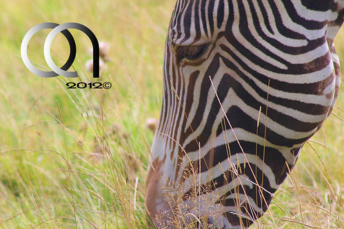
#3 had the potential to be a great shot, the biggest problem for me is that the grass is in focus and the zebra is not, shame it would have been the best of them.
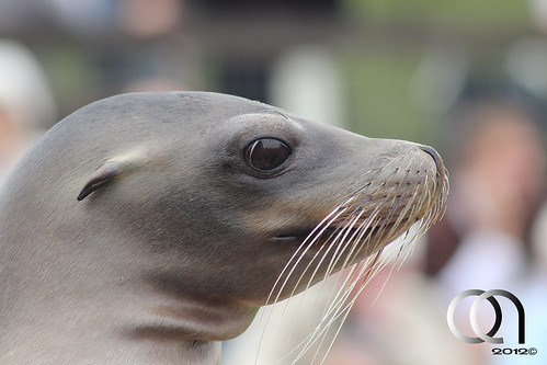
#4 as has been said the background is a little distracting, have you tried an adjustment layer and darken it down a bit, other wise nice placement within the frame and ncie sharpness.
 
Back
Top