weekly d00d's 52 in 2015 ... Week 51 & 52

I like them both! - Nicely on theme and nicely shot and processed, I'd be happy with either. Perhaps you could have waited at the tube station for the people to arrange themselves a bit better, I like the guy appearing up out of no-where though! Sorry I can't add much more, you are too good for me to offer improvements to.

:cow:
 
brilliant! #1 is my favourite, just because the people distracted me slightly in #2. all these great shots are making me wish i'd held on a bit to think of another subject....well done :)
 
I like them both! - Nicely on theme and nicely shot and processed, I'd be happy with either. Perhaps you could have waited at the tube station for the people to arrange themselves a bit better, I like the guy appearing up out of no-where though! Sorry I can't add much more, you are too good for me to offer improvements to.

:cow:
Awe thanks Brian ... re the tube station ... I took shots of no people, in-yer-face people, but liked the in between.

brilliant! #1 is my favourite, just because the people distracted me slightly in #2. all these great shots are making me wish i'd held on a bit to think of another subject....well done :)
Thanks Laura
 
Passed through Westfield London this morning, took a couple of shots ...

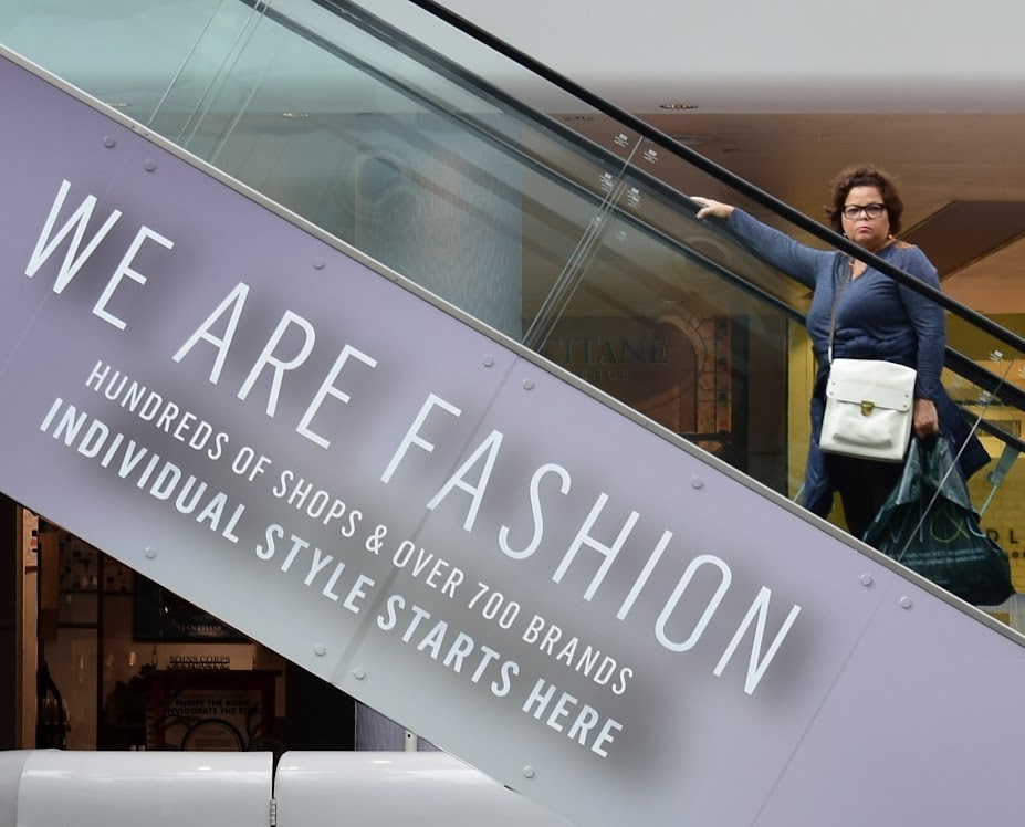
Fashion #1
WiYeAlM_3jUxu2mJ6JlnvTQMf8EH-YjFaIj65X2yr48=w1148-h884-no


Fashion #2
zjzVSL3808mida43KDmqVzZAn7dPb7Y3OG1HpDFmfYM=w1212-h884-no
 
Hi d00d, I guessed you'd come up with a bit of street photography for this one.

The first one is eye really eye catching, excellent angle on the escalator, the absence of colour elsewhere makes it really stand out.
(That lady doesn't look too happy ...did she spot you snapping away :))

I assume the young lady in the second shot is modelling the hat ...well spotted with that one.
 
I Love the escalator shot, her face is a picture in itself!

How long did you hang around?
 
Hi d00d, the escalator shot for me not usually keen on selective colour but it works quite well here the woman's face definitely makes the picture
 
Hi d00d, I guessed you'd come up with a bit of street photography for this one.

The first one is eye really eye catching, excellent angle on the escalator, the absence of colour elsewhere makes it really stand out.
(That lady doesn't look too happy ...did she spot you snapping away :))

I assume the young lady in the second shot is modelling the hat ...well spotted with that one.

Thanks susie ... Re #2 ... I spoke to the blond who told me they were doing a makeover, whatever that is, and it occurred to me this morning how unprofessional it all was ... I googled makeover and for £20 or £30 you can be madeup and have your pic taken. Of course my pic is best.

I Love the escalator shot, her face is a picture in itself!

How long did you hang around?
I did a zoom in just for you ... see below.

I was there looking up at that escalator for just 4 or 5 mins thinking fashion and fashionable-looking types. Then tried different escalators with different POVs, and finally decided this lone lady is a star. :cautious:

Hi d00d, the escalator shot for me not usually keen on selective colour but it works quite well here the woman's face definitely makes the picture
Thanks Allan ... see below ..

fashion1.jpg
 
Last edited:
Elevator image for me too David (y)
But as others have said, what a grumpy model :D
 
Hi David
#1 - I think the selective colour works well and the woman face is great lol. Your patience paid off with that #2 is a good grab shot.
 
#2 for me as I don't really like selective colouring (although I agree, your model in #1 has an expression to kill for/with).
Presumably in #2 the fashion items are the 2 Canon cameras?

If those two are professional togs, you'd think they would pose the model further away from the wall to allow a shallow DoF to blur it out...
 
Both shots fit the theme well David but I really like the first shot but without the pillars. No 1 is running out a bit so the cropped version sits much better with me.
There is a great contrast between the brick red and the blue cloudy sky, very nice.
I like No2 very snazzy 60's look, but the first shot is better(y)
 
Hi David. I like both but the woman's expression in #1 is the winner for me. (I prefer the uncropped original as it's less clinical and, typical of a mall, got lots of things competing for attention).
 
Tog Spotted!
Thanks Matthew ... yes it has been known, and now I'm inspired to go out to do more.

Elevator image for me too David (y)
But as others have said, what a grumpy model :D
Cheers

Hi David
#1 - I think the selective colour works well and the woman face is great lol. Your patience paid off with that #2 is a good grab shot.
Cheers

#2 for me as I don't really like selective colouring (although I agree, your model in #1 has an expression to kill for/with).
Presumably in #2 the fashion items are the 2 Canon cameras?

If those two are professional togs, you'd think they would pose the model further away from the wall to allow a shallow DoF to blur it out...
Yes they were modelling the latest Canon straps, and no not very professional. ;)


Both shots fit the theme well David but I really like the first shot but without the pillars. No 1 is running out a bit so the cropped version sits much better with me.
There is a great contrast between the brick red and the blue cloudy sky, very nice.
I like No2 very snazzy 60's look, but the first shot is better(y)
Thanks Steve ... it's OK, I've guessed you're referring to Geometric. ;)

Hi David. I like both but the woman's expression in #1 is the winner for me. (I prefer the uncropped original as it's less clinical and, typical of a mall, got lots of things competing for attention).
Thanks ... I felt the uncropped original really did need the SC treatment tho as there was a bit too much distraction.

#1 for me, well spotted and great eye contact.

Cheers.
great eye contact indeed :cautious:
 
Sorry Duuurrrr having a senior moment, as when I posted I had been flipping through the pages and hadn't seen your Fashion post:rolleyes:
So lets do Fashion...

I like No1 because of your "Model" cracking expression:D(y). The strong diagonal of the escalator really works well. Nice exposure!
However I really like No 2. You will have to excuse me though as its not particularly for Photographic reasons! The girl in the shot reminds me of a former girlfriend with that hat! My ex from 196....... had several identical hats, Bugger that's giving my age away:eek: Funny how fashions turn a full circle isn't it. POV is I tad tight and the Togs are using Canons:eek::exit:

Anyhow going to pick No1 Nice shot(y)
 
Now that looks a good way to chill out. Nice lighting, great reflections and I like the condensation on the glass
 
I can't see it?
I can see it, but I know there are problems with JPEGs on Google+ ... Yesterday I couldn't see the next one up: Fashion #1 Cropped. Refreshing the page didn't help so I had to repost it. Anyone else not seeing it? Please let me know.
 
Love the crop of the escalator for Fashion. The strong diagonal, the grumpy woman and the prominence of 'We are Fashion' all come togetherto make a fab shot :clap::clap::clap:

And the Captain Morgan Spiced Rum reminds me of winter in the UK where I was definitely chilled :coldfeet: but it seems
Iike there is something missing in the composition, maybe because I prefer odd numbers in composition :thinking:
 
Rum and Coke, not had that in a very long time, sounds like a good idea (y)

Like Jill, I also feel there maybe something missing,
I just wonder if it would work better seeing the top of the bottle or the bottom of the glass?
or both? ( Portrait style)
 
Hi David,
Good idea, liking the condensation the glass, but I think it needs more lighting to make it pop (although I believe lighting bottles is pretty hard to do well - thats what I've read on in the lighting section :) ). Like Cobra I think maybe pulling back a little to include the whole bottle and glass would have added to the image.
 
Now that looks a good way to chill out. Nice lighting, great reflections and I like the condensation on the glass
(y) Carl


Love the crop of the escalator for Fashion. The strong diagonal, the grumpy woman and the prominence of 'We are Fashion' all come togetherto make a fab shot :clap::clap::clap:

And the Captain Morgan Spiced Rum reminds me of winter in the UK where I was definitely chilled :coldfeet: but it seems
Iike there is something missing in the composition, maybe because I prefer odd numbers in composition :thinking:
Thanks Jill ... you're right ... there's something missing.

Rum and Coke, not had that in a very long time, sounds like a good idea (y)

Like Jill, I also feel there maybe something missing,
I just wonder if it would work better seeing the top of the bottle or the bottom of the glass?
or both? ( Portrait style)
Thanks ... I was just trying to the chilled ice/condensation detail.

Can't see it on my iPad d00d [emoji45]
Yes I don't know what's going on.

Nice idea and I quite like the shot overall but agree with Jill and Chris that there's some element missing from the shot. Personally I would like to see the whole bottle and glass too. I like the brown table top complimenting the overall image.
Hmmm .. and there was me thinking the brown tabletop was a mistake ... think I'll do a reshoot.

Hi David,
Good idea, liking the condensation the glass, but I think it needs more lighting to make it pop (although I believe lighting bottles is pretty hard to do well - thats what I've read on in the lighting section :) ). Like Cobra I think maybe pulling back a little to include the whole bottle and glass would have added to the image.
Yeah I tend to reduce the light and do a long exposure.

Hi d00d .... that's really nicely done, I like it as it is ...perfect for the theme ...and you get to drink the props what could be better :)

Did you do a portrait one ...then we could compare.

I might have a drop in my coffee later ... I guess I could show a portrait orientation ... but I'm thinking more reshoot.
 
Nice use of leading (clothes) lines.
Nice use of the rule of 3rds
Nice use of DoF
Nice use of Colour

Yup, like that shot. I bet it took a while to set up.
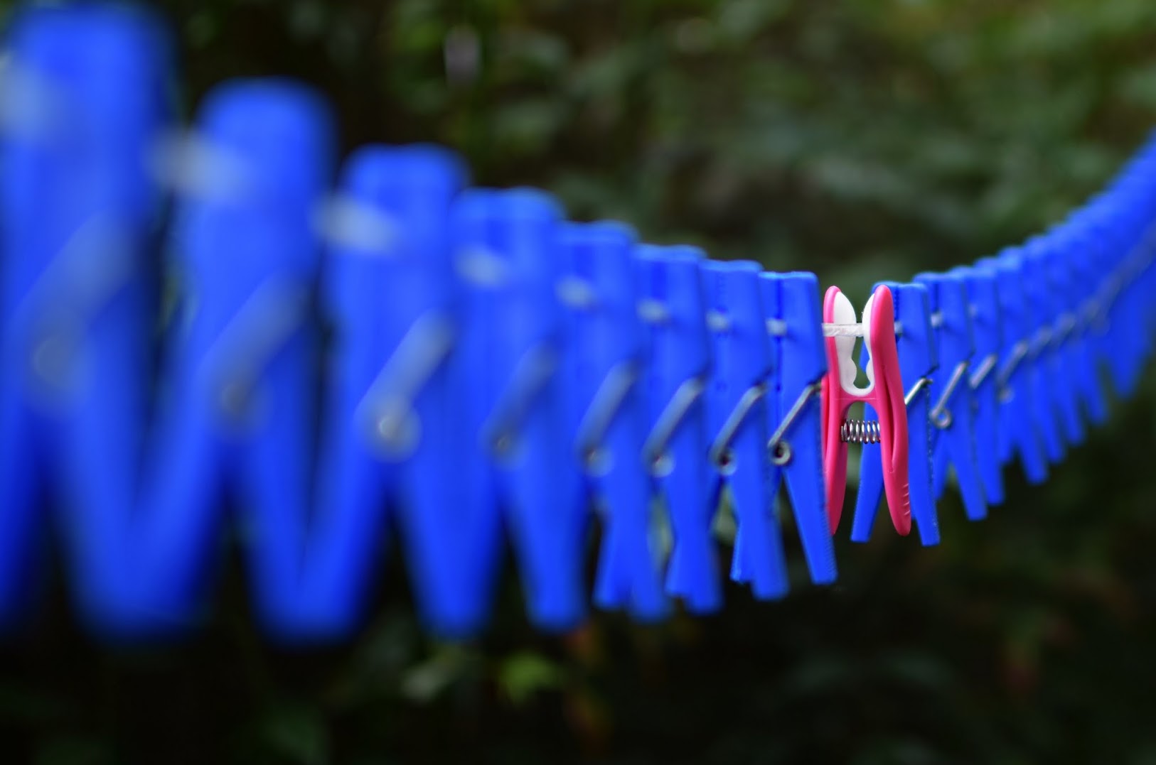
Hmm Dominos... If only I hadn't already posted my 'Special'.
 
Hi d00d, have to agree with the others about chilled, not the best composition and it looks a little squashed :thinking:

Special works really well because of the DoF and placement of the pink peg in the frame, little bit off the bottom maybe just to be picky ;)
 
Genrally a very notable shot, how many bags of pegs did you have to buy? I expect you have many pink ones left over.
 
Hi David. Simple, colourful and effective. Just been reading up on DoF and how one third is in focus forward of the actual point of focus and two thirds behind - this image helps put that in context for me. Well taken
 
Hey David :)

Fashion - Love this, a perfect spot, the angle works brilliantly and the look/capture of the lady is the icing on the fashion cake (y)

Chilled - Nice chill on the glass, and the included bottle/label adds to the whole, like it :)

Special - Ooooo now I really like this one, what a great idea, love the colours, angle and DoF - smashing :clap:
 
Back
Top