Help or advice for removing a sign

Messages
163
Name
David Woodyatt
Edit My Images
Yes
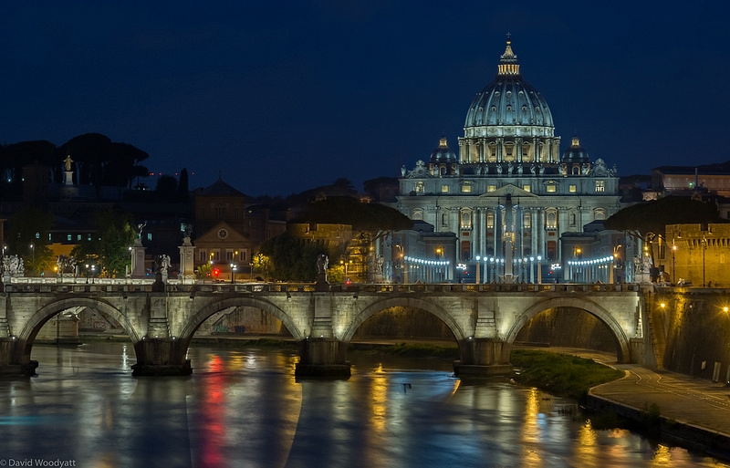
I show the below image last night but knew the VW advert was going to be a pain. I thought I may be able to clone or heal it out in Photoshop but its beyond my level at this moment. Does anyone have any advice on how to remove it?

Rome by Dave Woodyatt, on Flickr
 
Is that advert tacked to a giant stone block / monument ? That is to say, would you be lookig to replace the ad with flat stonework ? Seems like a fairly standard place to take a shot, can you find any taken without the advert in place as an indication of what's typically there?
 
That's a real pain isn't it. I don't know either, as whatever you choose to replace it with will need to mimic the lighting that falls on the sign as it is and even if you replace it, I suspect it would just look odd. Horrific place for a chuffing big billboard :(
 
I've had a look though online sources to try and find a similar picture to use as a layer mask, but as has been said by others getting it to match the light is unmatchable. I think I may just have to suck it up but its such a pain in the bum bum
 
You could flip the image and use the other side of the portico thing but what about alongside without making a totally fake scene,
You could probably cover the area one way or another using perhaps a tree from the left.
I'd be more inclined to desaturate and darken it so it kind of faded into the background more.
Even then the reflection ought to be dealt with too.
 
Just copied from right side to a new layer and stretched it to fit. Copied the post/statue just left to a new layer above. Masked in a HSL layer in "colorize" to blend temps. There was a little bit of masking/blending of all layers individually I think...

It could be done better with a bit more time/effort... (I spent < 5min on it)
 
Last edited:
No I changed it so that you could do it. Thanks so much for doing that. I will endeavour to learn more for myself, really appreciated
 
Open in PS.

Copy layer.

Flip copy in transform.

Slide copy across using move tool; align cross on top of dome.

Apply a layer mask, and then paint with black to blend in, paint with white to correct any slip-ups.

Flatten image.

Save.


Rhodese.


15494-1464592406-8985f70f3816904b065073f8b54bb994.jpg
 
Last edited:
I like the last edit - it makes it look much more photogenic - but is obviously now not the place that was photographed. Is it better we photoshop to make it look pretty even if the real life scene is different? If I didn't know the place - it wouldn't matter to me - I would just think 'oh there's a nice shot' - but if I knew the place I might feel differently....
 
I like the last edit - it makes it look much more photogenic - but is obviously now not the place that was photographed. Is it better we photoshop to make it look pretty even if the real life scene is different? If I didn't know the place - it wouldn't matter to me - I would just think 'oh there's a nice shot' - but if I knew the place I might feel differently....

It's a good question and there's probably no right or wrong answer. The first edit baffles me, though as the wall to the right has just been stuck in front of the sign, which seems a tad bizarre?
 
I like the last edit - it makes it look much more photogenic - but is obviously now not the place that was photographed. Is it better we photoshop to make it look pretty even if the real life scene is different? If I didn't know the place - it wouldn't matter to me - I would just think 'oh there's a nice shot' - but if I knew the place I might feel differently....

A bit of a grey area really, personally I'd have done exactly the same as Rhodese did, for me that works, ok I don't know the place or what it's supposed to look like, but that looks right to me.
Yes I know theres a school of thought that says a photo must be exactly as it was when you pressed the shutter, but at the same time we're supposed to be artists, and that means artistic licence. If theres a coke can in my landscape it gets removed (before I shoot if I spot it) in this case you couldn't remove the blot on the ladscape before, so removing it after is fair game. Well as far as I'm concerned it is. :)
 
What a terrible place to put a sign.


I would say it's a brilliant place to put a massive advertising hording! Royal PITA for photographers but great for the advertisers.

Have to admit that I'm in the "It was there so it's part of the scenery" camp and I would have either taken the snap or tried to find another viewpoint where the hording wasn't visible (or at least less obtrusive.)
 
The first edit baffles me, though as the wall to the right has just been stuck in front of the sign, which seems a tad bizarre?
It's because it's not "a sign"... it's a building with signs on it (looks kind of like construction wrap). The approach to the building is lined on both sides symmetrically with buildings/lighting and we are looking at it from an angle.
 
It's because it's not "a sign"... it's a building with signs on it (looks kind of like construction wrap). The approach to the building is lined on both sides symmetrically with buildings/lighting and we are looking at it from an angle.

OK, I see where you're coming from. I've no idea what it would look like without the advertising in front of it but the second edit would have been my "guess".

OP, what building is that, please? It would be interesting to see a photo of it before that advertising was placed there.
 
I've no idea what it would look like without the advertising in front of it but the second edit would have been my "guess".
I think the second image would be closer if it had been taken from a couple hundred meters to the right.
It's St Peter's Basilica...
 
Last edited:
Yes its the Basilica in Rome. Due to the bridge that gave me the vantage point I was already maxed out on the view point.
 
That is one of THE exact viewpoints I have in mind for my trip to Rome next year. I'll be livid if that sign is still there.

Both of the edits have merit actually. I like the second one but the first one is closer to reality in some ways.

My tip with any sort of cloning is to try and avoid repetition although with architecture is is less of an issue. So copy and paste something but then clone it further to make changes.

That sounds like sound advice but I'd be really interested to see your edit. Any chance you could give it a go? I'm fascinated by this thread as the edit is not easy.
 
It's not an easy looking one is it. I'll have a crack when I'm at my computer and not on my iPhone!

If you were working from scratch any other photos taken at the same sort of time in similar light could also be utilised to composite a suitable building in. One that is not as strongly lit would draw less attention to it, a bit like the digital compositing version of burning instead of dodging...

Exactly! Oh come, can't do PS on your phone? :D Looking forward to seeing your edit and thanks.
 
It's not an easy looking one is it. I'll have a crack when I'm at my computer and not on my iPhone!

If you were working from scratch any other photos taken at the same sort of time in similar light could also be utilised to composite a suitable building in. One that is not as strongly lit would draw less attention to it, a bit like the digital compositing version of burning instead of dodging...

There's a creative commons image almost identical to this but w/o the sign...
 
Last edited:
That's the way to do it! I have no problem with editing like this but but again what a stupid place for a sign, don't they think about us photographers anymore?!?!
TBH, I don't think that the minimal sampling needed would require CC/permission regardless... but where's the challenge in that?
 
So the challenge is you can only use the information available in the file from the OP. This is what I have just come up with quickly. I don't really like the colour tone of what I have created, I think the whiter marble looking stuff would be nicer and I do think this should have more light on it, but I am trying to keep it subtle, although the edge on the face of the building is not great.

signremoval by Craig Hollis, on Flickr
 
So the challenge is you can only use the information available in the file from the OP. This is what I have just come up with quickly. I don't really like the colour tone of what I have created, I think the whiter marble looking stuff would be nicer and I do think this should have more light on it, but I am trying to keep it subtle, although the edge on the face of the building is not great.
Very nice job... I'm not even sure where you got it all from... that's definitely more work than I'm going to put into it. Temp/tone/luminance are pretty easy in comparison.
 
Very nice job... I'm not even sure where you got it all from... that's definitely more work than I'm going to put into it. Temp/tone/luminance are pretty easy in comparison.

Feel free to sort the colours out and paint some more light onto the building I gave up after this.

With such a small file it is not easy. Mainly I use the vanishing point tool to create selections that can be duplicated and enlarged within the correct perspective.Then it is a case of also using masks and blank layers with the clone tool and or paintbrush replacing colour.

The face of the building came from the one a third of the way in on the left above the red light. Like I said earlier with some other shots of extra buildings you could add one from another shot entirely.
 
wow guys fair play these are awesome edits. Makes me realise how much further I have to go in my understanding of Photoshop also. The Image I posted was a composite of 5 images shot with a -1EV range.
 
The image is nice David, like the colour in the water and the detail in the dome. Have you seen Elia Locardi's shots from here? Got a couple of absolute stunners.
 
Feel free to sort the colours out and paint some more light onto the building I gave up after this.

With such a small file it is not easy. Mainly I use the vanishing point tool to create selections that can be duplicated and enlarged within the correct perspective.Then it is a case of also using masks and blank layers with the clone tool and or paintbrush replacing colour.

The face of the building came from the one a third of the way in on the left above the red light. Like I said earlier with some other shots of extra buildings you could add one from another shot entirely.
Ha! You make it sound much easier than I know it was... how many layers did you have? 20? I'd bet it was more than 10 even if you combined edits.
 
wow guys fair play these are awesome edits. Makes me realise how much further I have to go in my understanding of Photoshop also. The Image I posted was a composite of 5 images shot with a -1EV range.
It's a nice image... not sure +/- 1 is worth the bother (with most cameras/raw).
 
So the challenge is you can only use the information available in the file from the OP. This is what I have just come up with quickly. I don't really like the colour tone of what I have created, I think the whiter marble looking stuff would be nicer and I do think this should have more light on it, but I am trying to keep it subtle, although the edge on the face of the building is not great.

signremoval by Craig Hollis, on Flickr


Great stuff. Probably the best thus far. Thanks for that, Craig!
 
I have seen Ellia's photos from there yes, I really like his style of photography. He's the reason I shoot a scene with +/- a few EV. for the sake of clicking a button a few more times I will guarantee I have all the detail I will need.
 
Back
Top