
- Messages
- 759
- Name
- Peter
- Edit My Images
- No
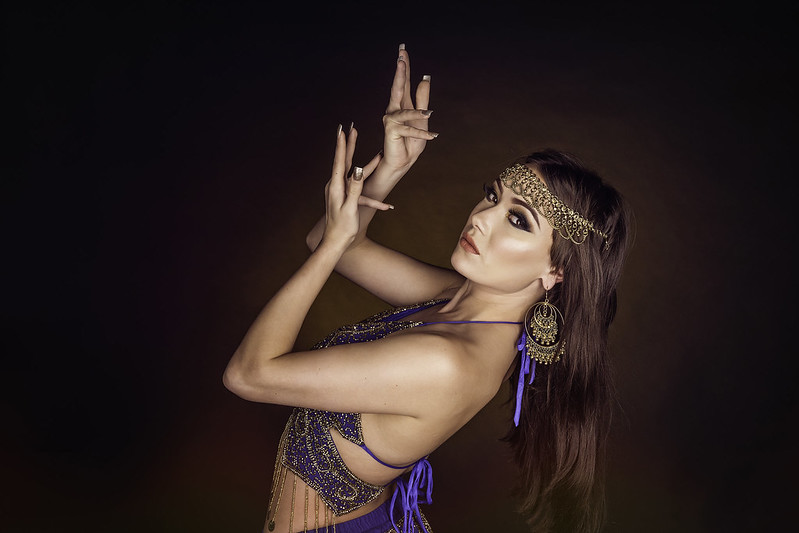
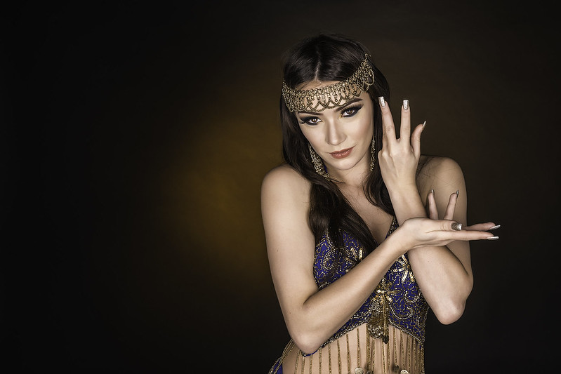
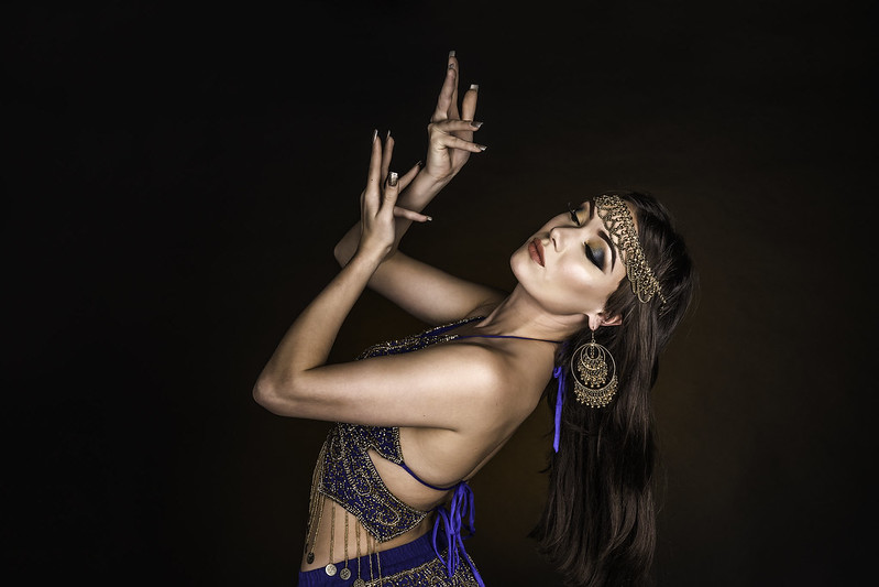
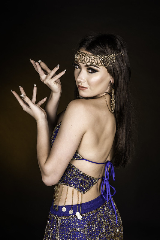
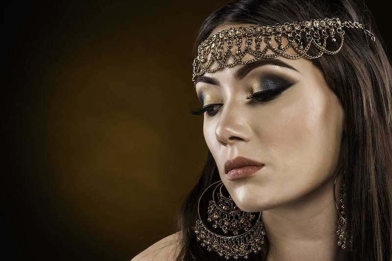
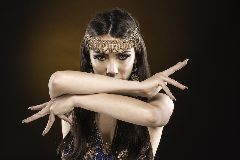
Hi all just sharing a few of my shoot with Stevie C&C Welcome.
Peter
1.
 2.
2.
3.
 4.
4.
5.
 6.
6.
Peter
1.
3.
5.

Interplay with the background?For me the the fifth makes a very effective portrait of a beautiful woman.
The others have no mystery, as the lighting is perhaps too harsh with no interplay with the background.
I just looked at this on my phone and the images look completely different very desaturated and colours completely different compared to earlier when I looked at work. I remember thinking at the time the preview image on tp homepage looked different from the images when opening the thread.
I've downloaded the image and looking at the exif it looks like you've exported these with a prophoto colour space. If sharing on the web you should always choose srgb for the colour space when you save as a jpeg as not all browsers/devices will honour the embeded icc profile.