Although I am a sucker for a reflection and I do like one, I prefer the motion of 2 better and the composition of 3.
I know why you took 6 but the bigger view works better.
The mono is good, but the dark cool tones I think work better in the colour renditi8ons. All strong images and whilst my own preferences are for golden light chocolate box these pull off the rare trick of being moody and dark in mood, without having to be dark and hard to see in appareance.
Great work.
Thanks Steve. The mono was actually because I had messed up the colour balancing and gave up! The dark and moody whilst retaining luminance was exactly what I was after, pleased it works for you.
Very nice set
3 is my fave the mono is very well done I like that and it is worth viewing on black on Flickr
The last one looks to me like it suffered water drops on the lens/filter on the foreground section something I have seen a lot of myself
Thanks Alf. That is the precise reason I was unsure if the last one works or not. It looks just like water on the front element but it is in fact black sand and water spray being blown along the ground, but I guess it looks more like a wet lens!
And just to prove we all have different tastes, #3 and #6 don't really work for me as the foreground dunes/grasses just don't seem to fit with the rest of the scenes for me. #1 is a bit tight on the rhs, but otherwise they are all fine shots.
Thanks Peter, fair point. There are some stunning compositions from within the dunes that I failed to find in the horrible conditions, some shots I have seen from others pull off a more harmonious scene with them.
Hard to pick a winner there Craig but I think number 2 is my fave which has a bit of everything, love those cool steely tones.
The ones with the yellow grasses in feel a bit tight with the horizon for me, especially the last one, I'd have maybe got set up higher and pointed down to give then more clearance maybe?
Thanks Stuart, I agree but these mounds with yellow grass are actually quite large, 2-3m high in places. By the time the weather had settled enough to be able to get a proper look around them and find a better composition a workshop of photographers had turned up and any shots then would have looked like something out of meerkat manor!
•
These are like Iceland: out of this world!
My pick is #1! Thanks for the pleasure.
Thanks Kodiak, pleased you like.
This is a great set Craig. I always wanted to go to Iceland and seeing these hasn't changed my mind.
I think no 2 just edges it for me purely from a composition point of view, with No 5 not far behind.
I do agree with the comments about the dunes /grasses somehow not fitting in with the rest of the scene.
Clearly they are part of the natural landscape and do fit the viewed scene, but purely from a photographic point of view and with them being a total different colour they are competing with the lovely cool tones of the mountains.
Thanks Roger, I like the breaking wave in 2 but other friends prefer the strong diagonal of 5.
A really nice set and a place I still want to visit
Thanks Adam, get it booked before the tourist numbers go even higher!
I won't offer too much crit Craig as I think its all been covered but I am slightly jealous of number 1. They're all wow in their own way but I just love that first one.
Thanks Dale, I hope the simple beauty of the first one comes across in the shot.


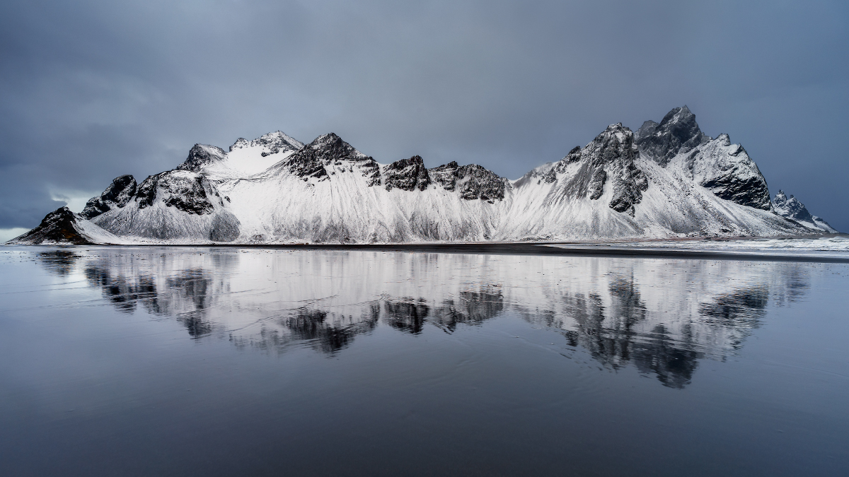 Vestrahorn by Craig Hollis, on Flickr
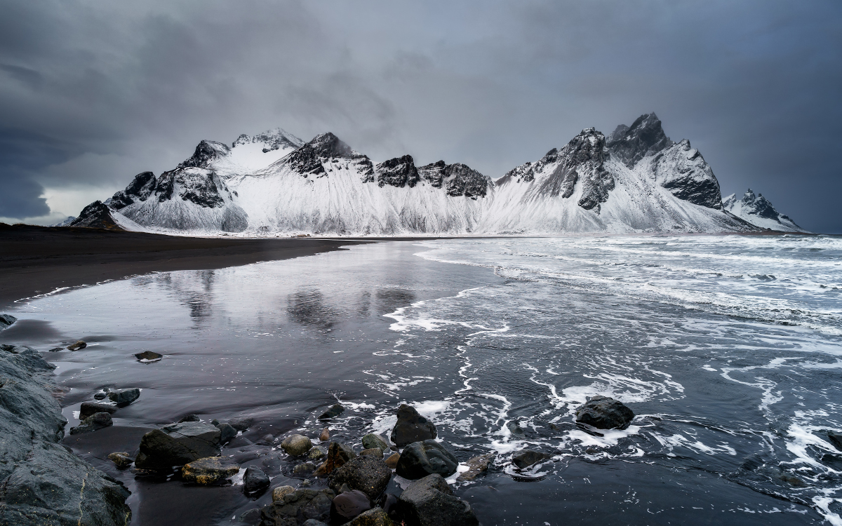 Vestahorn Sea by Craig Hollis, on Flickr
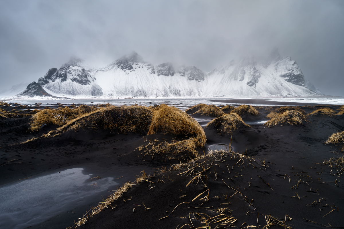 Vestrahorn Dunes by Craig Hollis, on Flickr
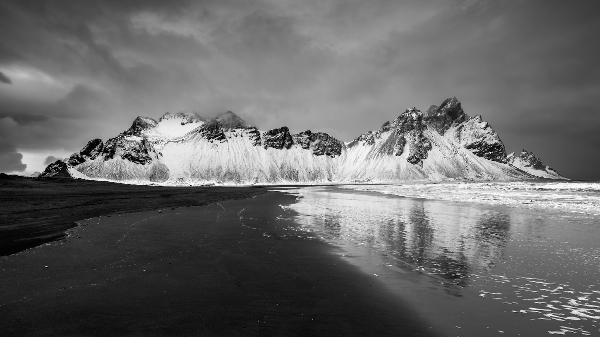 Vestrahorn B & W by Craig Hollis, on Flickr
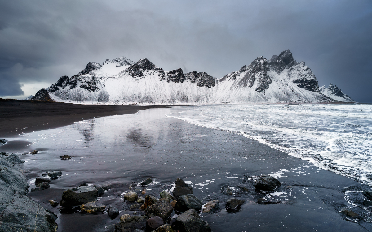 Vestahorn Sea by Craig Hollis, on Flickr
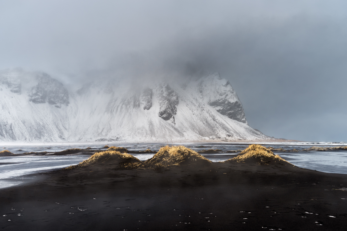 Vestrahorn Wind by Craig Hollis, on Flickr