Critique Peveril Ledge - Swanage

Messages
451
Edit My Images
Yes
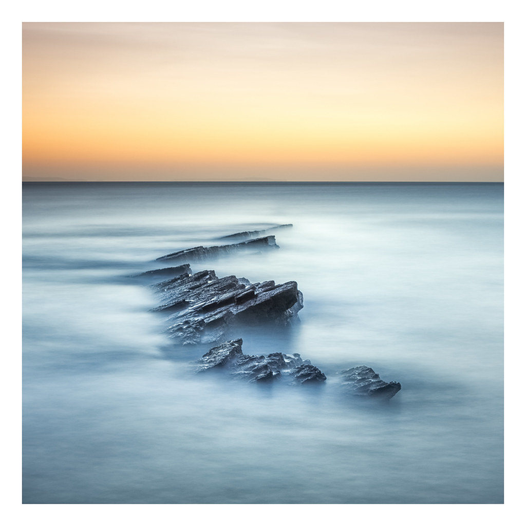
A couple of shots from yesterday...can't work out which I prefer... i'm siding with the black and white image..

I've tried to go for the fine art style... the whites aren't as persil white as i'd like...I'm guessing its down to not exposing for long enough..

Anyway, two different shots, the colour one was about 220 seconds long and the black and white about 210

Any good pointers for improving appreciated!


Generated from my Apple iPhone using tools.rackonly.com


Generated from my Apple iPhone using tools.rackonly.com


[edit] Gah!can't access flickr from work to embed image.... will do it when I get a mo...
 
Last edited:
I think I agree. I initially did really like the first shot but then after scrolling down, the second shot made me realise that the first one was perhaps too much contrast between the colourful top half and the almost monochrome by comparison bottom half. I think both are good shots and I could easily imagine each one on someone's wall but more often than not I think it would be image 2 unless the top colouring happened to match something else in the room.

Afraid I can't offer any constructive criticism as I don't see anything I would change about the images.
 
I'm going to be "argumentive" here, I dont think the sunset adds anything to either and if cropped out results in a better picture (IMO - which counts for zilch really :) )
Matt
 
I'm going to be "argumentive" here, I dont think the sunset adds anything to either and if cropped out results in a better picture (IMO - which counts for zilch really :) )
Matt

SUN-RISE!!!! ;)

But yeah, I think I agree...need to revisit and try a slightly higher vantage point... the sunrise was completely clear, so the colours I guess are just the light refracting through whatever dust and whatnot is in the atmosphere as there were zilcho cloulds...
 
I'm going to be "argumentive" here, I dont think the sunset adds anything to either and if cropped out results in a better picture (IMO - which counts for zilch really :) )
Matt

If I scroll my screen so that the sunrise is out of frame it then crosses a line into being boring. I much prefer with the sunrise included.
 
I prefer the first image and I think the sunrise adds something to the shot. Without it the shot feels to be missing something, for me anyway
 
Very nicely done, another vote for the colour version.
A little surprised there seems to be no reflected colour on the sea or from the wet rocks.
 
Very nicely done, another vote for the colour version.
A little surprised there seems to be no reflected colour on the sea or from the wet rocks.

I'm guessing its because its was probably 20 'ish mins before sunrise, so no direct light on the sea or rocks... any light that was around wasnt really strong enough to light up either... only reason the skys popped out like that is due to a 3 stop nd grad..
 
I'm guessing its because its was probably 20 'ish mins before sunrise, so no direct light on the sea or rocks... any light that was around wasnt really strong enough to light up either... only reason the skys popped out like that is due to a 3 stop nd grad..

Thats why I'm surprised, the only light source is the sky, which is coloured, so I would have expected that colour to be picked up.
Just goes to show, you can never second guess what mother nature will give you ;)
 
Back
Top