

- Messages
- 104,465
- Name
- The other Chris
- Edit My Images
- Yes
Wasn't sure where to post this, not really a "project" in that it was all shot in a day although some of the photos will be part of an on-going project but it felt like too many photos for the landscapes section and they aren't really the normal style of landscapes. Besides I am not interested in crit of the individual photos, they are what they are, but I am interested in opinions (if anyone has any at all) on the collection.
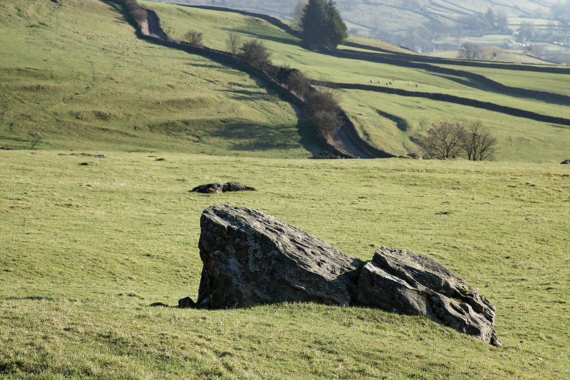 Norber (1) by Chris H, on Flickr
 Norber (8) by Chris H, on Flickr
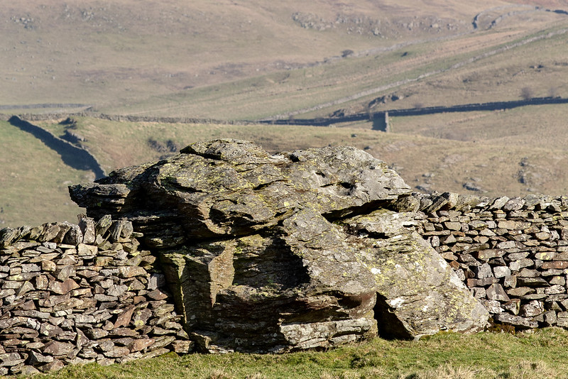
 Norber (3) by Chris H, on Flickr
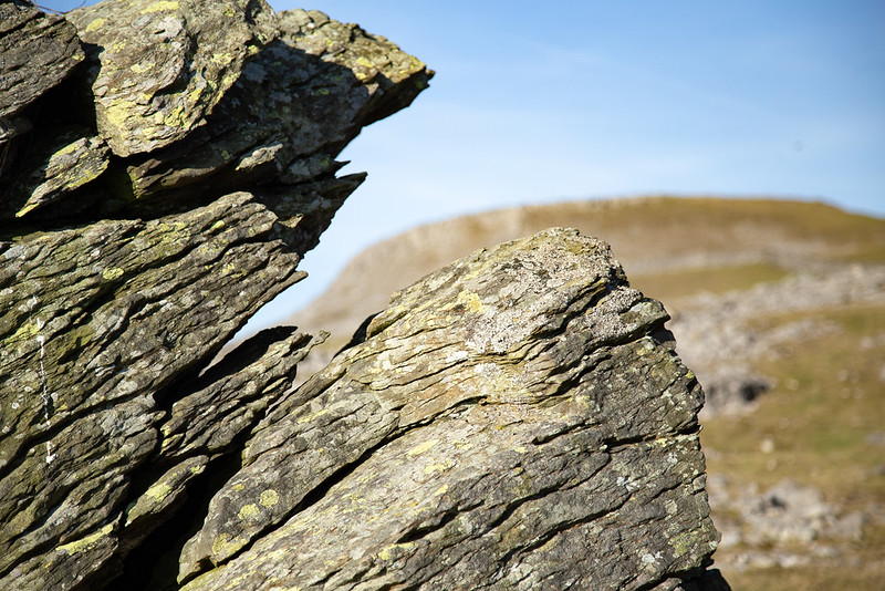
 Norber (2) by Chris H, on Flickr
 Norber (4) by Chris H, on Flickr
Norber (1) by Chris H, on FlickrNorber (8) by Chris H, on FlickrNorber (3) by Chris H, on FlickrNorber (2) by Chris H, on FlickrNorber (4) by Chris H, on Flickr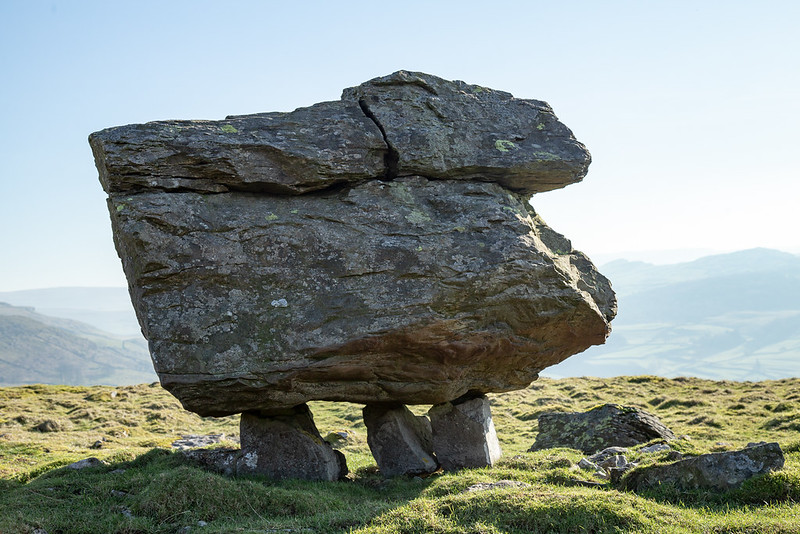 Norber (6)
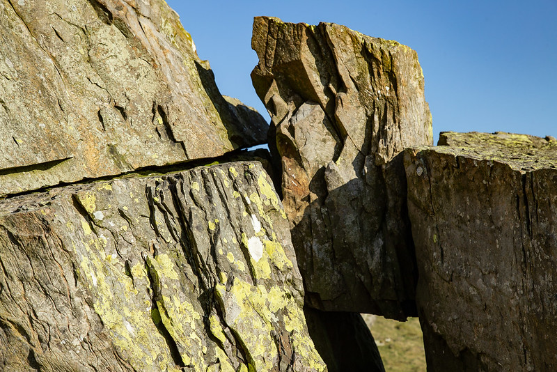 Norber (5)
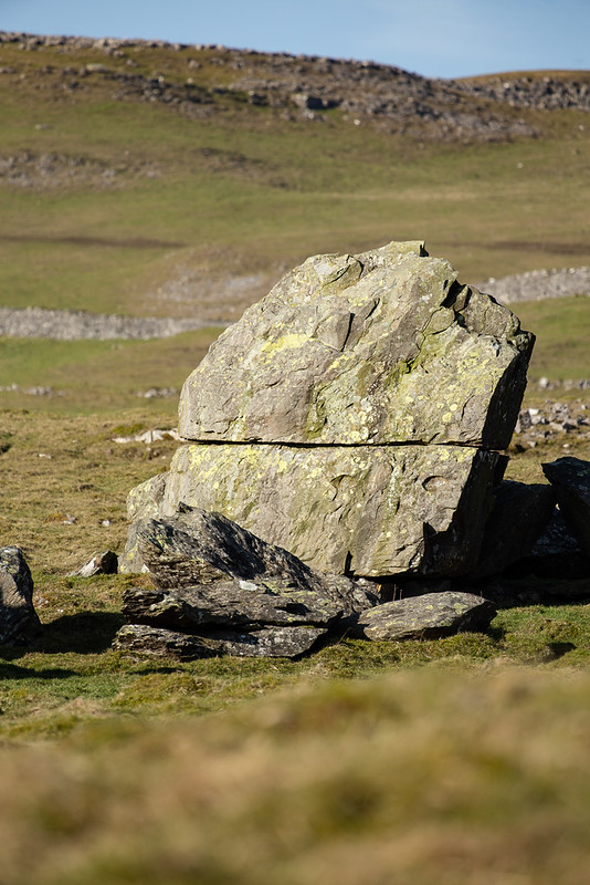 Norber (7)
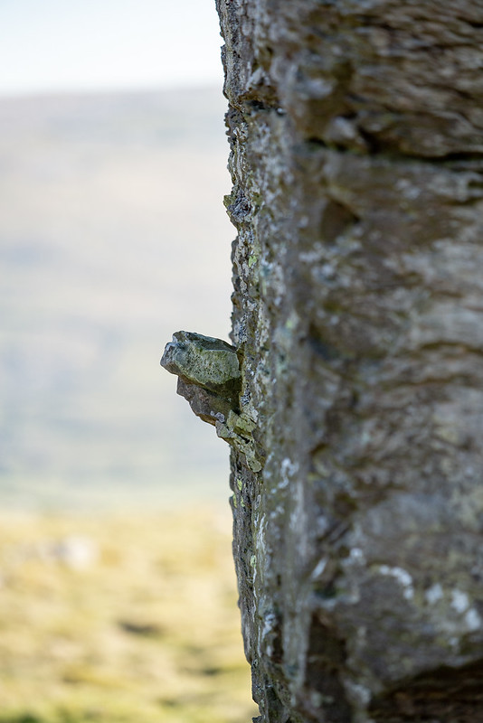 Norber (9)
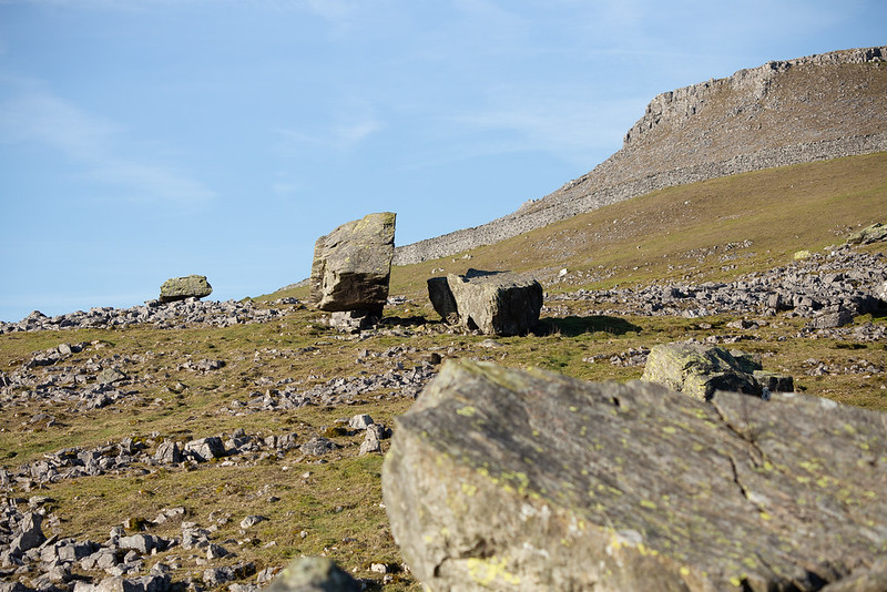 Norber (10)
 Norber (11)
 Norber (12)
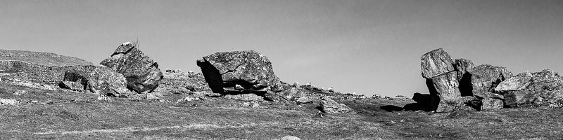 Norber-mono (1)
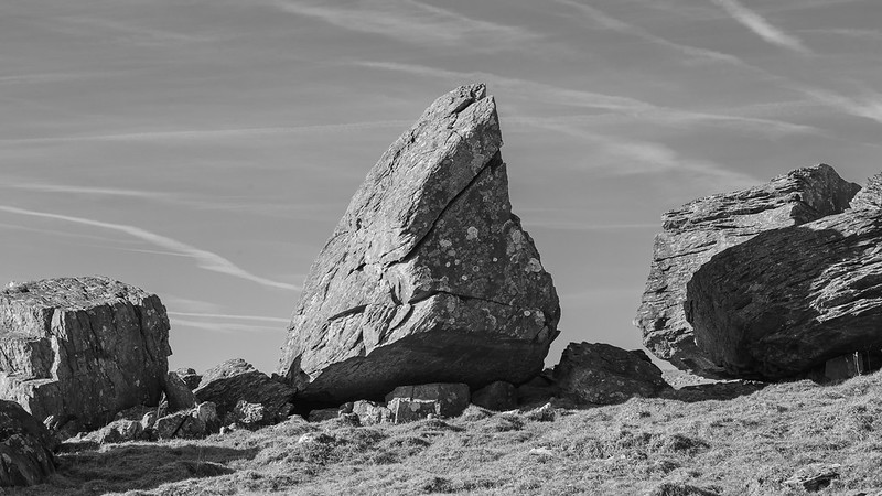 Norber-mono (2)
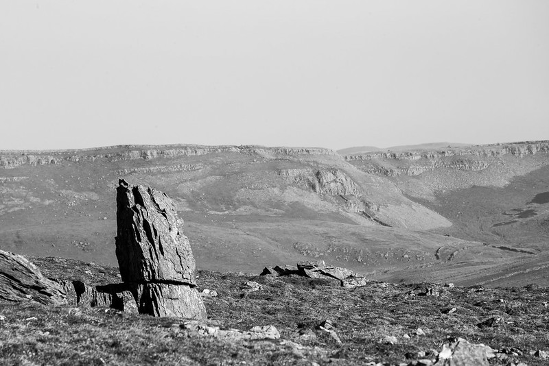 Norber-mono (3)
")
