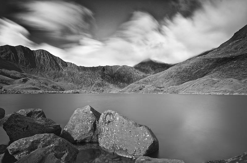
10 stop Lake (B&W or not)

Messages
1,899
Edit My Images
Yes
Had a play about with a B&W conversion, not sure if it works or not.
Your opinions on both the conversion and original would be great.

Black & white

DSC_9808 by ts446, on Flickr


Original
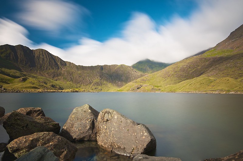
Llyn Teyrn by TS446Photo, on Flickr

Thanks for looking
 
A bit more dodging and burning and the B&W will be there
 
The colour one for me,
 
I prefer the colour one also. I think the b+w would work better if it were more contrasty...
 
Prefer the black and white version, agree a bit of dodging and burning would enhance it further. That said I like them both.
 
I like the B&W and think I would up the saturation in the colour one to see how that came out (I like over saturated colours which is not to everyones taste though)
 
Had a play about with a B&W conversion, not sure if it works or not.
Your opinions on both the conversion and original would be great.

Black & white

DSC_9808 by ts446, on Flickr

I Like this image, composition and exposure work well..

I don't have a clue with PP, but I think all this needs was a boost of contrast. Obviously dodging and burning will be more accurate but here's a quick boost for you.


NOT MY PICTURE by ^Joe, on Flickr
 
I prefer the one with more contrast. But to be honest I prefer the colour version of this.
 
Generally I tend to prefer colour landscapes - think you need strong "shapes" to make a B&W landscape work - having said that I'm finding it hard to pick one or the other!

The latest edit from ynot does work for me though!! Also might be worth taking a little off the bottom to remove the "slices" of the 2 rocks to the right - sorta looks right to me.......
 
Given that the image has a good composition and exposure it should really work either as a colour or B&W image.

Your B&W edit has revealed that their is more detail in the cloud so you could pull this out on the colour image as well which would improve that image.

Good B&W's usually have definite Blacks and whites as well a good tonal range. If there are too many mid greys then the picture lacks punch (or contrast). It is evident on the colour picture that their is shade on the centre and right-hand hill-side which could be exaggerated and add this punch. The rest of the tonal range is good in my opinion.

Overdoing the skies does not add to the image (again in my opinion). Your scene has a straightforward reality about it which is it's appeal, pushing it too hard will only spoil it.

There are three rocks which touch the bottom left edge which are distracting. A simple crop could help but then it may have a "cramped" look as it rests on the large rocks. Better to try and clone out these small rocks and create a bit of space around the larger rocks - which are the foreground subject and will add to their impact. This may be easier to do on the B&W image than the colour one.

Hope that helps! (y)
 
I forgot to mention that there is a sign of oversharpening on the mountain ridge. You should also try to "soften" this by masking this when adjusting. (y)
 
Back
Top